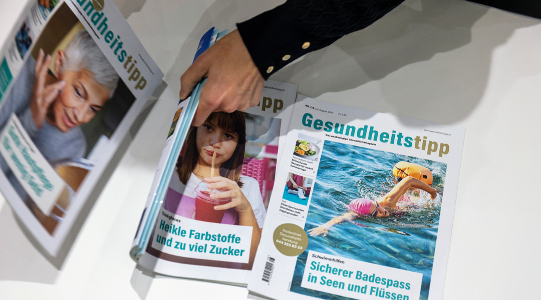
The aim was to make the content more modern and manageable for readers to understand, whether for the comprehensive advice, the product tests known throughout Switzerland, or the stories and research on health-related topics. Gesundheitstipp is an independent magazine with a print run of 40,000, which around 400,000 Swiss people read. In 2024, the magazine celebrated its 30th anniversary and is firmly established.
The redesign was strategically conceived to retain the magazine's character. However, it was modernized in appearance on several levels: type area, color scheme, leading typography, structuring, and reader guidance. Additionally, storytelling forms were developed.
The goal was to create more colorfulness, lightness, nuances, and variants. The primary and secondary colors were mixed to be warmer, and all the other rubric colors were redefined to increase the perceived value of the appearance. The content was structured more strongly, and quotes, figures, and infographics were integrated into the storytelling elements. Besides the revision of all layouts, tables and the design of the tests were an essential part of the redesign. When optimizing the entire advice section at the back of the magazine, the focus was firmly on functionality and aesthetics.
In some examples, you can see direct comparisons with the previous design (left-right or with a gray background on the double page).