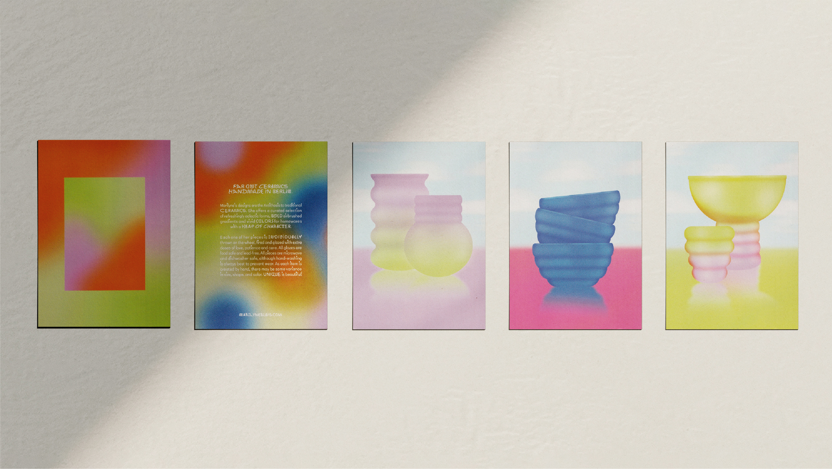
Marilyne Blais is an artist hand making far-out ceramics in Berlin, Germany. Marilyne's designs are the antithesis to traditional ceramics. She offers a curated selection of refreshingly eclectic forms, bold airbrushed gradients and vivid colours. These three elements became the cornerstones of her new brand identity.
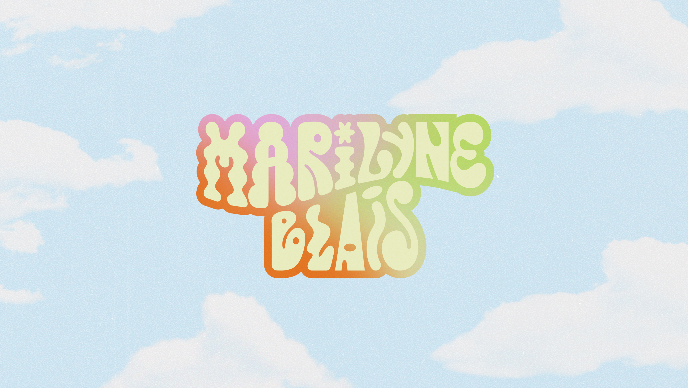
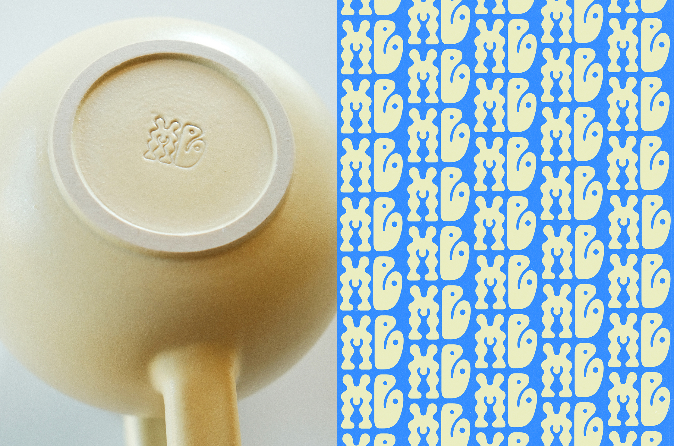
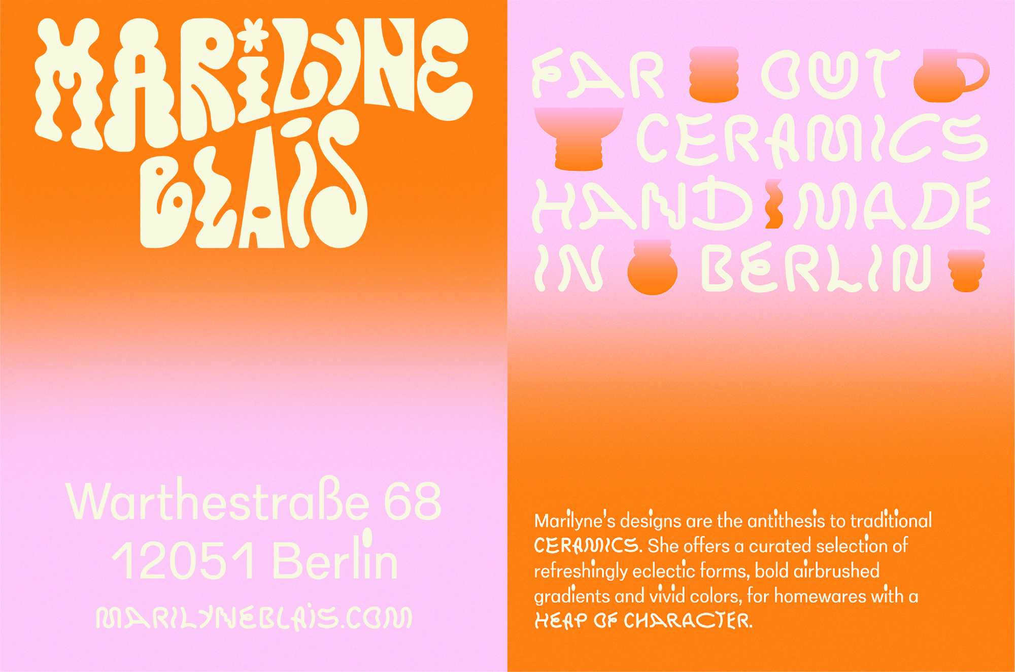
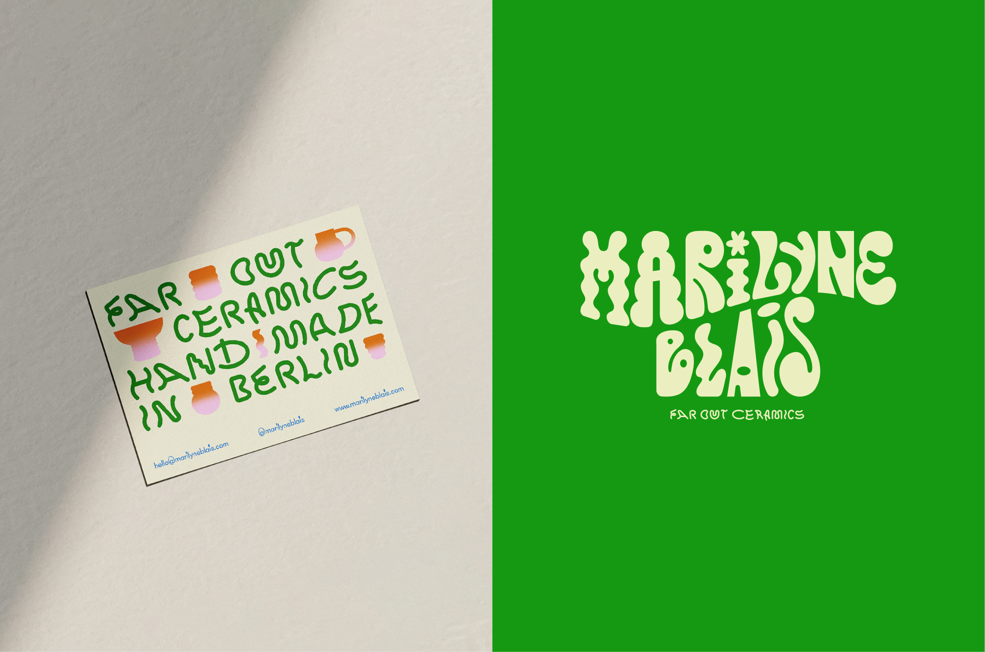
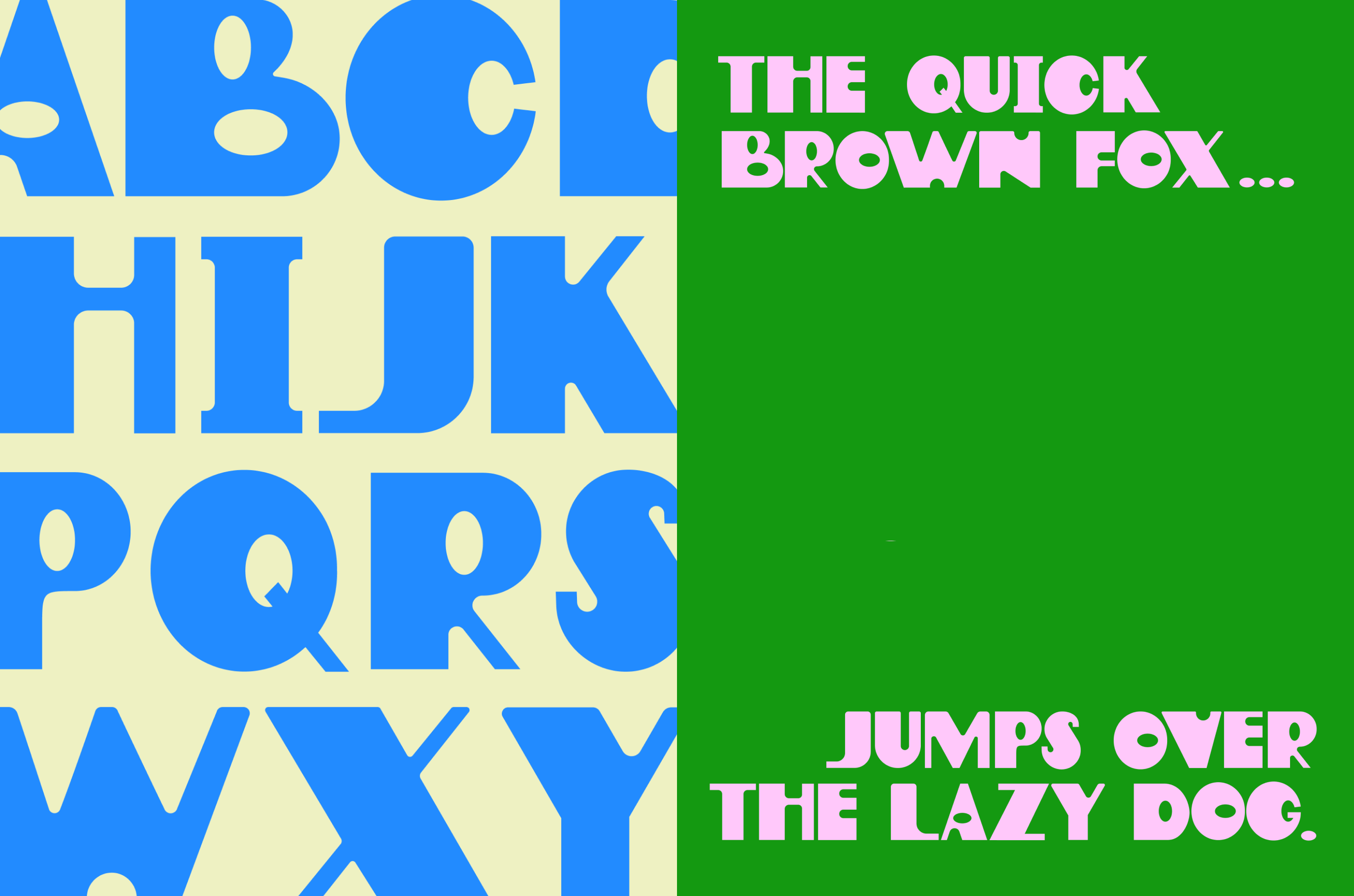
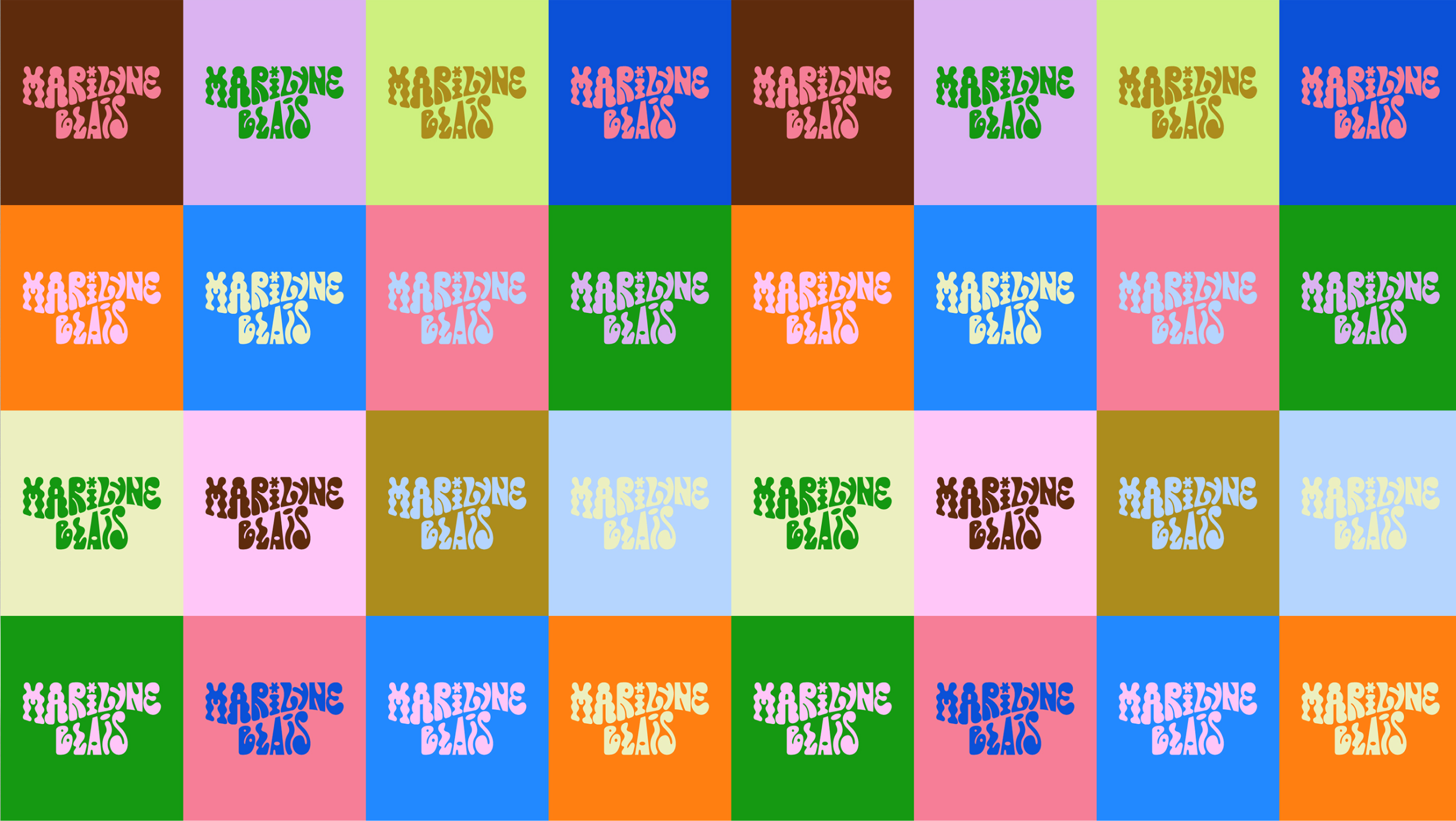
For Marilyne's logo we created a variety of bespoke letterforms, each taking inspiration from the undulating shapes of her ceramics. The typefaces we paired this with continue the eclectic graphic forms of the logo.
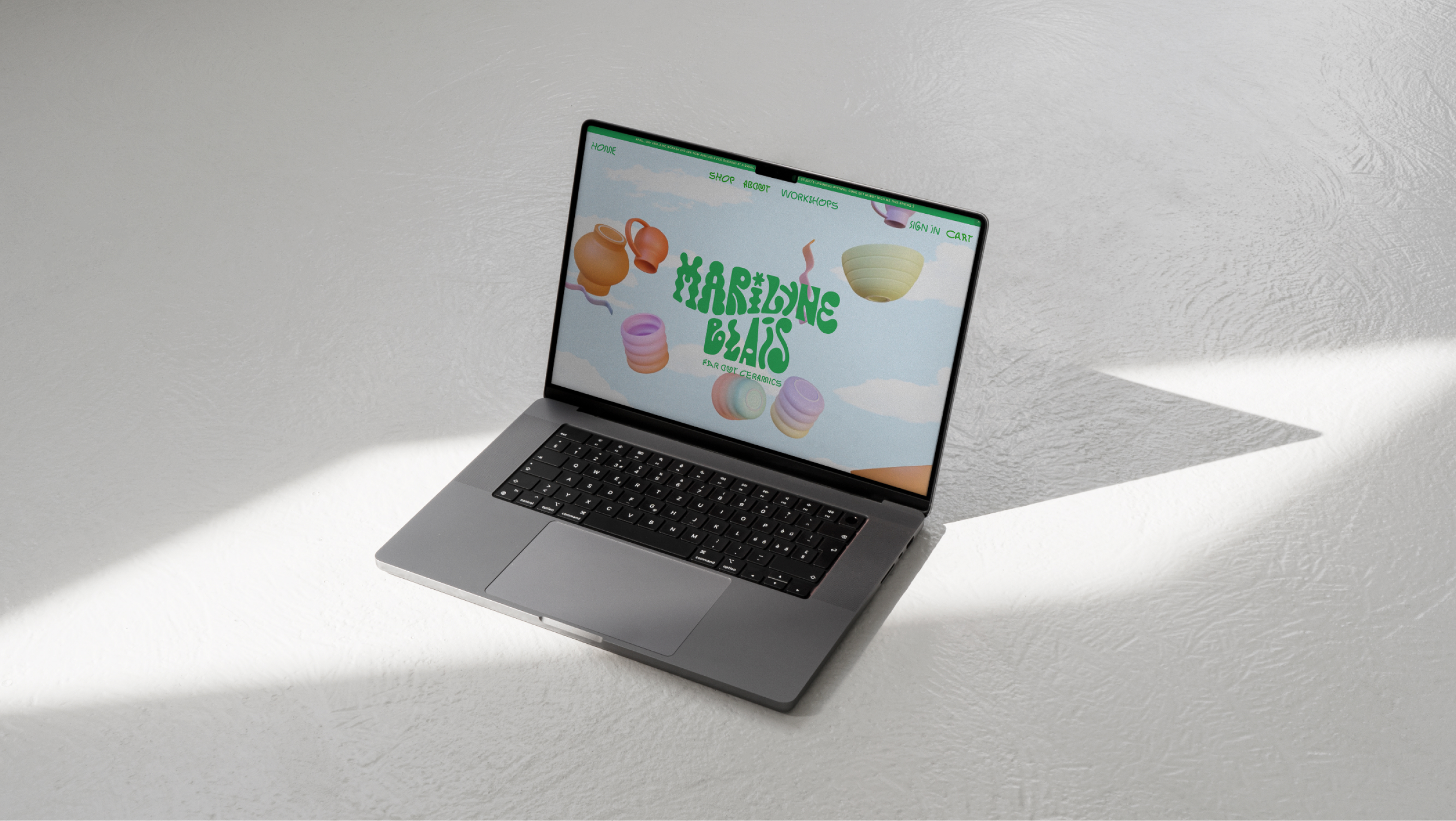
We aimed to avoid black and white. Inspired by Marilyne's ceramics, bursting with colour, a vivid green-screen-green became our black, while butter yellow stands in for white. The full colour palette is extensive and rich, while still maintaining eclectic cohesion.
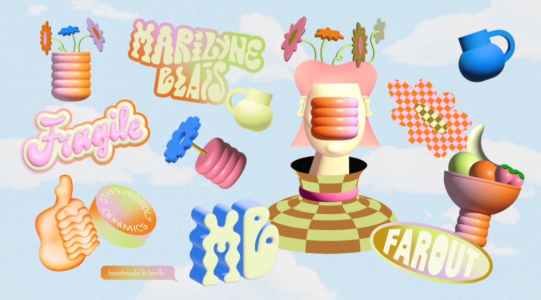
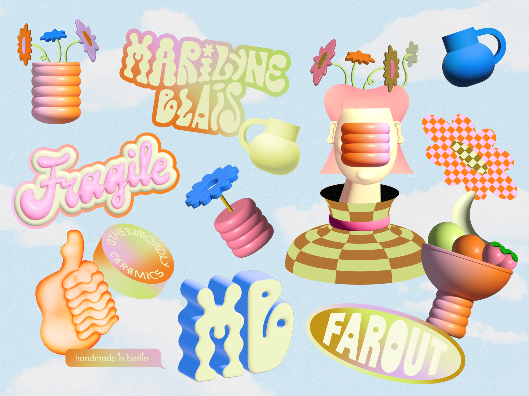
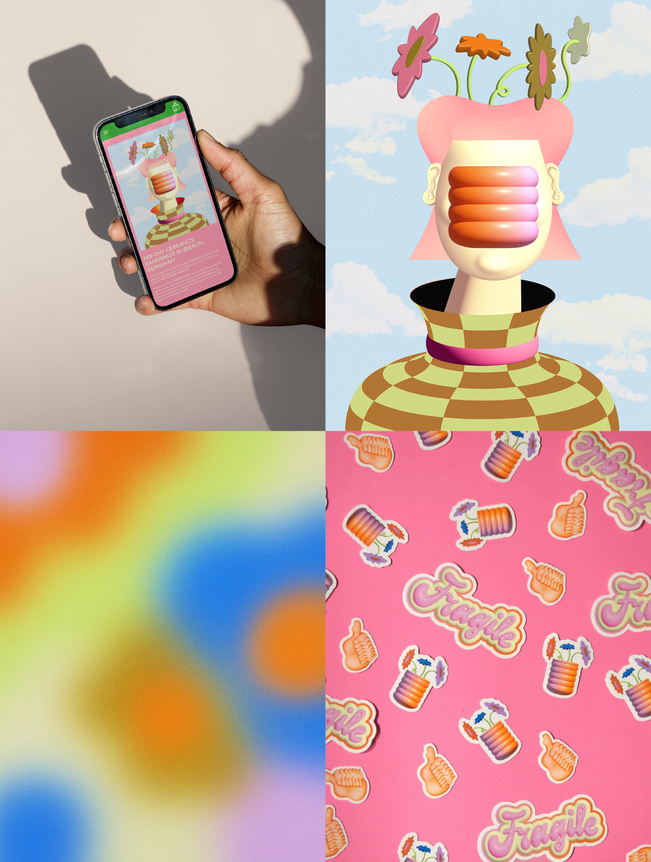
In bringing Marilyne Blais' world to life, an otherworldly illustrated identity emerged, combining 2D and 3D graphics and airbrushing. The brand collection pulls inspiration from 60s psychedelia, 80s post-Modernism and early internet culture. In addition, we made a modular graphics system with an extensive library of assets (gradients, shapes, ready-to-use graphics) for endless combinations of imagery.