INDIGO DESIGN WINNER 2025
INDIGO DESIGN WINNER 2025
INDIGO DESIGN WINNER 2025
INDIGO DESIGN WINNER 2025
INDIGO DESIGN WINNER 2025
INDIGO DESIGN WINNER 2025
INDIGO DESIGN WINNER 2025
INDIGO DESIGN WINNER 2025
Namuun Valley Identity Design
/by Anar Baasanbat
2025 Freelancer Winner
Gold Winner in Logos for Graphic Design
Gold Winner in Merchandise Design for Graphic Design
Silver Winner in Branding for Graphic Design
Silver Winner in Branding for Hotels & Resorts
Silver Winner in Branding for Restaurants / Cafe
Description
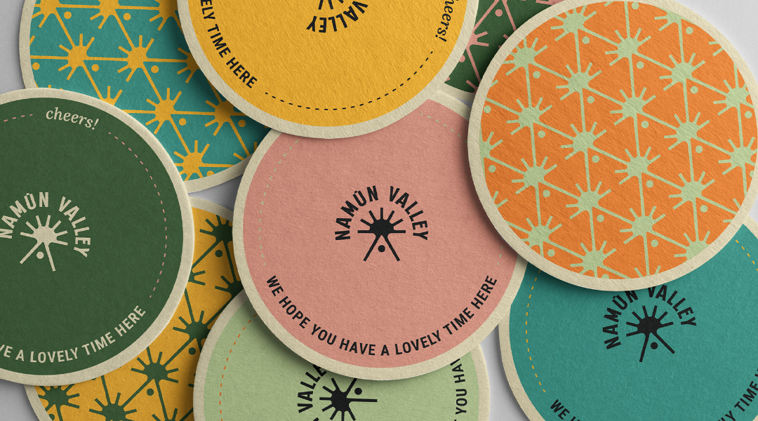
Namuun Valley is a peaceful, secluded camping resort located at the end of the road in Terelj, Mongolia, nestled beside a tranquil forest, far from the city’s noise and rush. Unlike traditional Mongolian camps, Namuun Valley operates as a reservation-only resort, partnering with businesses to offer a variety of fun and educational workshops and activities. Guests are encouraged to create lasting memories while embracing the beauty of nature. The name "Namuun" is a Latinized Mongolian word. For the logotype, we simplified it by removing one of the "u"s, as double "u"s are rare in Latin words. The remaining "u" is adorned with a macron (a line above the letter), highlighting its pronunciation and giving the typography a distinct touch. This adjustment also makes the name easier for non-Mongolian speakers to pronounce. The colorful brand identity reflects the resort’s values and sets it apart from competitors. With its friendly, joyful tone, the vibrant palette appeals to a wide audience, from children to elders - perfect for families, colleagues, and friends seeking a unified and cheerful experience. The brandmark is simple yet evocative, portraying rays of sunlight shining behind the resort’s iconic triangular houses. This creates a visual link between the brand and the resort’s natural setting. Paired with the compact logotype, the design layout uses rectangular shapes to draw attention to key elements, establishing clear visual hierarchy. This structure balances the vibrant colors, preventing the design from feeling overwhelming. The color system is easy to implement and maintain, with colors primarily used in the backgrounds, not in the text. The palette consists of six warm, welcoming hues, each named after natural elements, reinforcing the resort’s connection to the environment. Given that Namuun Valley provides hospitality services in both the hotel and restaurant sectors, a variety of print materials and brand applications were required on-site. We developed a flexible yet cohesive identity system that ensures a unified look across all touchpoints. Each brand application was treated as a unique asset, avoiding repetitive designs. This approach makes the applications distinctive and memorable, creating a consistent yet engaging experience without becoming monotonous.


