INDIGO DESIGN WINNER 2026
INDIGO DESIGN WINNER 2026
INDIGO DESIGN WINNER 2026
INDIGO DESIGN WINNER 2026
INDIGO DESIGN WINNER 2026
INDIGO DESIGN WINNER 2026
INDIGO DESIGN WINNER 2026
INDIGO DESIGN WINNER 2026
Designing for specification: a future-ready website and printed toolkit for architects
/by Think!
2026 Agency Winner
Gold Winner in Poster and Brochure Design for Graphic Design
Silver Winner in Integrated Graphic Design for Graphic Design
Bronze Winner in Website Design for Digital Design
Created by:
Lead Designer
Paul Grogan
Design Company
Think!
Client
Standard Patent Glazing
Design Team
Paige Brown, Tom Oakley
Description
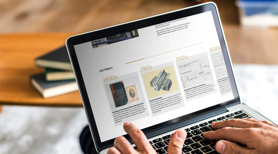
Project overview Standard Patent Glazing (SPG) has more than a century of expertise behind its patented glazing systems. But the way architects and construction professionals research, specify and download technical information has changed fast. SPG needed a modern digital platform and a premium suite of printed collateral that could do one thing exceptionally well: make specification easier. We designed a new website and an integrated suite of brand and print materials to support SPG’s key audiences. Architects, specifiers, contractors and supply-chain partners all need to make confident decisions quickly. The work supports the moments that matter most. Choosing the right system, checking performance, understanding design considerations, accessing drawings and details, and knowing the right next step for support or quotation. Alongside the website, we created a hand-held printed ‘library’ of SPG’s offering, designed to live in architects’ studios and materials libraries. Presented as a set of brochures in a slip case, the pack brings SPG’s systems to life through carefully crafted typography, a disciplined layout system and premium print finishes. Metallic ink and a black overprint create a tactile, high-authority experience that feels worthy of a heritage manufacturer. The result is a cohesive brand ecosystem. Digital and print work together to position SPG as a specification-led authority in patent glazing, built for the needs of today’s specifiers. Challenge This wasn’t about giving SPG a fresh coat of paint. It was about taking deep technical knowledge and real craftsmanship, then turning it into something people can use quickly and confidently. SPG’s audiences are time-poor and detail-driven. Architects and construction professionals don’t browse for fun. They’re usually under pressure and trying to solve a problem. They need to find the right system, understand constraints, compare options, and download the exact drawings and specification information required for planning, tender and build stages. If those resources are hard to find, confidence drops. If information is unclear, projects slow down and enquiries disappear. At the same time, the brand needed to balance two truths. SPG is established and trusted, but it also needs to feel current, precise and engineered for modern buildings. Everything had to work in two very different contexts. Online, where people want fast answers and downloads. In print, where the materials needed to sit on desks, get passed between teams, and still feel useful weeks or months later. The project demanded a system that could pull everything together. Website, guidelines, downloads, brochures and corporate communications. It also had to feel premium and recognisable, in a way architects would trust. Solution We approached SPG’s transformation as one integrated design system, expressed across multiple touchpoints. The website and printed slip-case pack were designed as complementary tools for the same audience. Online approach The new website was built around real specifier journeys. Instead of forcing users through brand-led storytelling, the structure prioritises the jobs architects and construction professionals come to SPG to complete: - find the right system - understand performance and suitability - review design considerations - access drawings and technical downloads - validate with case studies and precedent - reach the right next step through technical support, quotation or contact To make those journeys easier, we created clear entry points for key audiences and dedicated hubs for the content specifiers rely on most. Technical downloads, design considerations, case studies and guidance are structured so users can move from overview to detail without losing context. A key feature is the drawings and downloads experience. A filter-led library helps users locate the right resources quickly, supported by a basket-style selection flow so teams can collect what they need in one go. For architects, this turns what is often a frustrating scavenger hunt into a purposeful online tool. It also acts as a practical extension of SPG’s technical team. Integrating the design system To connect digital and print, we established a design system defined by strong typographic hierarchy, disciplined spacing and a consistent messaging framework that speaks directly to specifier priorities. The brand voice is confident and clear, and the visual system is designed to make technical information feel organised, calm and premium. We created rules that scale across formats, from web pages and technical guidance to corporate documentation and printed brochures. This keeps SPG recognisable whether you’re browsing system information online, reading a brochure in a studio library, or using a corporate template. The system supports clarity at every level. Headline, subhead, body, captions and technical call-outs all work together so complex information can be scanned quickly, while still rewarding deeper reading. Brochure design The printed suite was designed as a premium, hand-held reference library for architects. It’s intended to be kept, referenced and shared. Where the website is optimised for speed and retrieval, the brochures are designed for clarity, confidence and permanence. Built on the same grid system and typographic hierarchy, the layouts give content space to breathe through generous white space and disciplined alignment. The result is minimal and highly legible, helping technical information feel clear rather than overwhelming. Craft was essential. Each brochure (nine in total) uses a distinct metallic ink paired with a black overprint to create depth, contrast and a sense of quality that aligns with SPG’s product precision. Metallic colour is used with intent, functioning as a system cue across the library. It helps readers recognise ranges quickly and reinforces a sense of engineered consistency. The black overprint adds authority and keeps typography crisp and readable. Presented together in a slip case, the set becomes more than collateral. It becomes a tool. A curated printed resource that supports specification conversations and keeps SPG present at the point of decision-making. Results This project created a joined-up ecosystem for SPG. A website and printed pack designed to work together for specifiers. Pre-launch, the website recorded minimal measurable conversion activity. Since relaunch, the site has generated 3,000+ high-intent interactions, showing that architects and construction professionals are finding and using the resources the platform was built to deliver, including: - 696 PDF downloads (technical and product documentation) - 1,399 specification downloads - 43 brochure downloads Digitally, the new website now gives specifiers clearer paths to what they need. Systems, technical drawings, design considerations and case studies are easier to find, and the structure is built around real-world tasks. It helps people move faster, with fewer dead ends and less guesswork. In print, the slip-case brochure library gives SPG a premium physical presence within architecture practices. It’s a tactile, high-quality reference pack designed to live in studio libraries and remain useful over time. Across every touchpoint, SPG now speaks with one voice and one visual system. Recognition is stronger, usability is improved, and SPG is positioned as a modern, specification-led partner built for the demands of today’s built environment.


