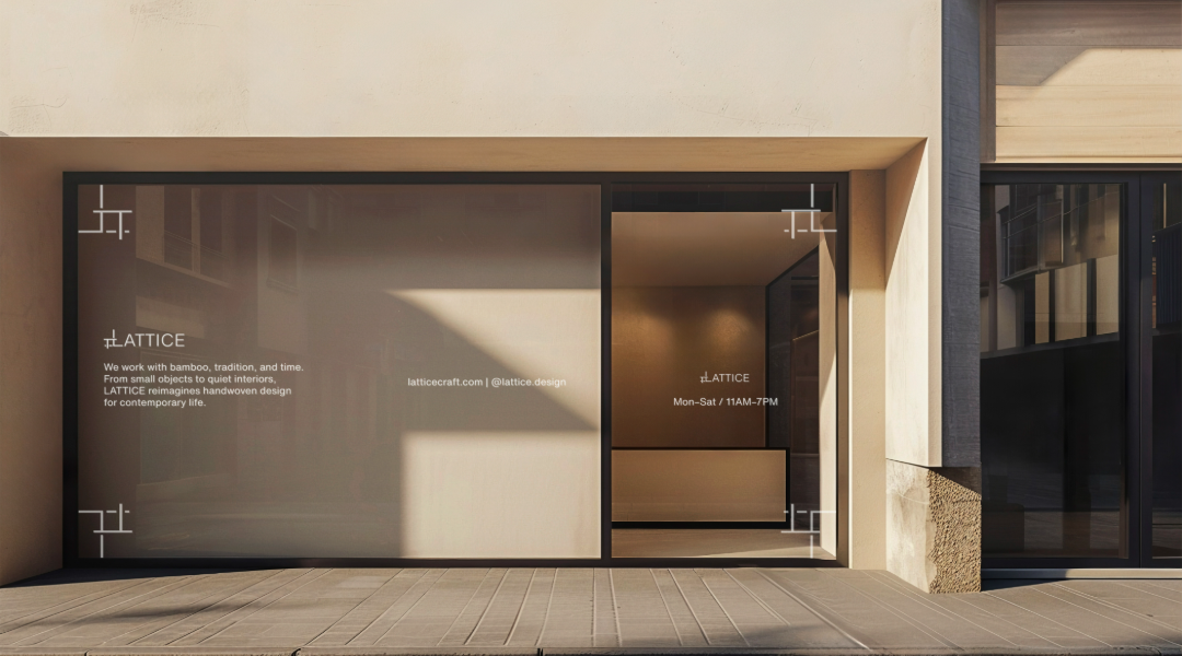
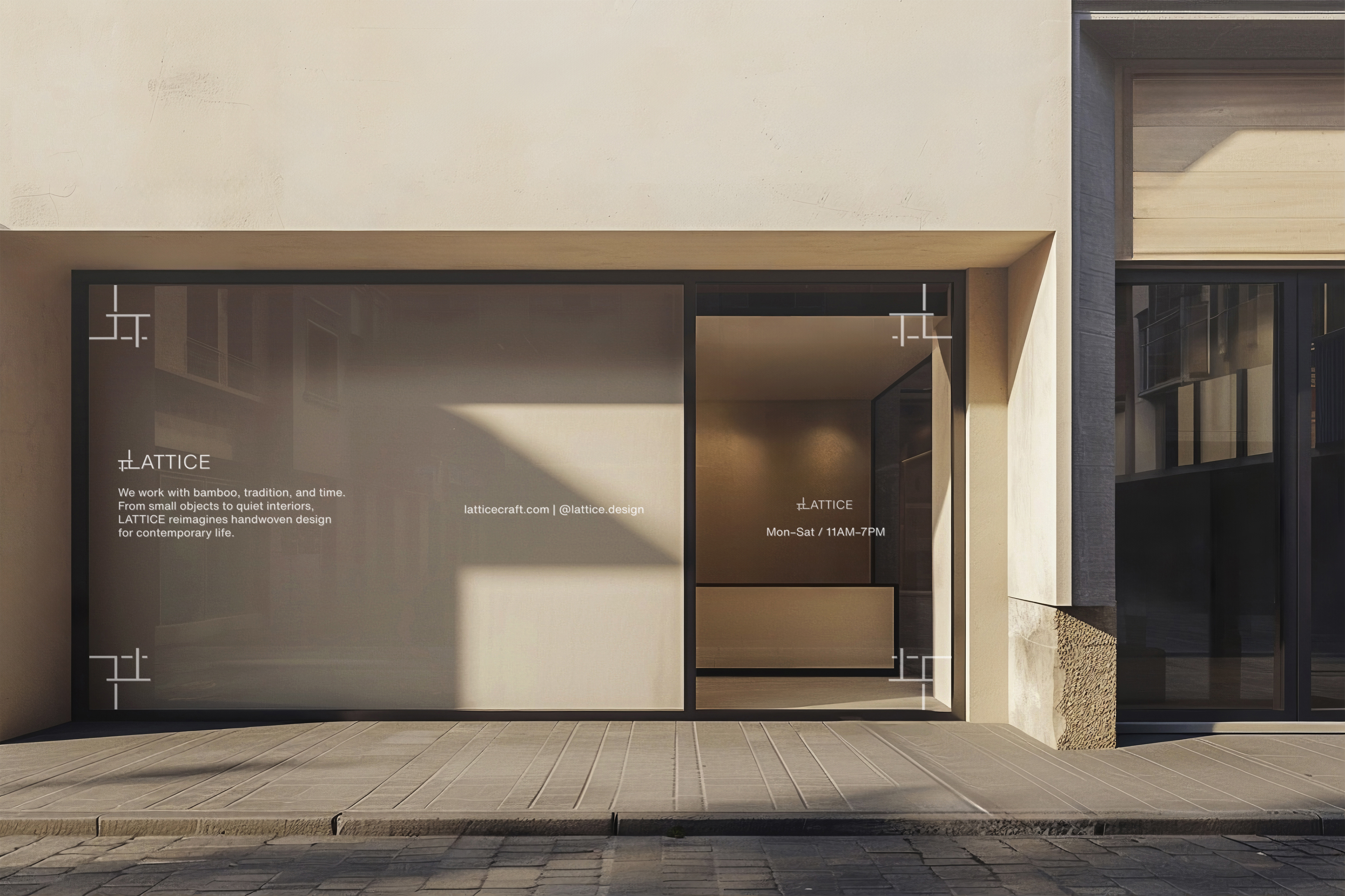
This project began as an exploration of traditional Chinese bamboo weaving and how its logic could be translated into a contemporary branding system.
The goal was to create an accessible, minimal identity that invites people to reconnect with craft through a hands-on, DIY experience.
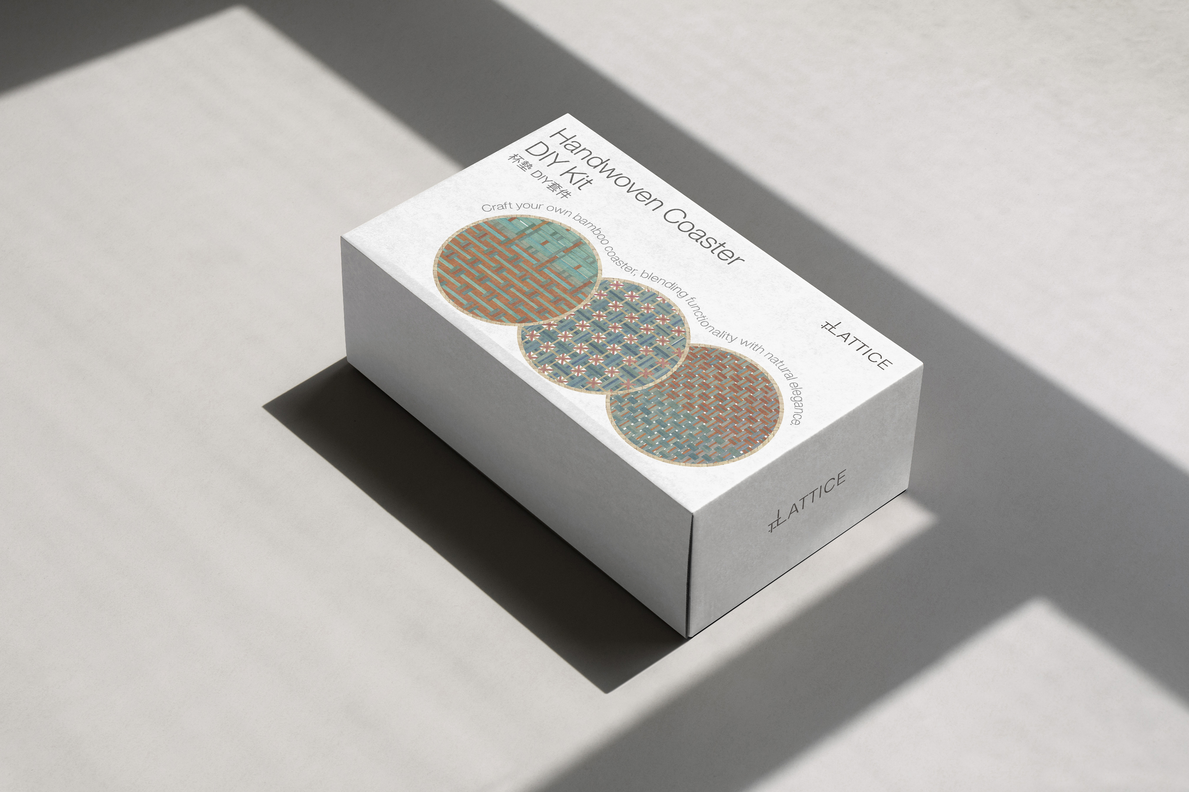
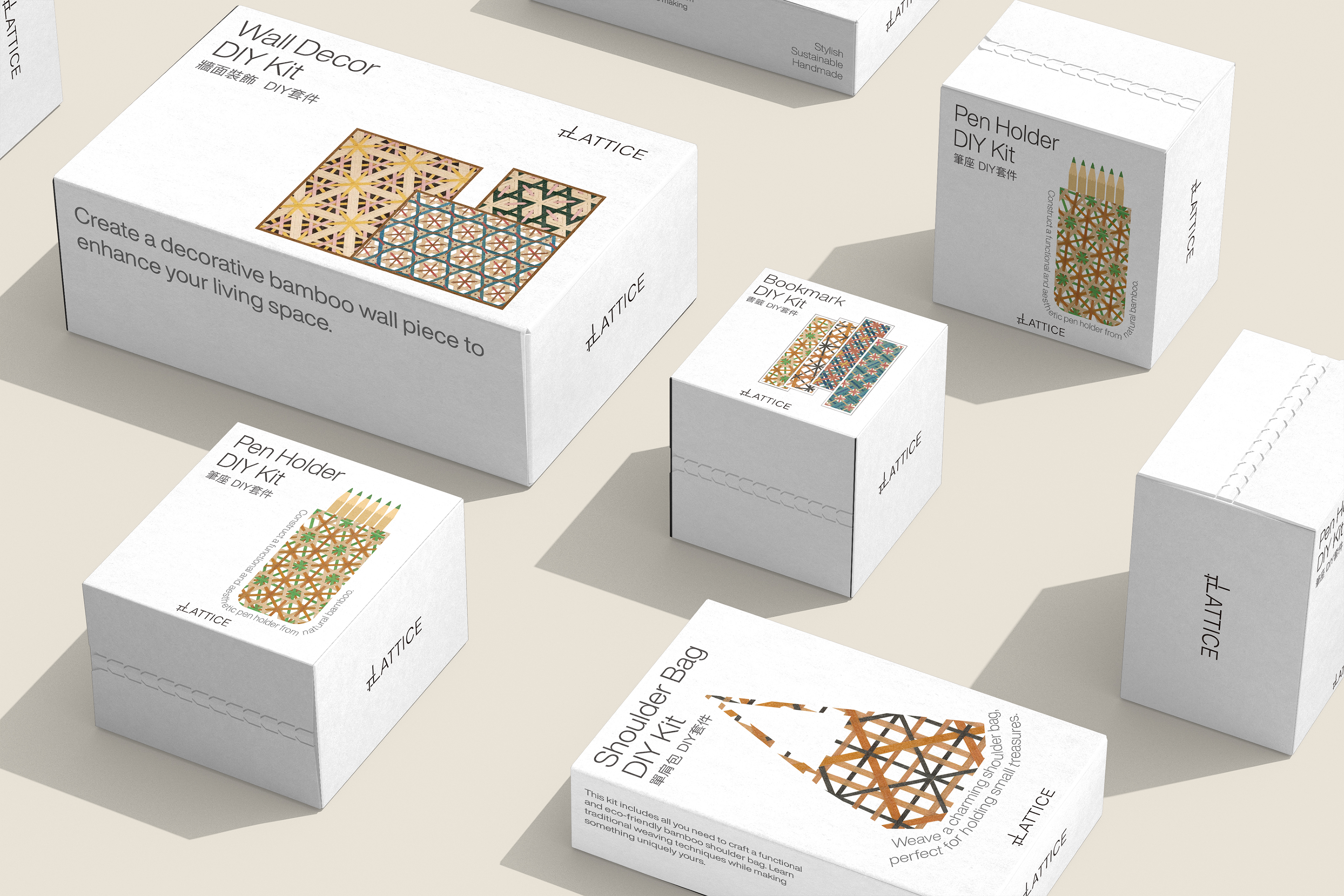
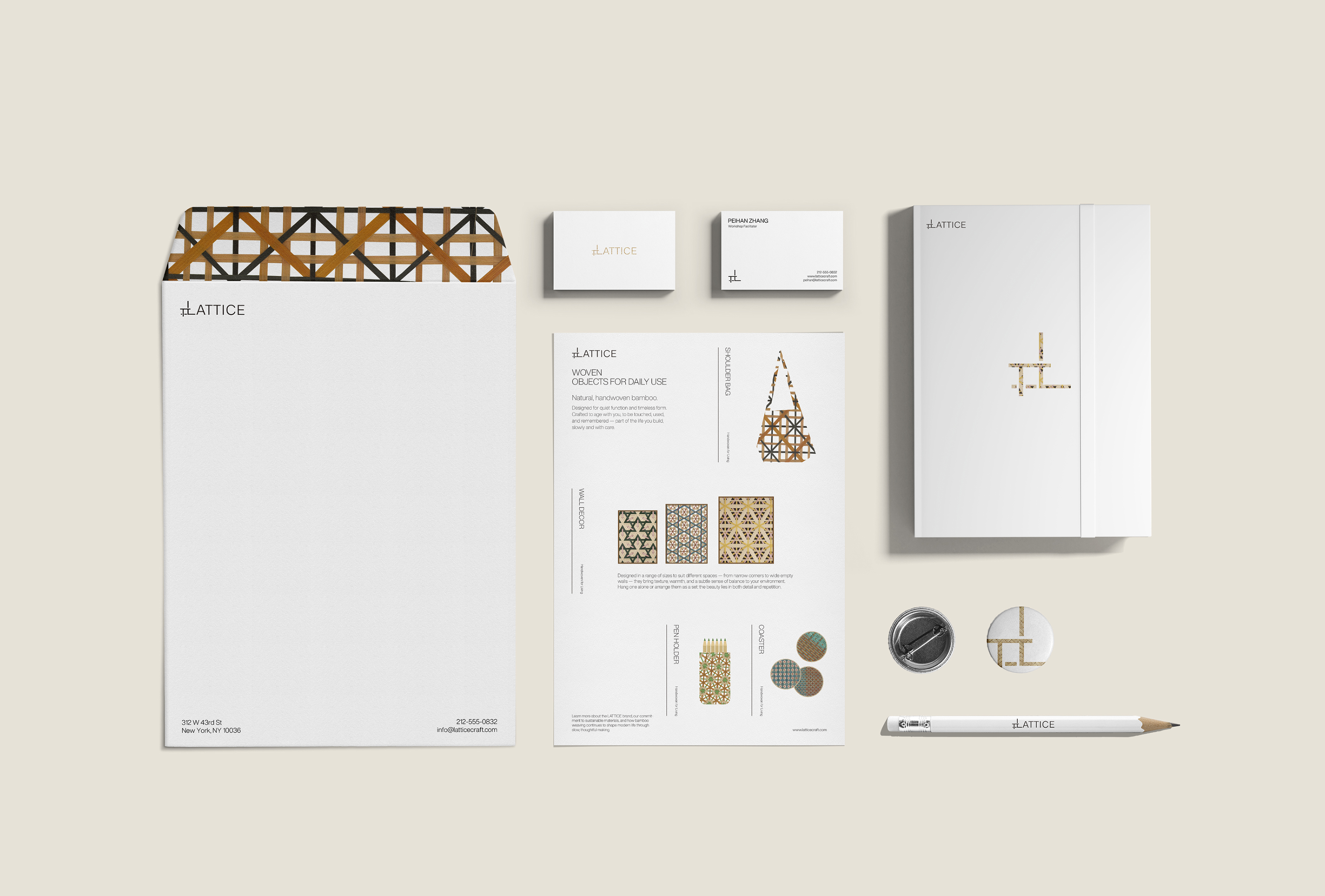
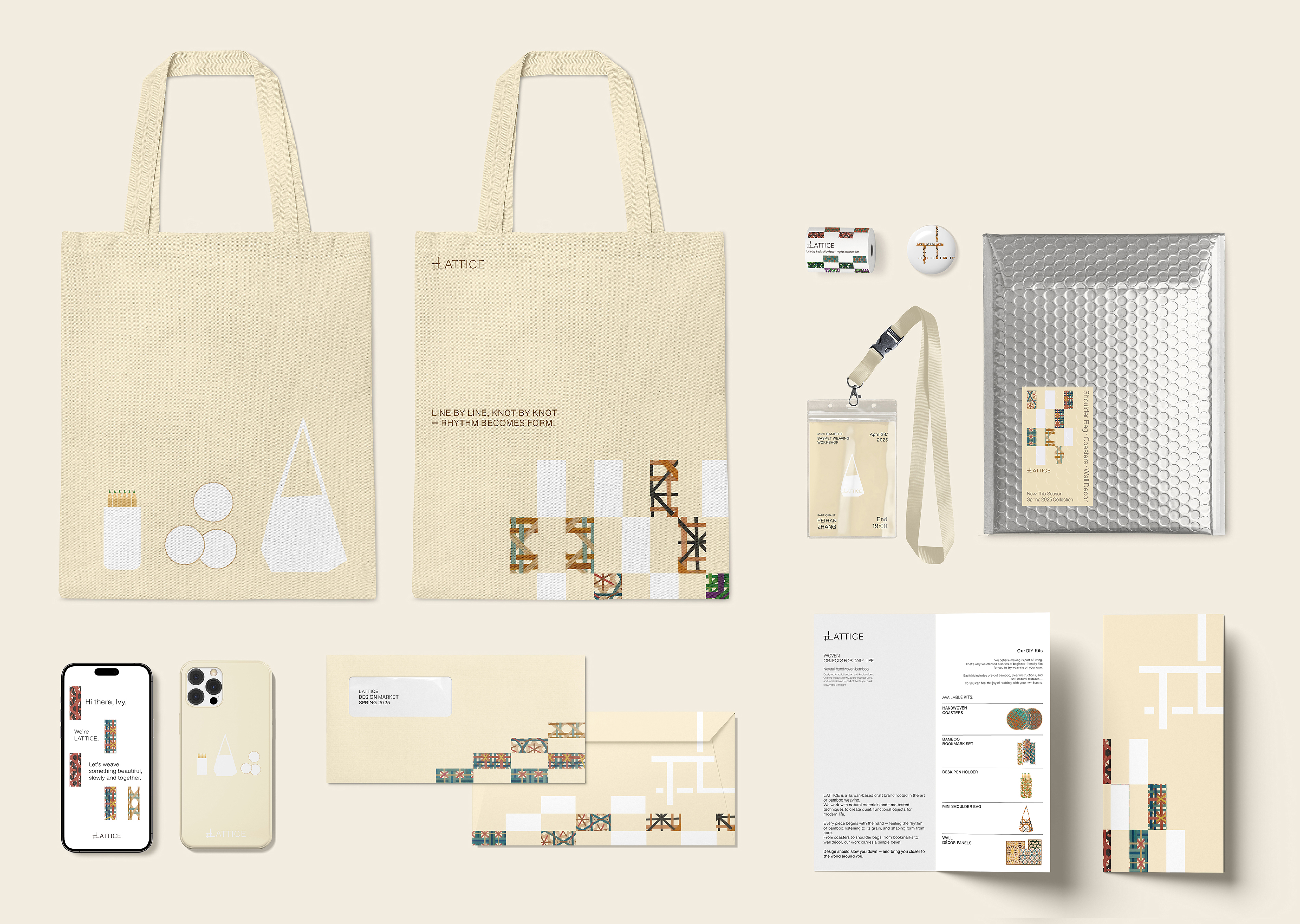
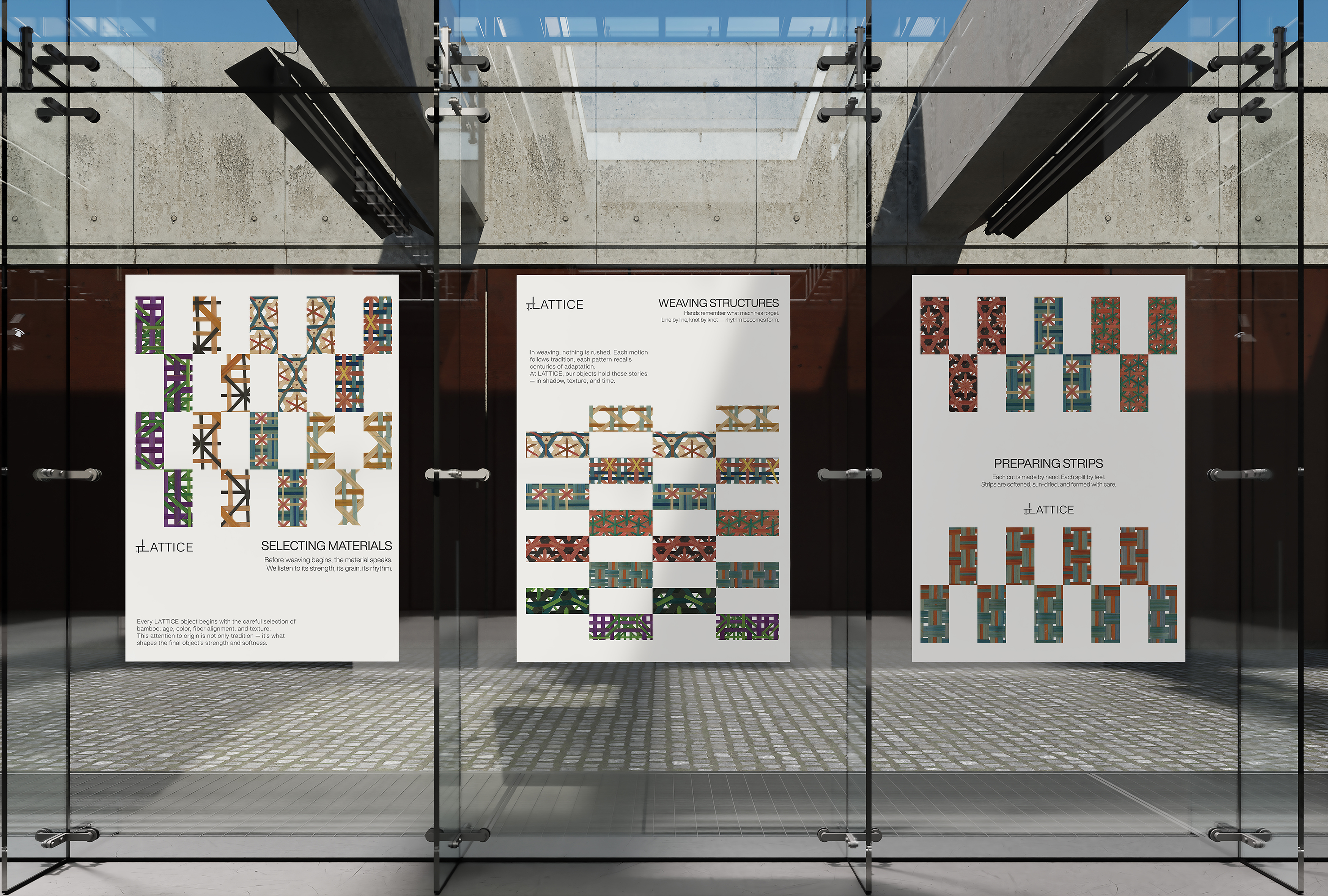
I researched traditional bamboo weaving patterns and their dense over–under structures, using these observations to inform the project’s visual mark and surface graphics. Because the woven pattern already carries visual complexity, the packaging was kept white to avoid competing focal points, while warmer off-white tones were introduced on stationery and merchandise to create a more approachable, human presence beyond the product itself.
The result is a focused brand system centered on DIY kit packaging, supported by printed instructions, posters, and brand stationery.
A limited palette and consistent graphic language extend to small merchandise items such as tote bags and phone cases, reinforcing recognition without competing with the woven patterns.