VECS GARDENIA is a Taiwanese skincare of a founder with pharmacy and horticulture. Over the decade, it has been dedicated to developing plant-based, simple, safe, and premium items. White Fern assisted to build its style positioning, brand identity, packaging design for 40 series, and visual transformation with its gentle and sophisticated vibe in stores.
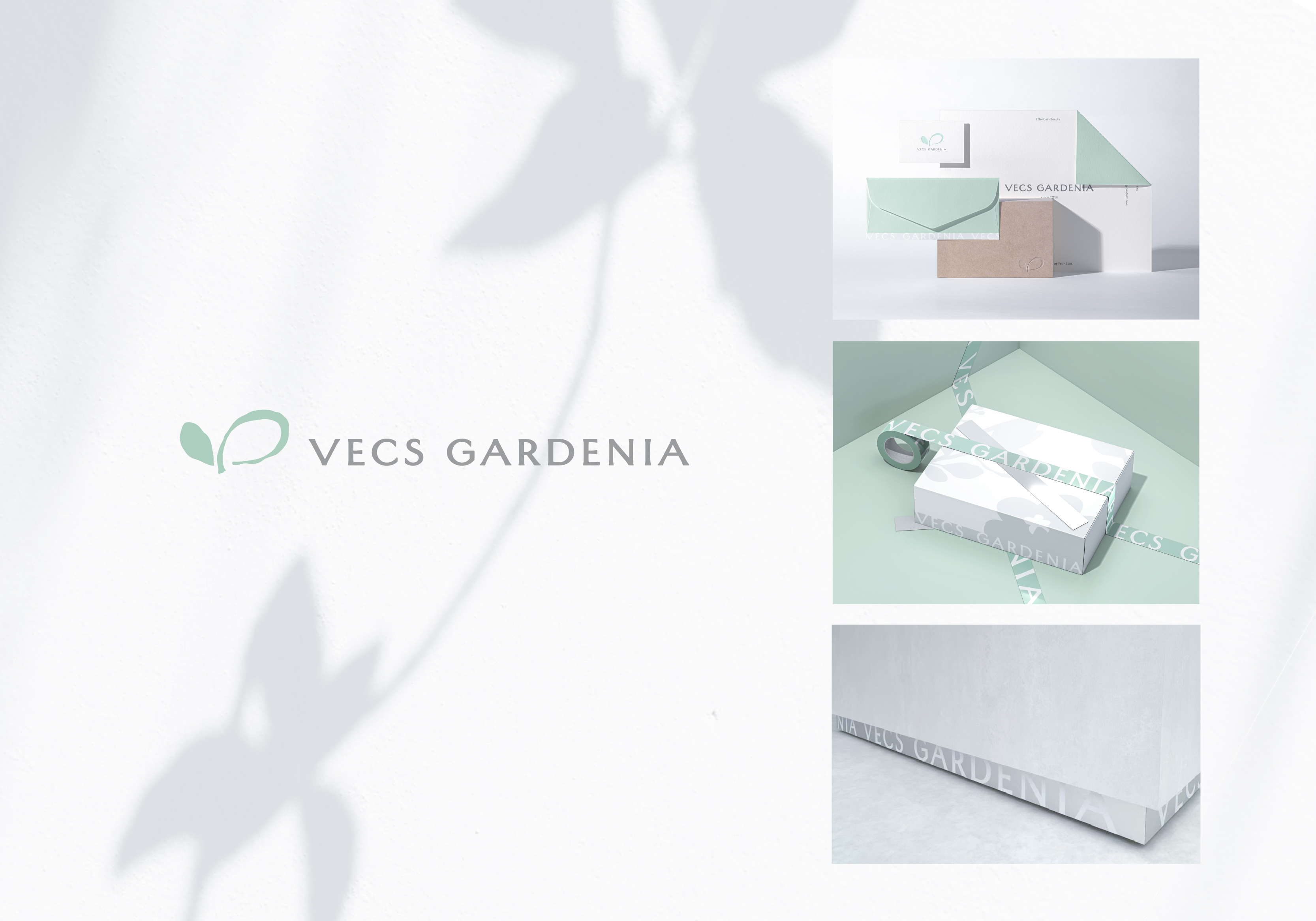
The logo was inspired from a double-leaf motif, with one leaf rendered as a solid shape and the other as a line-drawn leaf, creating a delicate layered effect. Natural textures are incorporated and the organic texture reflects its commitment to natural ingredients.
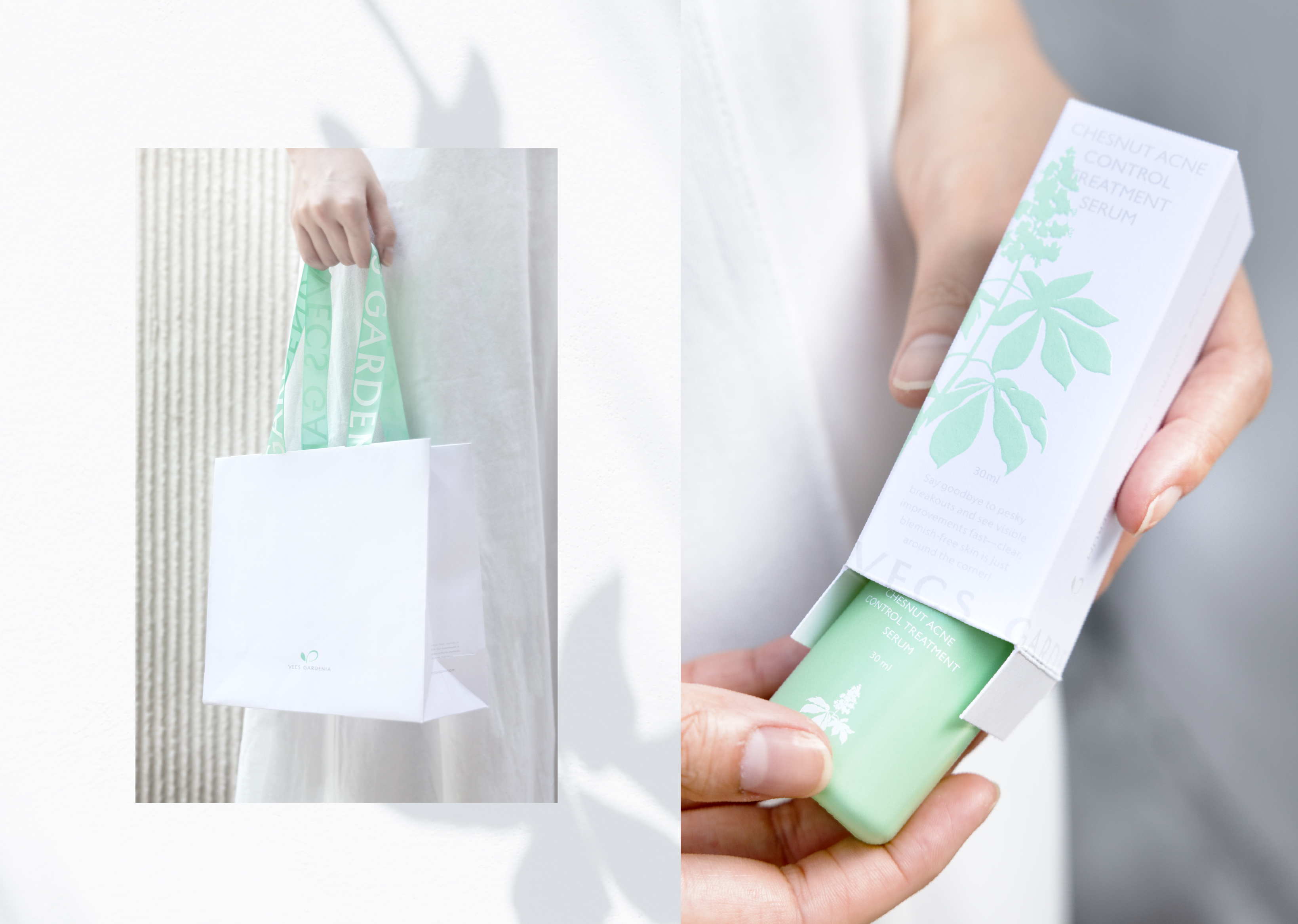
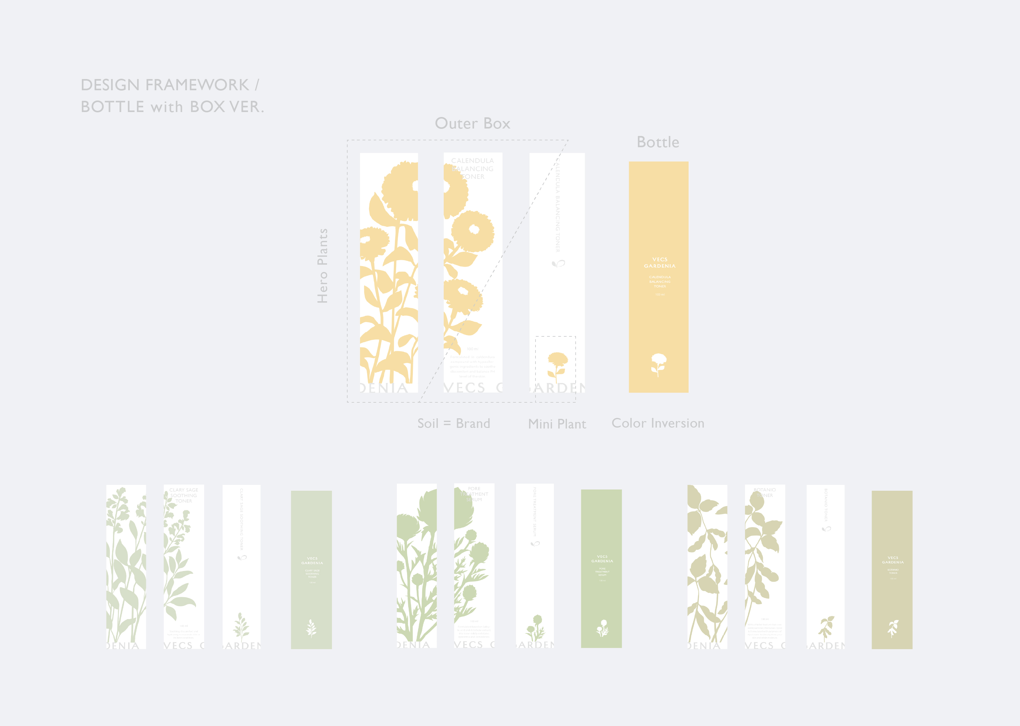
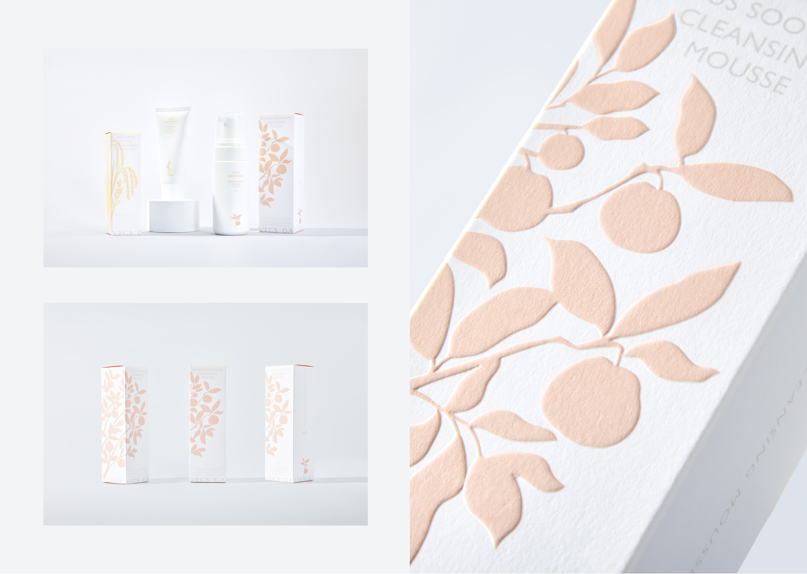
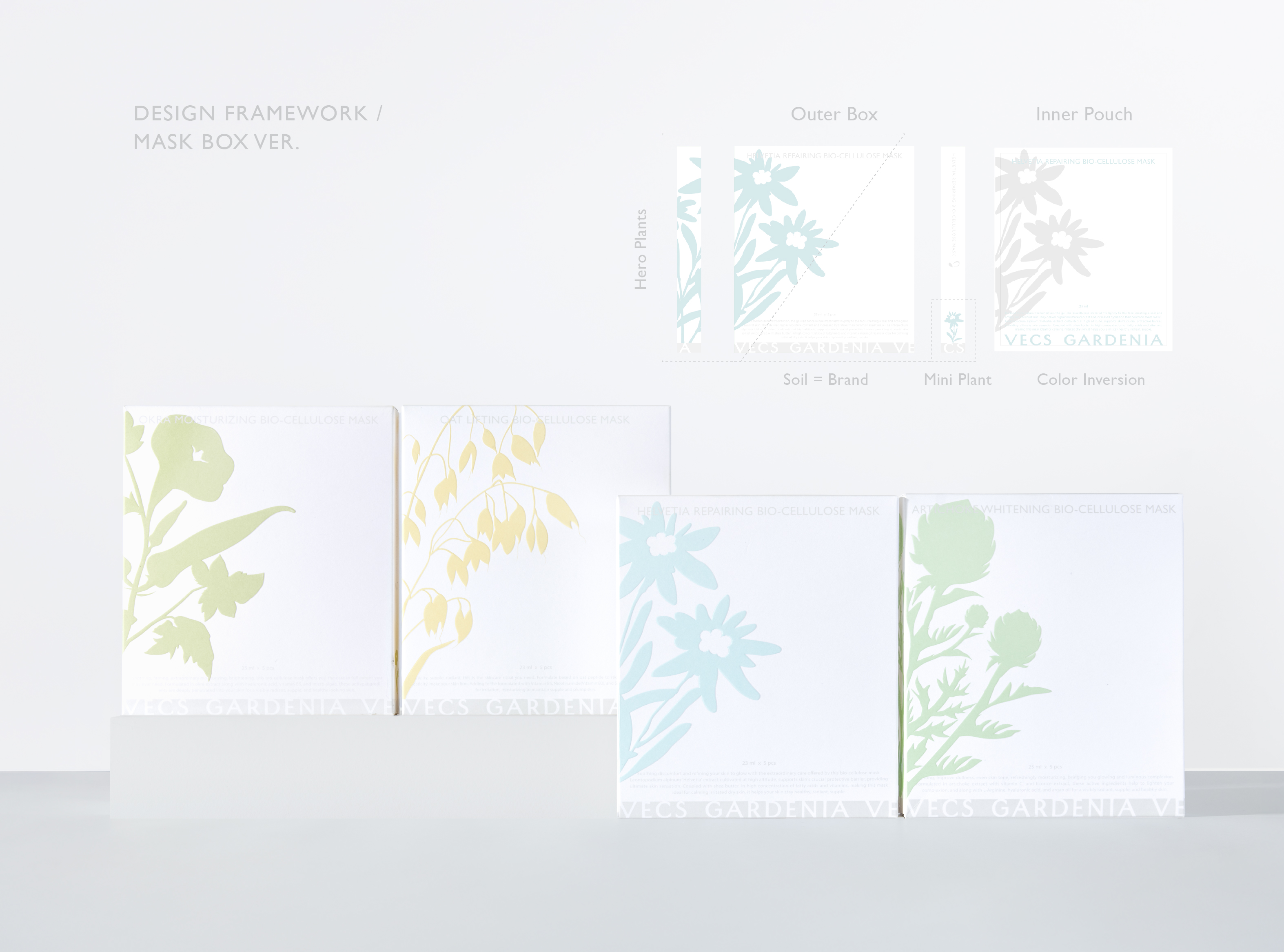
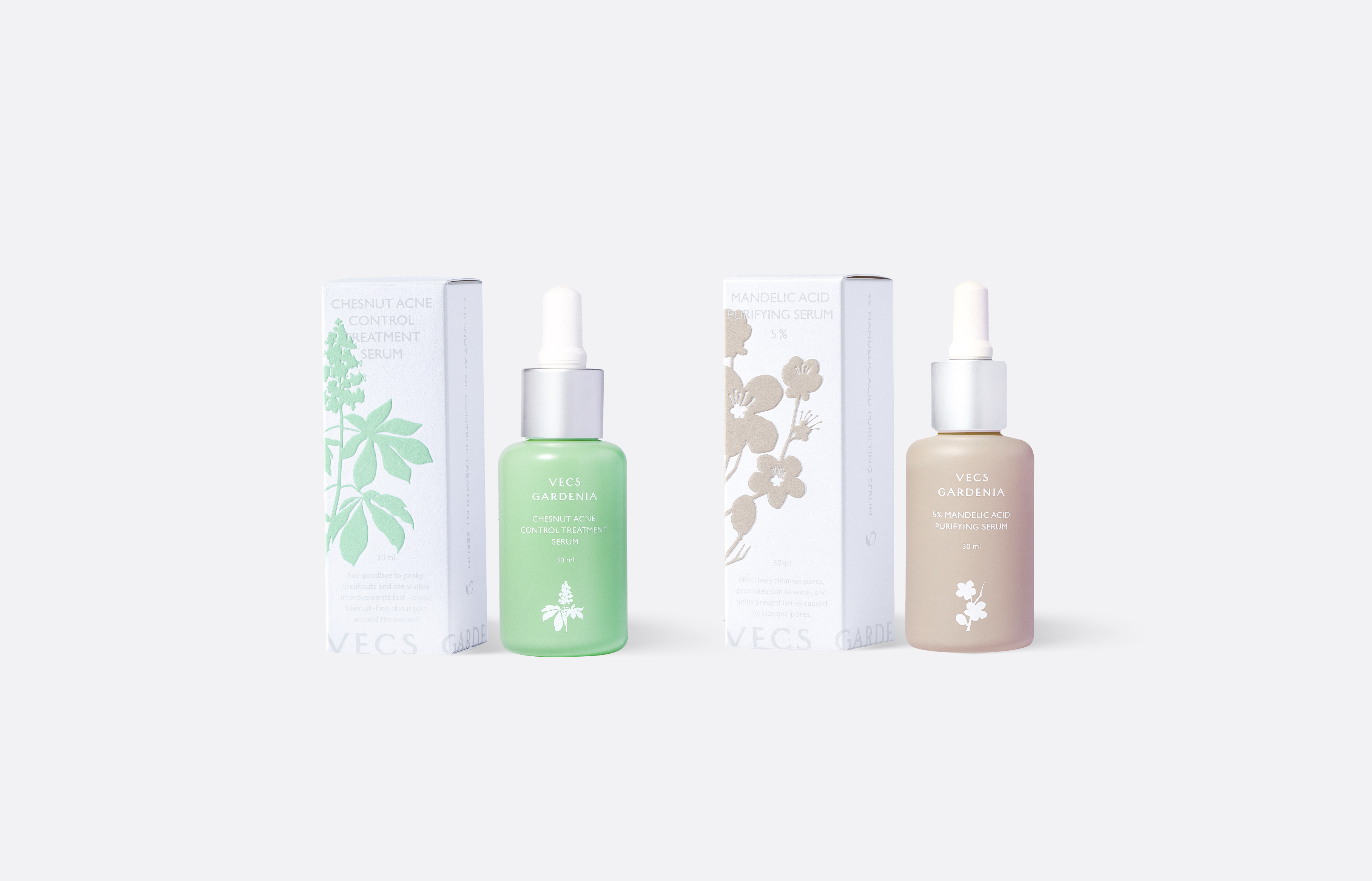
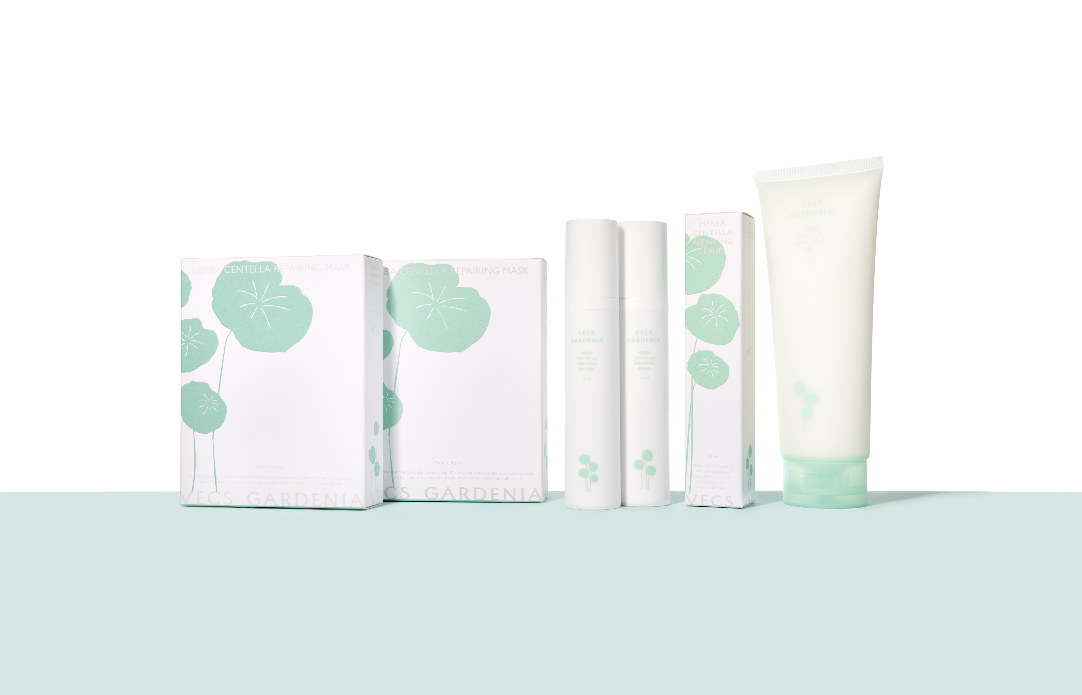
All packaging uses tactile paper, with plant symbols enlarged to break the mold and span the page, with embossed plant effects to extend the visual experience to the tactile sense. The large-scale visual sets it apart from competitors, using small-scale plants as their main visuals.
The main plant extract graphic is fixed on the left side of the front with delicate typography and low-saturation colors for a stable and gentle visual aesthetic and a thoughtful warm vibe. For various prices’ products, localized designs employ various techniques, such as high-end bio-fiber masks featuring a silver background on its name in English at the bottom, enhancing their premium feel and extended to the design of the store display base. After the packaging redesign, the display exhibits greater consistency and recognition, showcasing its soft aesthetic and brand identity. The display counters were redesigned with white and light gray as the primary color for a minimalist and pure base to spotlight the products. The counter surfaces feature a textured, rough coating echoing its commitment to natural materials for a gentle texture distinct from mass-market skincare brands.