INDIGO DESIGN WINNER 2019

INDIGO DESIGN WINNER 2019

INDIGO DESIGN WINNER 2019

INDIGO DESIGN WINNER 2019

INDIGO DESIGN WINNER 2019

INDIGO DESIGN WINNER 2019

INDIGO DESIGN WINNER 2019

INDIGO DESIGN WINNER 2019

Kroger: Rebranding

/by Sukhui Jeong

Indigo Design Award: Kroger: Rebranding

2019 Non-Professional Winner

Silver Winner in Branding for Graphic Design

Created by:

Design Director

Sukhui Jeong

Company/University or Design School

Savannah College of Art and Design(SCAD)

Description

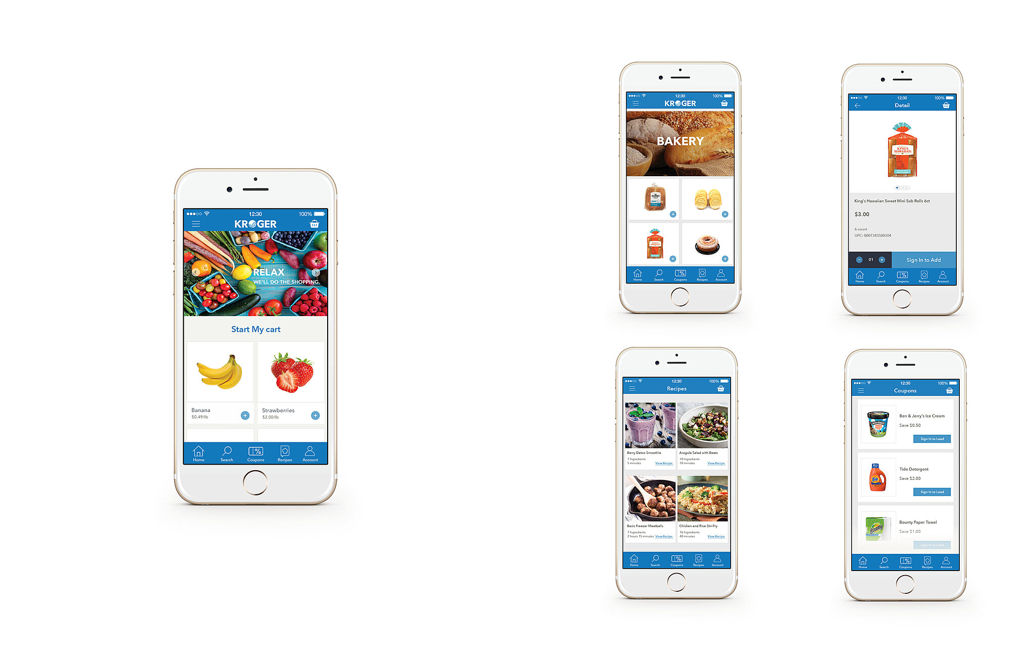
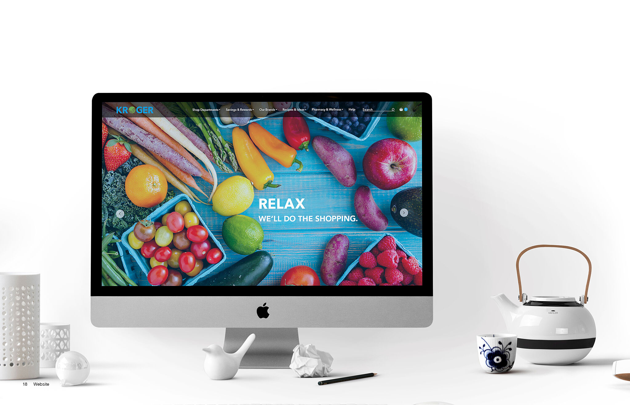
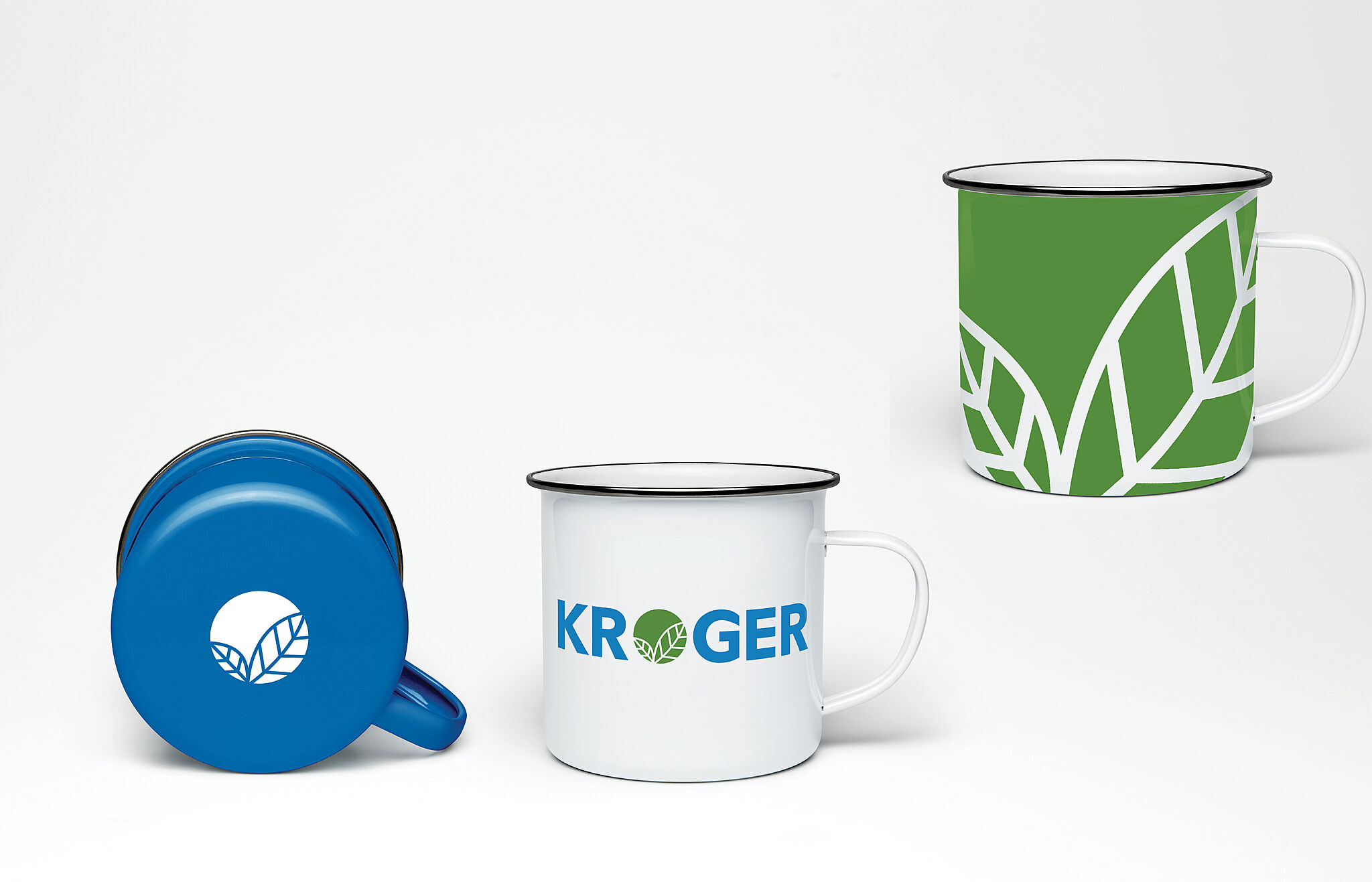
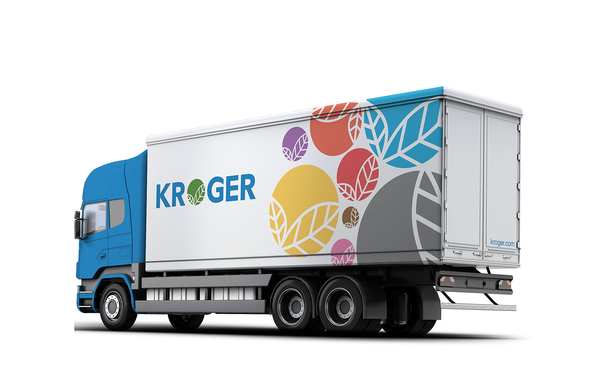
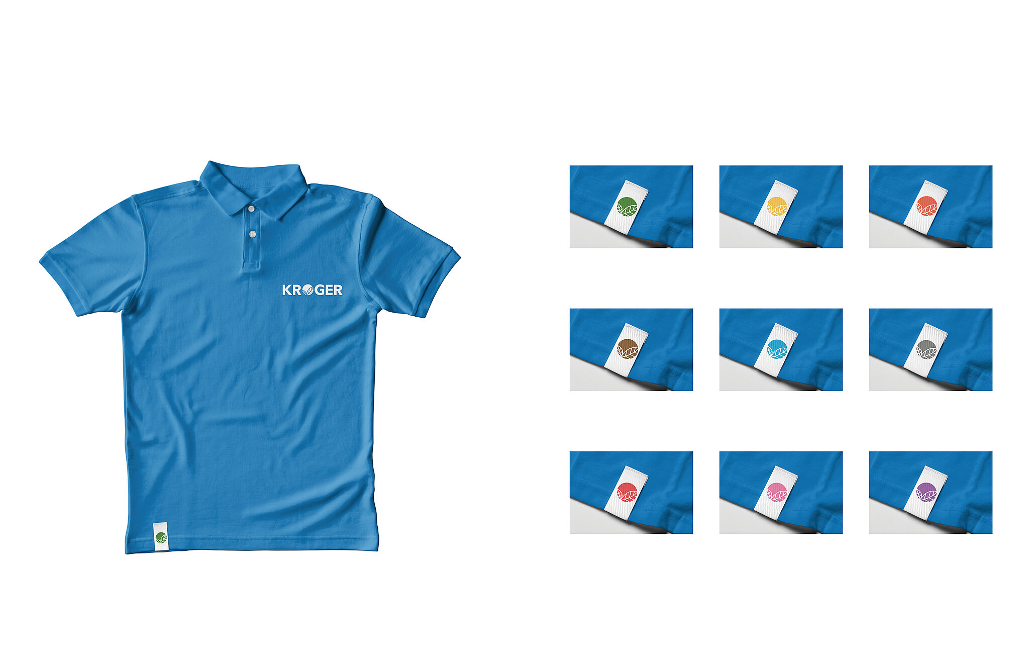
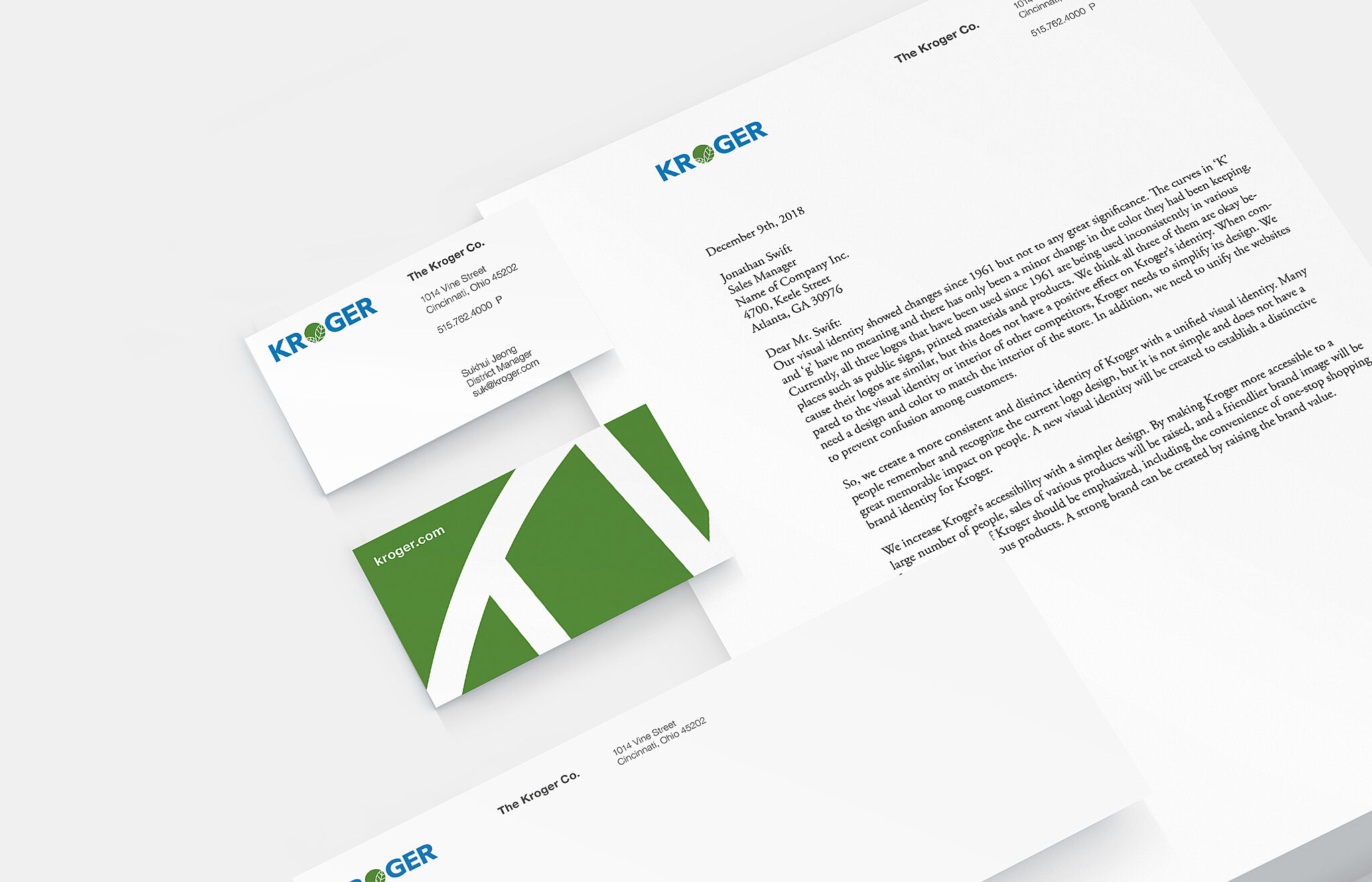
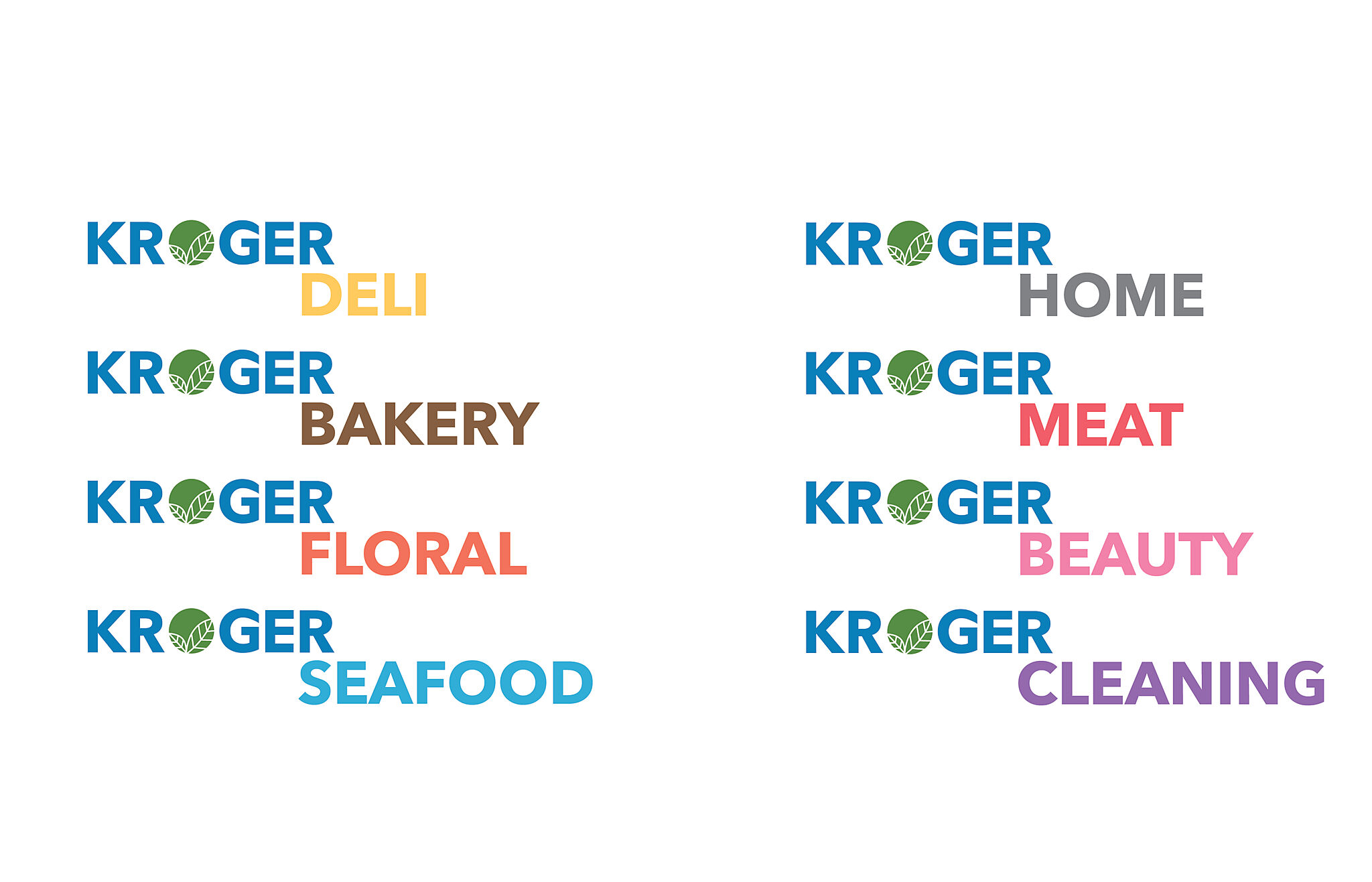
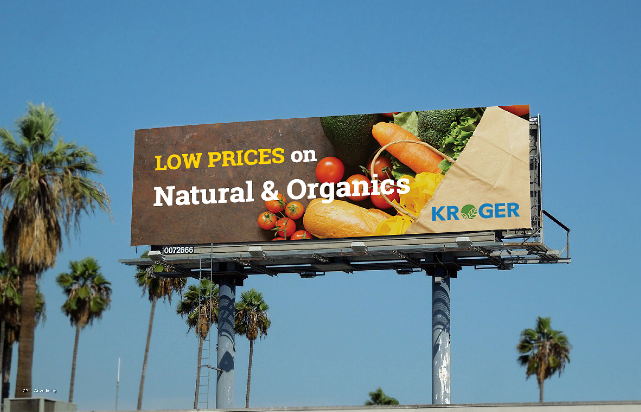
In 1883, Bernard Henry Kroger opened a grocery store at 66 Pearl Street in downtown Cincinnati. Kroger is one of the world’s largest retailers and sells more than $115.3 billion annually. It also has almost 2,800 stores in 35 states under two dozen banners. their visual identity showed changes since 1961 but not to any great significance. Currently, all three logos that have been used since 1961 are being used inconsistently in various places such as public signs, printed materials, and products. New Kroger logo is simple, and the leaves in the O suggest a check and show it is a grocery market. The leaves also show freshness and include the meaning of ‘choose Kroger by putting a check’. The company logo shows different departments using different colors. The various colors of the ‘O’ show that Kroger has many departments. Using various colors, that there are various departments, it also emphasizes ‘One-stop shopping’ Kroger emphasizes.

Share:

Kroger: Rebranding
Kroger: Rebranding
Kroger: Rebranding
Kroger: Rebranding
Kroger: Rebranding
Kroger: Rebranding
Kroger: Rebranding
Kroger: Rebranding
Kroger: Rebranding
Kroger: Rebranding
All winnersSubmit Your Work
logo

INDIGO

Enter your email to subscribe to our newsletter

legal termscontact usFAQs

Rua Andre Brun 7

Apt RCD 1350-017

Lisbon, Portugal

Managed by Marly Group Limited

link to indigo award Instagramlink to indigo award TikToklink to indigo award LinkedIn