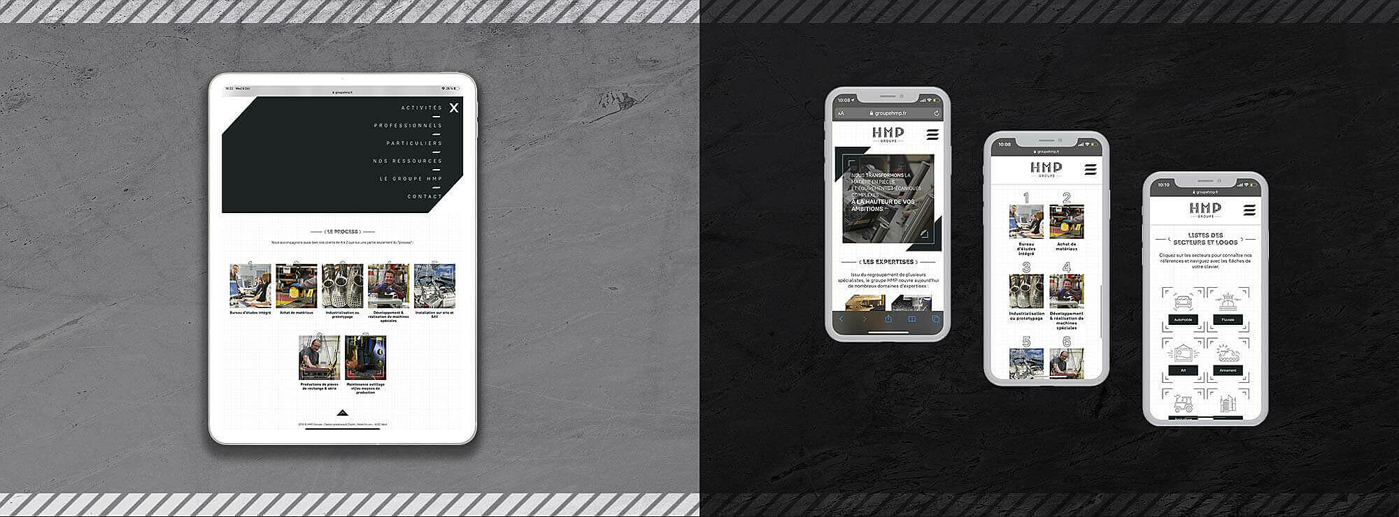
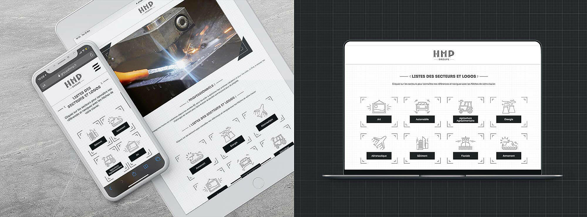
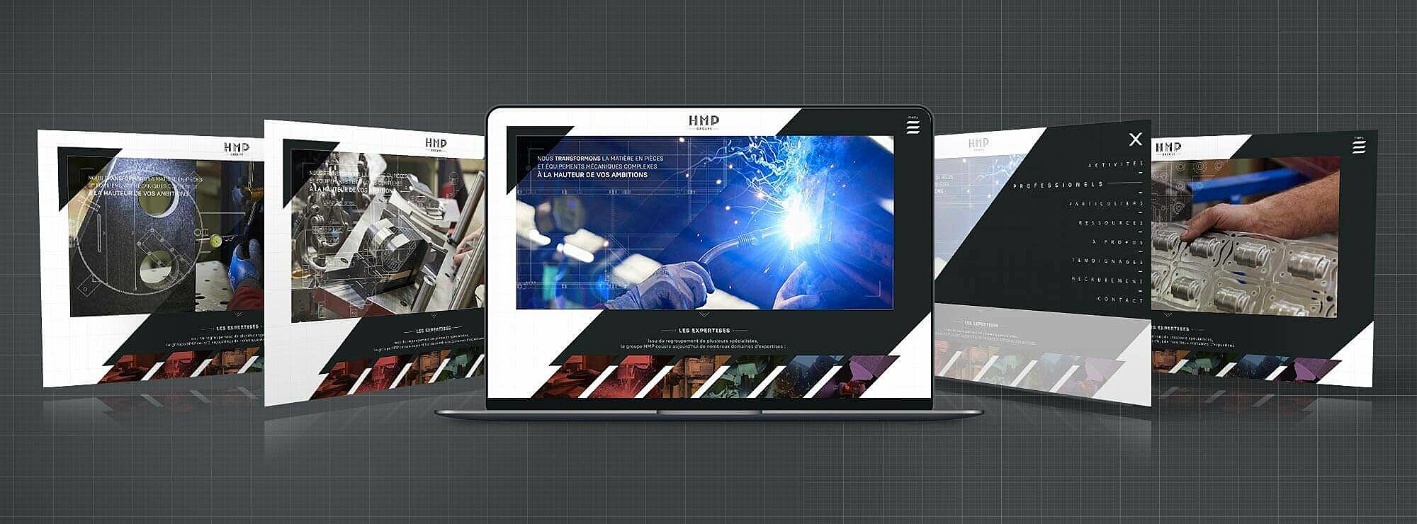
HMP is the result of a merger of various entities individually existing for several years, their common expertise mechanical design and manufacture. The accompany several professionals (production parts, machines, pieces for sculptured designs for art galleries and so one) as well as individuals (manufacturing doors, stairs and so forth).
THE GROUP CALLED UPON M4U TO CLARIFY THEIR COMMUNICATION STRATEGY AND HIGHLIGHT THEIR EXPERTISE.
NEW DESIGN, NEW BRAND
After thorough analyses of the current market, the agency focused on the strategy to apply in terms of positing the brand to best highlight HMP.SN.
The reflection conducted by M4U focused mainly on the architectural aspect of the group, as well as the fact that their brand name is quite complicated to remember, evoking close to nothing for potential clients. The aim is to preserve their identity as well as their reputation, while simplifying the understand of their brand, their different expertise as well as what they have to offer. The “SN” was scratched off, giving it a whole new meaning.
AN EVOCATIVE VISUAL IDENTITY
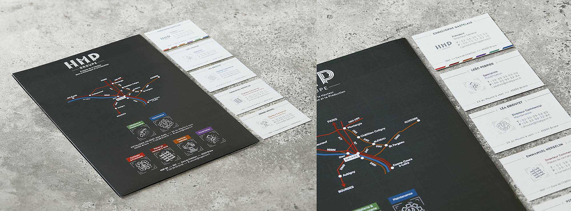
The « HMP Group » logo is created to underline the strength of the company. And the letters are created in the same way the group stamps it on their pieces. In the background, sketches and schemes evoke the global accompaniment that HMP represents.
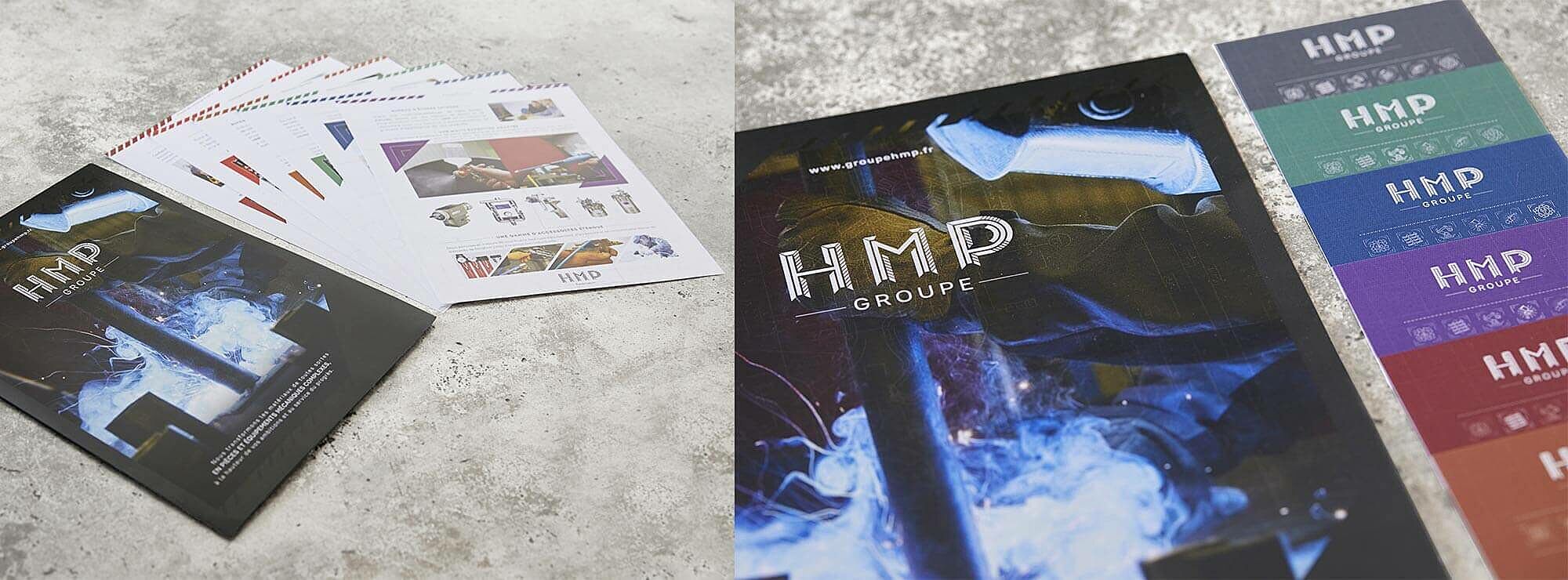
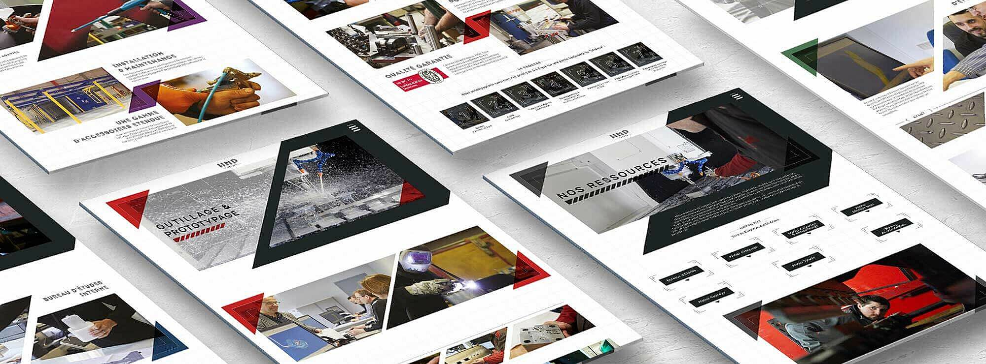
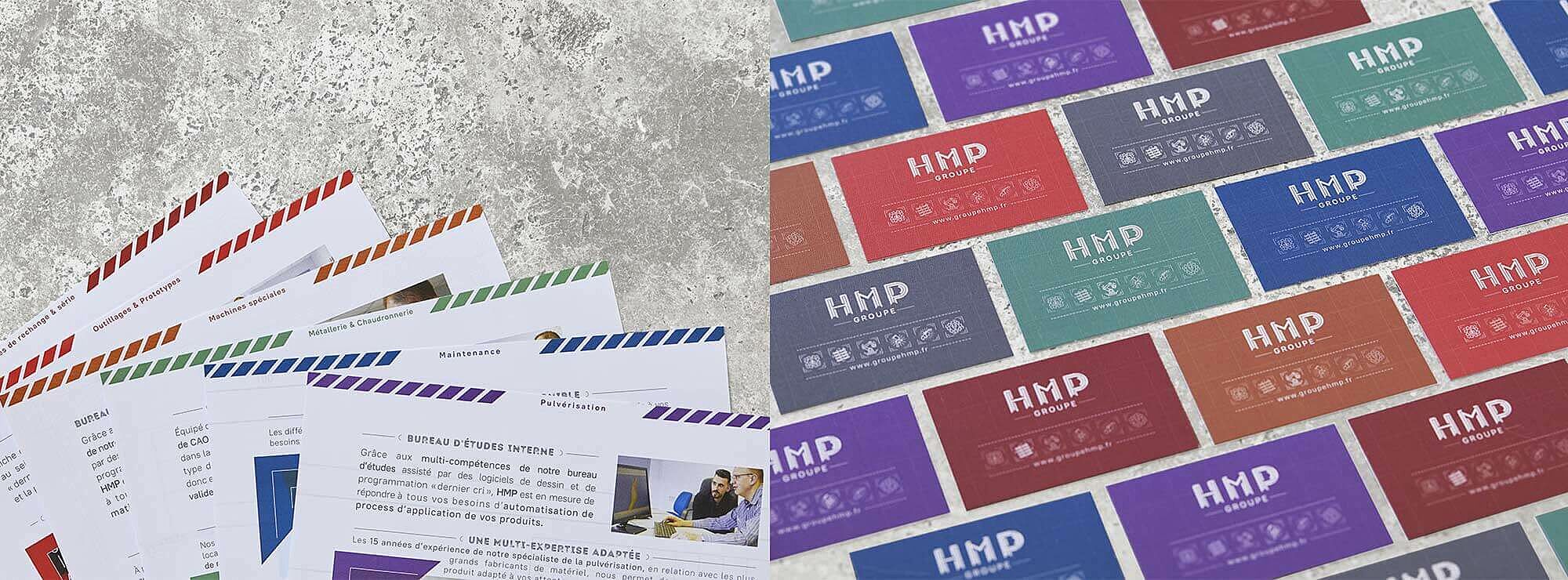
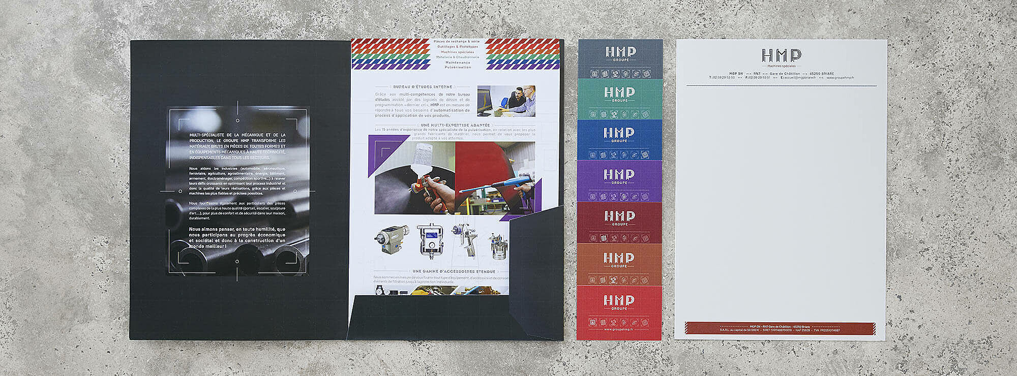
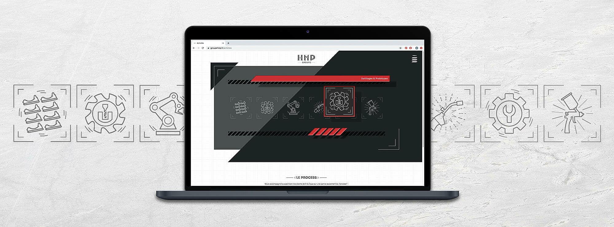
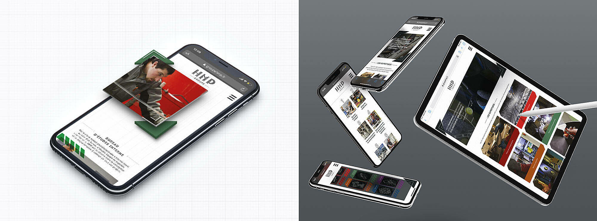
Each expertise is symbolized by pictogram as well as a specific color, chosen with the client to better understand and highlight their different services. The brochure is complemented by a short presentation of the company as well as product sheets, each represented with their individual colors. Those colors are present in the business card and adapted to each activity and member of the group. The front is composed of the logo, and the pictogram to highlight the diversity, the name of the employee” lit” and the color that represents their expertise.
The aim is to create emotion in the very specific domain, as it was a priority to ease the clientele. M4U challenged themselves to reach the perfect combination between visual identity that is “technical” and a more human approach (Coming soon on our homepage).