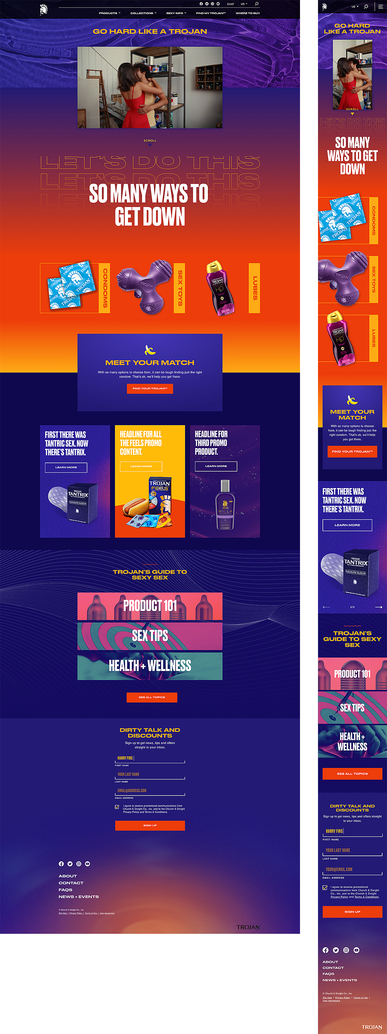
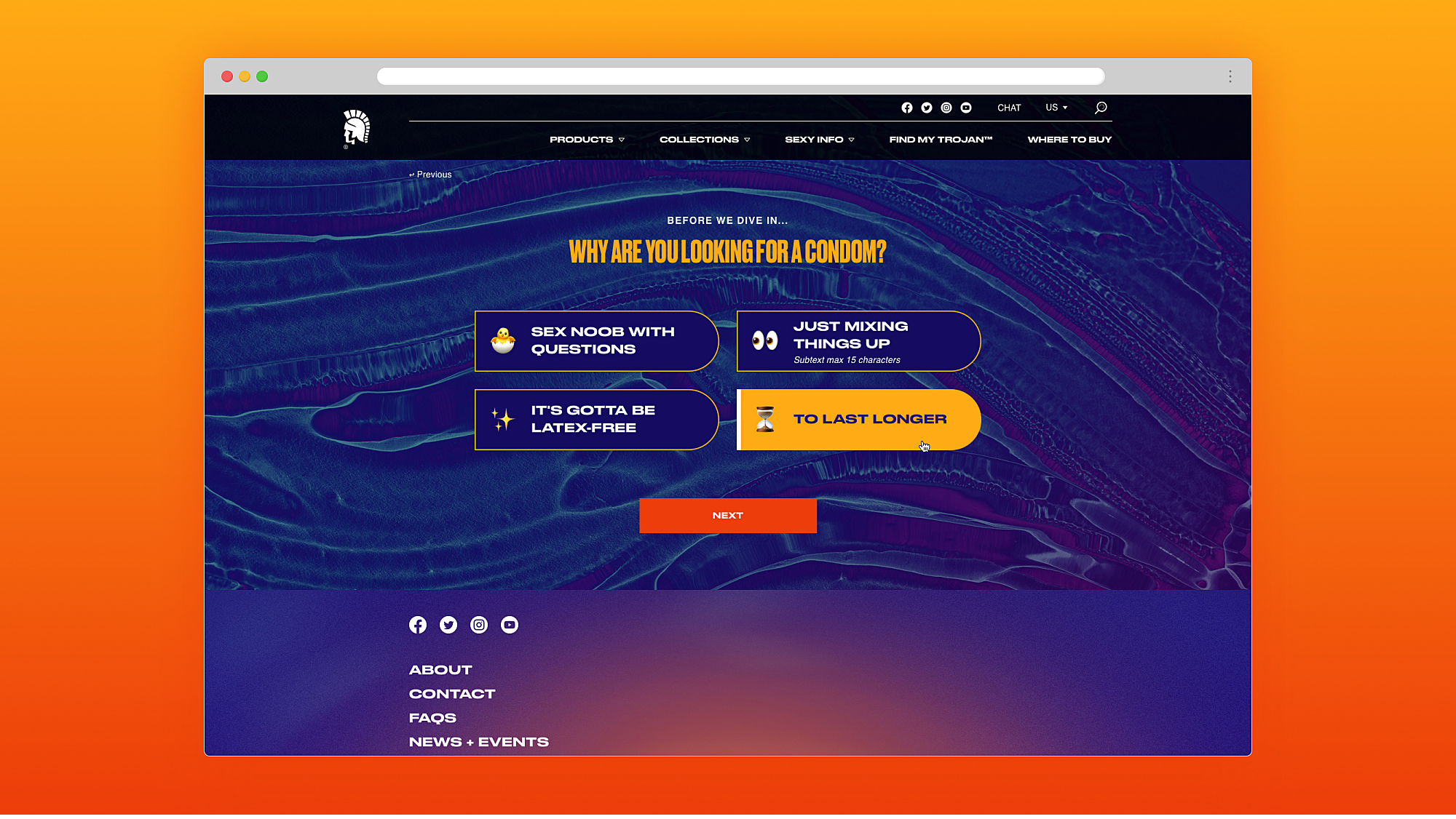
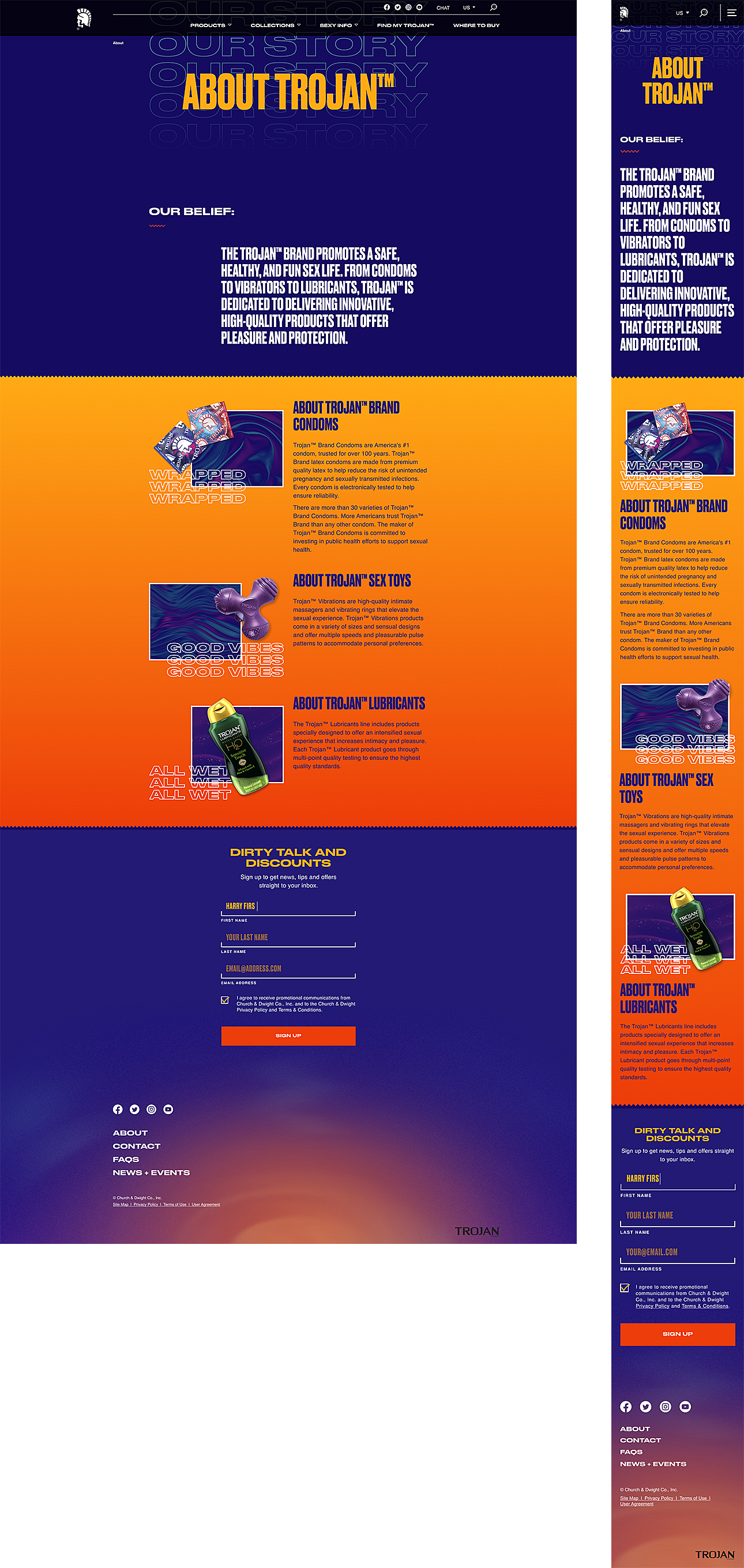
Trojan Condoms looked to Razorfish to design a youthful, usable, and accessible website that digitally transforms their online presence. Each element of the redesign was specifically crafted to target and capture a younger audience in the evaluation stage of their prophylactic purchase journey.
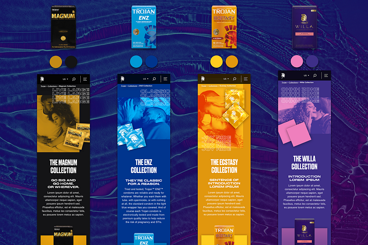
To translate Trojan’s new branding for the web, Razorfish designed a digital interface that reinforce their edgy, youthful vibe—yet remained safely within the accessibility requirements of the Web Content Accessibility Guidelines (WCAG). Colours from their packaging were extracted and tweaked for optimal luminance contrast, creating distinctive sub-brand palettes that allowed each of Trojan’s product collections to retain their brick-and-mortar differentiation.
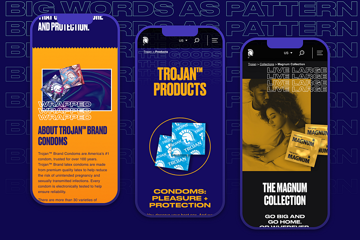
The design team further developed new visual expressions and design patterns that expanded upon their brand SOMETHING in a cost-efficient and modular way. With no budget to commission photography, we created a stylistic treatment for stock imagery that could easily be duplicated onto new image files in just 5 clicks of a mouse. A style of typographic outline illustrations was established so that fresh assets could be generated as long as one has the font file.
Responsive and adaptive mobile-first page templates ensure that mobile users, accounting for 84% of all website traffic, can intuitively navigate the site. The result is a vibrant, welcoming online presence that educates and inspires users on the joys of sexcessories and how to have their best sex.