Pensions don’t have to be boring.
Penny automatically finds all your old misplaced pensions and collates them into one place—an incredible and timely offering for a generation who change their jobs on average every five years.
After a successful round of investment from Google Gradient Ventures and Monzo Founder Tom Blomfield, Penny approached us to reimagine their brand for mass-market as they scaled from 10k users to 1 million.
The ‘Coin’
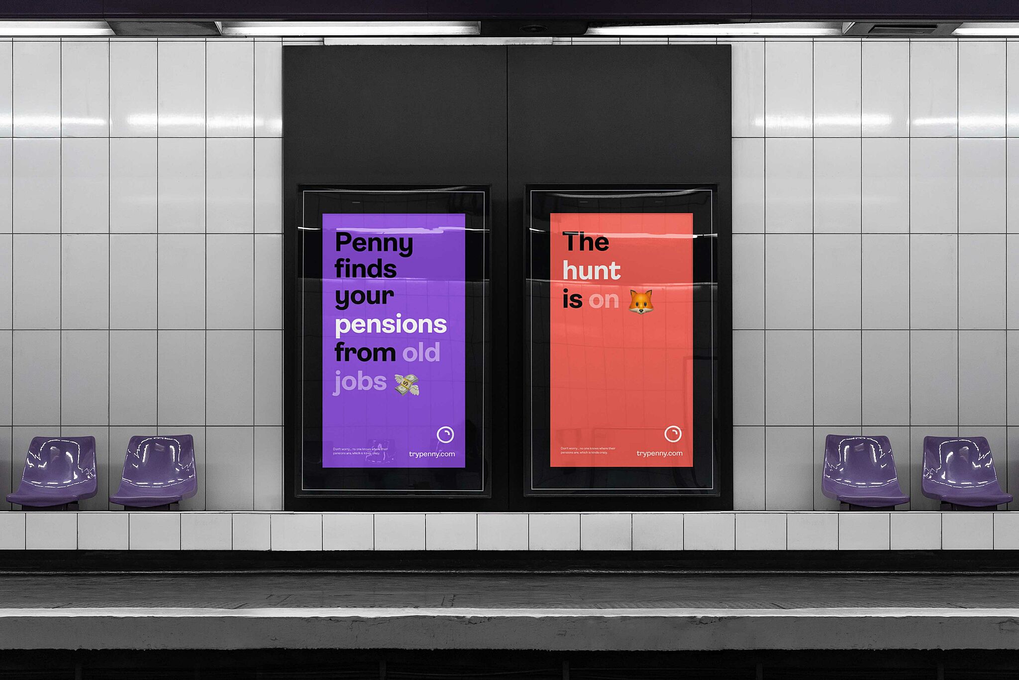
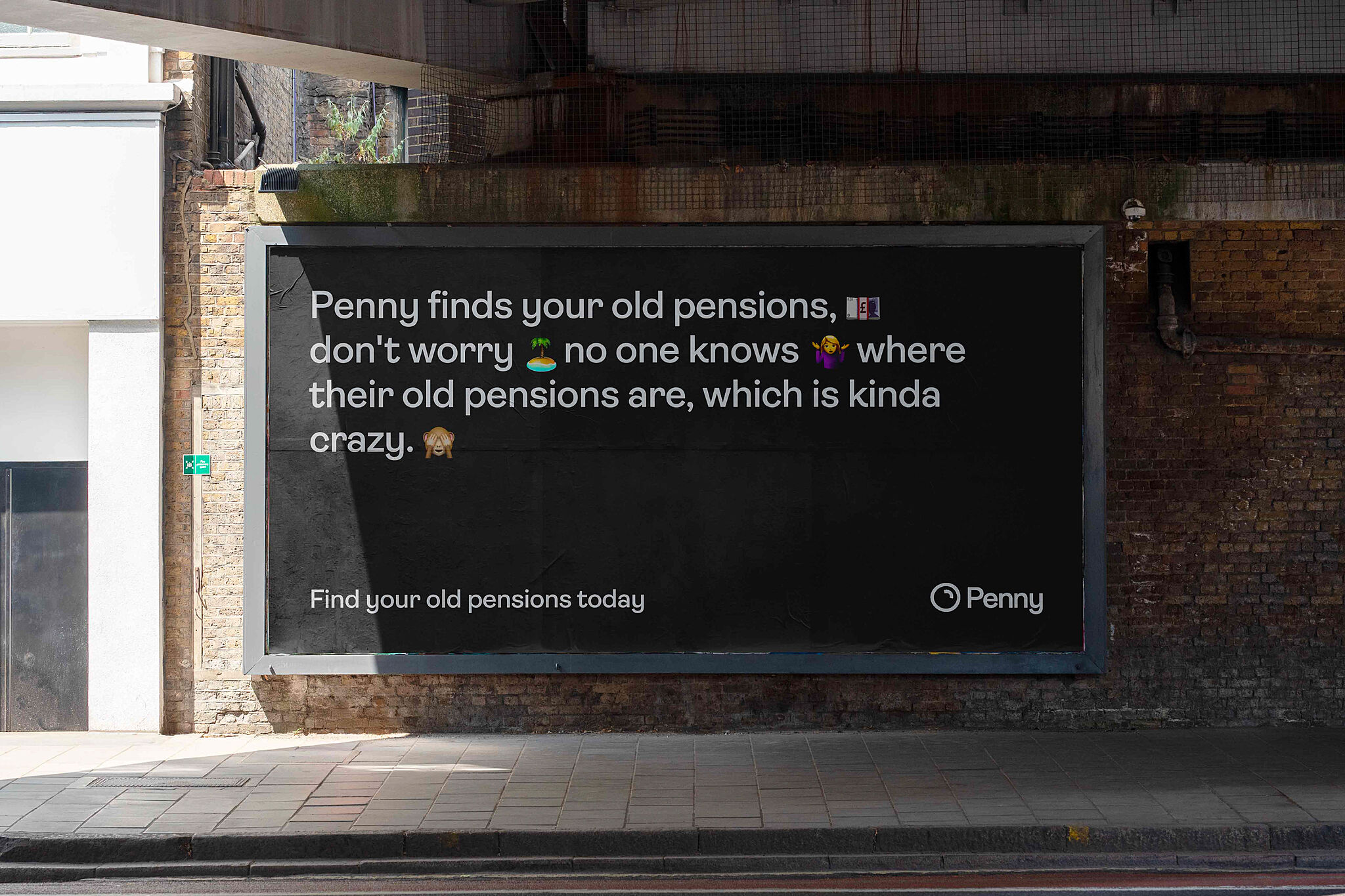
We created a playful identity that cut through the formal visual language common in the financial sector. A brand that balanced the tricky tension of being 'playful' and maintaining the necessary ‘sturdiness’ of the pensions industry — after all, they are dealing with your life savings.
While keeping Penny’s playful and ‘disrupter’ spirit, our approach was to keep the ‘coin’ at the heart of the identity and create a familiar mono feeling, not too far away from the beauty and excellence of Apple.
Ambit, an eccentric ad unique sans serif typeface inspired by early grotesques but adapted for the 21st century, provided this perfect balance of trust, and forward-thinking personality. Inline Emoji complement Ambit, bringing informality and a more visceral method of communication.
Penny's brand has a distinctive personality and a subtle playfulness, resulting in an identity full of character as well as trust.
Along with the brand ‘look and feel,’ we also created layouts for their new app and mobile site.