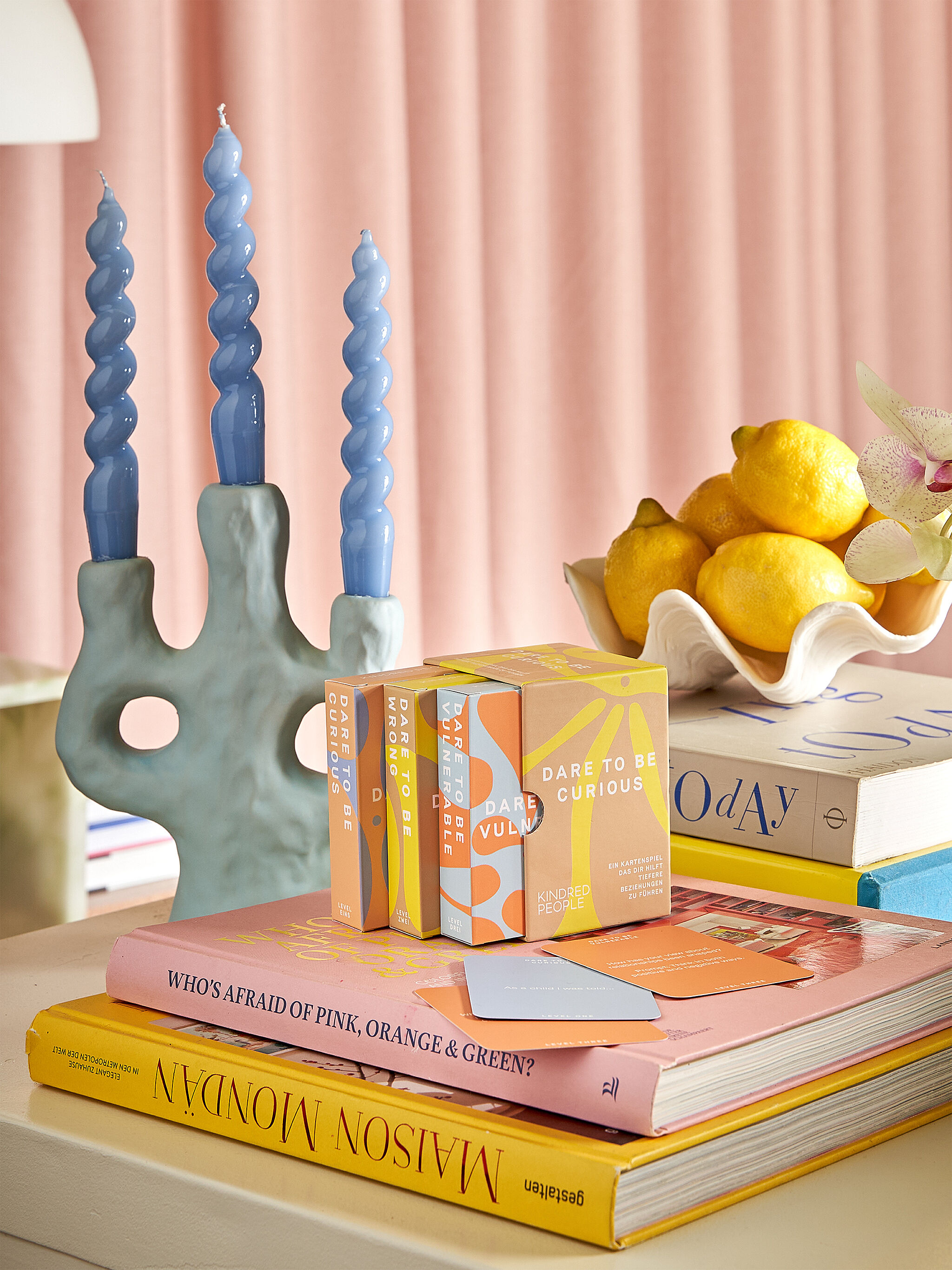
Kindred People is a lifestyle brand and conversation card game. The game itself is designed to facilitate deep, meaningful conversations between friends, partners and strangers, through a series of thought-provoking questions - helping you to know your fellow players (and yourself) better. The identity is contemporary and versatile, to eventually incorporate a lifestyle coaching business and a number of different box set versions of the game.
The solution is based around the fluidity of thought and feeling – inspired by the sensations of playing the game. and capturing this concept with broad appeal. Abstract illustrations of fluid forms put vulnerability and change at the centre of the messaging. An unexpected, cohesive pastel palette is gender-neutral, soft and comforting, whilst maintaining shelf appeal and recognition. The palette allows for different versions of any games to be identified with varying colour combinations.
The Dare To Be Curious game packaging – designed as a coffee table-worthy box set of chapters – is small and transportable, ready to take to picnics, dinner parties and dates. Fonts are humanist and a bespoke typeface for the logo sits alongside a sans serif with heaps of character and high readability.