INDIGO DESIGN WINNER 2023
INDIGO DESIGN WINNER 2023
INDIGO DESIGN WINNER 2023
INDIGO DESIGN WINNER 2023
INDIGO DESIGN WINNER 2023
INDIGO DESIGN WINNER 2023
INDIGO DESIGN WINNER 2023
INDIGO DESIGN WINNER 2023
Future Reimagined for SLK Software - Complete Brand Refresh
/by Zensciences Business Solutions LLP
2023 Agency Winner
Gold Winner in Branding for Technology
Silver Winner in Logos for Graphic Design
Created by:
Lead Designer
Soumyadip C, Head of Design
Design Company
Zensciences Business Solutions LLP
Client
SLK Software
Design Team
Antara Basu (Creative Designer), Sweedel Soans (Sr. Graphic Designer), Dippyaman Nath (Art Director), Neha Singh (Art Director), Dheeraj K. Ram (Presentation Designer), Priya Chakraborty (Presentation and Graphic Designer)
Credits:
Individual Credits
Head of Design: Soumyadip C
Creative Designer: Antara Basu
Sr. Graphic Designer: Sweedel Soans
Art Director: Dippyaman Nath
Art Director: Neha Singh
Presentation Designer: Dheeraj K. Ram
Presentation Designer: Priya Chakraborty
Brand Strategist: Artthi P
Content Lead: Namrata Harish
Account Lead: Sathya Kumar
Account Manager: Tenzin Varma
Content Specialist: Sneha Venugopal
Description
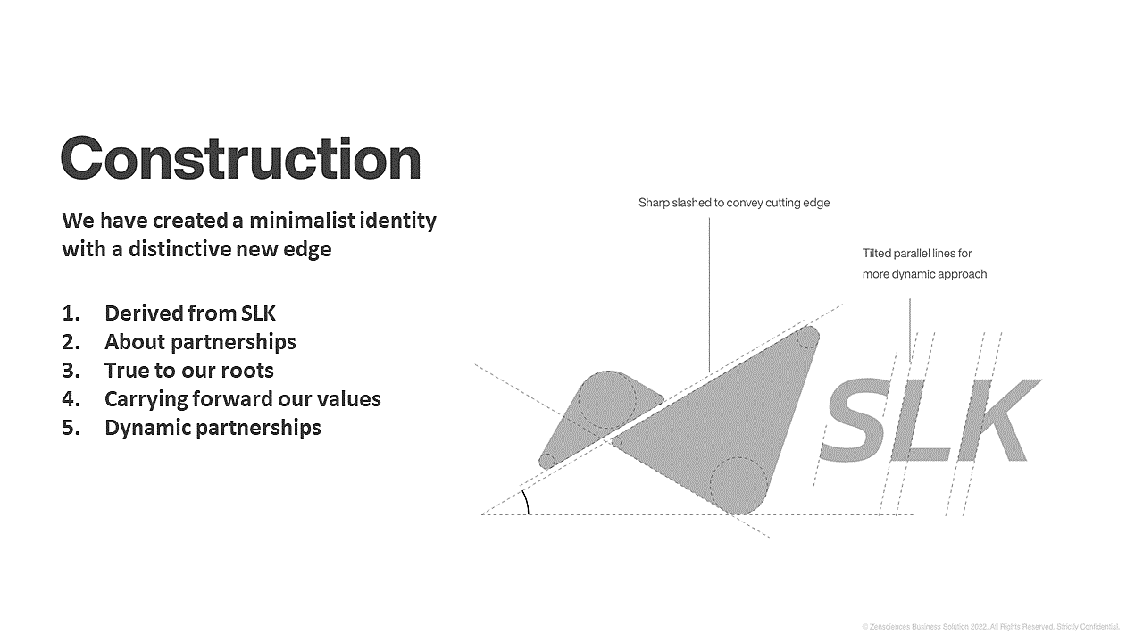
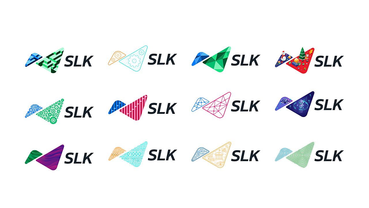
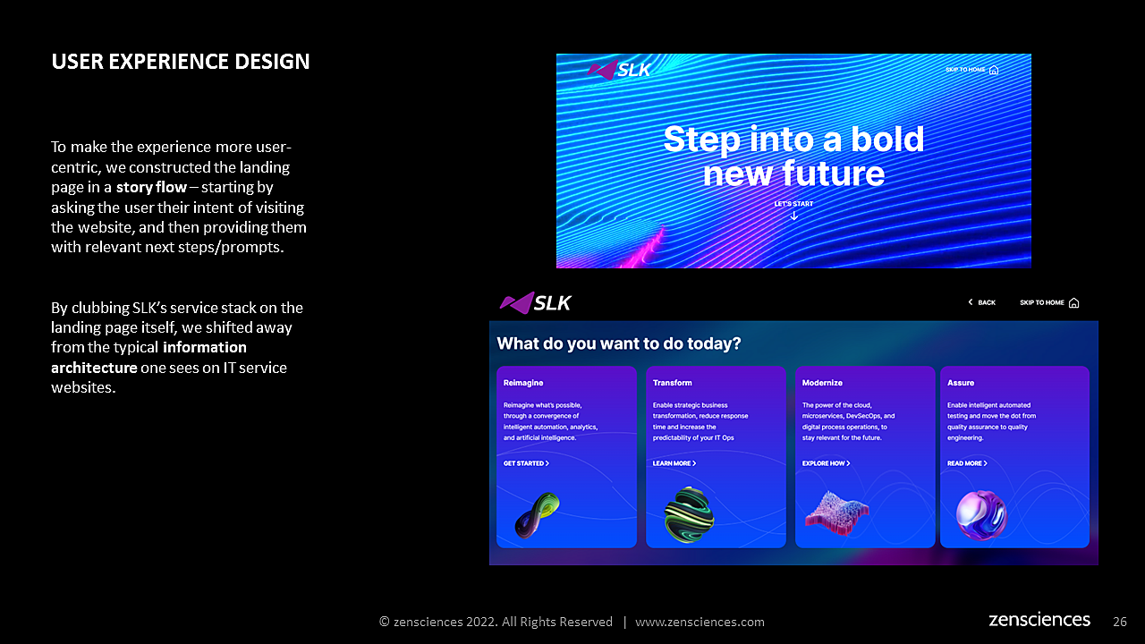
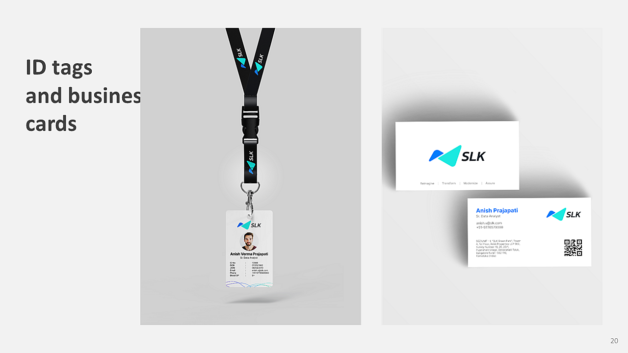
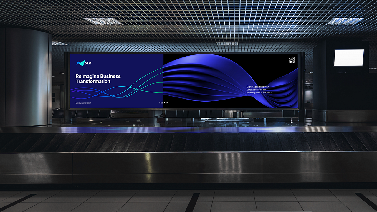
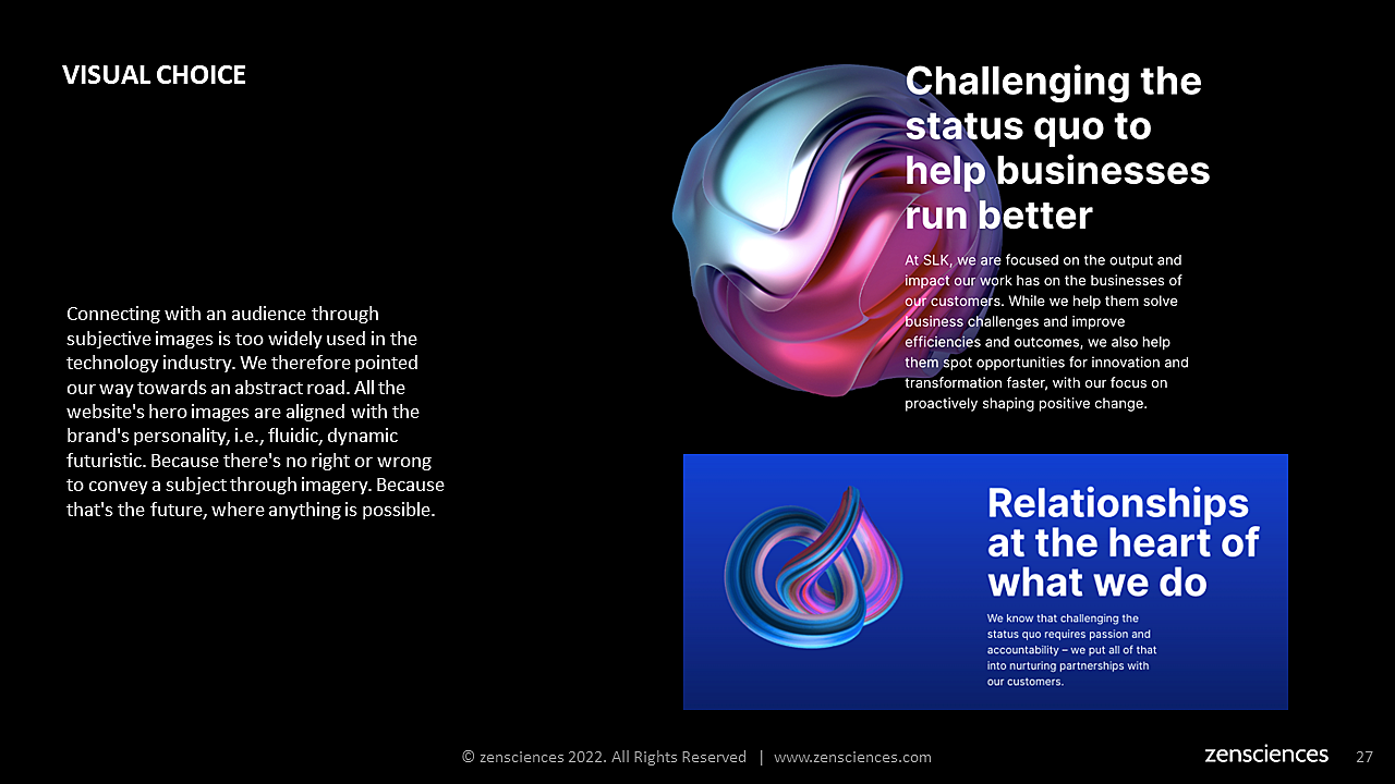
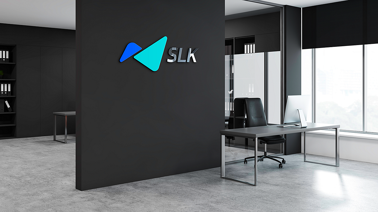
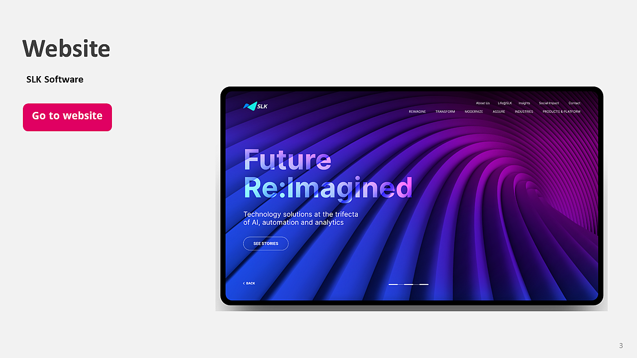
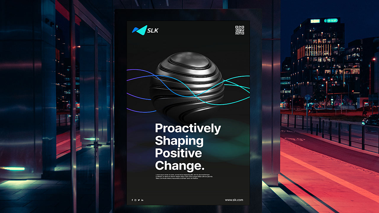
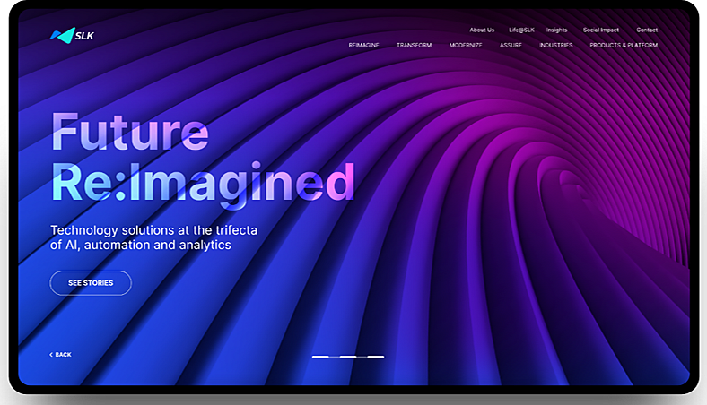
In a world where digital transformation is no longer a mere buzzword, every organization must adapt to meet new challenges and new demands of customers. SLK Software realized the need to not just change its service offerings and realign its brand narrative, but also revisit its approach to the market. This called for a complete overhaul of the messaging system, along with the look and feel of the brand - the whole nine yards. Main objectives: - Change and upgrade the perception of the brand - Become a partner of value to its customers (existing as well as potential) - Reimagine business as an Automation, Analytics, and AI-first organization To achieve the above, the brand carried out the following activities: - A brand identity refresh - A new look and feel in tandem with the new identity - Design system & messaging overhaul and offerings re-organization - logo, website, video assets, etc. That’s where Zensciences stepped in. We worked with the brand to recreate its complete identity. Our Approach Zensciences collaborated with SLK software to carry out the following: Step 1: Brand study We conducted in-depth interviews and primary research with all relevant stakeholders - including customers, leadership as well as employees to understand the current perception of the brand as well as their vision for the brand. This was coupled with assessing challenges they faced and opportunities that lay ahead, along with competition and market intelligence. Step 2: Analysis We collated all the qualitative and objective data to draw a comparison between how the brand wished to be perceived as opposed to how it was currently perceived. This helped us chart out the next steps of the brand refresh and develop a strategic communication plan to convey the right message to stakeholders. Step 3: Brand refresh From how services should be aligned, to what the new positioning should be – our task was to create a brand made for digital. A new brand positioning statement… With a problem-solving approach for innovation, SLK Software explores the realm of ‘possible futures’ – rather than ‘probable futures’. This means, every solution they create, and every project they collaborate on, can lead to transformation in the way their clients do business. This approach to ‘Futures Thinking’ is how we helped define the organization. …conveyed through a completely new look Once we locked in on the brand and story, the next step was to create a distinctive look that not only resonated with stakeholders, but also embodied the ‘future-first approach’. This involved completely revamping their logo, design and visual systems and consequently their website. A storytelling website that incorporated all the above was then created and executed. The Website Keeping in tandem with the brand refresh and visual identity, the website was given a complete overhaul. Not only did we change the user interface, but we refreshed the user experience as well - giving the audience a more interesting way of engagement. The website also had to meet the high standards and expectations of new brand values and achieve new brand promises: - They are a Futures-Thinking technology company - They are experts in AI, Automation and business reimagination - They are a specialized technology services partner - They are a strategic value-creation partner (with flawless execution) - They are customer-centric To make the experience more user-centric, we decided to construct the landing page in a story flow, providing interactive prompts that help the user find what they’re looking for with ease. Stepping away from the usual positioning of a website’s information architecture, we instead clubbed SLK’s services into buckets on the landing page itself, allowing users to decide upon startup what action they wished to take - Reimagine, Transform, Modernize or Assure. We kept in mind those users who prefer a more traditional approach to navigation, and provided a ‘skip to homepage’ option as well. We employed the use of ‘if pattern’ typography, and separated heavy typography into two column divisions, ensuring ease and speed of readability throughout all pages. A fluid design system was developed. This is where the ‘Futures Thinking’ had to meet a visual system that is infinitely flexible and denotes possible future worlds. It started with the logo. We evolved the iconic SLK logo to give it a more modern and distinctive new age character. We started with the thought that’s always been central to SLK's well-versed partnership philosophy and aligned that to the brand positioning that - 'Futures Thinking' is not just within the organization, but between the organization and its clients. We introduced a dynamic typeface for the new logo that defines speed and confidence. To symbolize the partnership philosophy, we constructed the logo in two distinctive shapes that overlapped each other. These shapes were born out of the Founding Chairman’s vision and posture. The entire Design Language System (DLS) was carefully designed in line with the brand's positioning. Our aim was to create a unique, scalable, fluid and agile DLS that contributes to SLK's partnership philosophy. Basic tenets of the website: Industry First - Dynamism was adopted as a core design value throughout the website, and this was extended throughout the logo, images and overall design Fluidic lines - Abstract and versatile, it is a perfect visual representation of how the future will be - innovative, dynamic, scalable. Color palette - While the primary color (purple) of the brand remained intact, we added more hues - pinks and blues that are a perfect extension of the primary color. Imagery - We broke away from the usual imagery of AI, people, innovation and future and took a road less taken in this industry - abstract, vibrant and dynamic visuals that break through the clutter and instantly grab your attention. More details on the PDF are attached. After all, pictures speak a thousand words.