INDIGO DESIGN WINNER 2023
INDIGO DESIGN WINNER 2023
INDIGO DESIGN WINNER 2023
INDIGO DESIGN WINNER 2023
INDIGO DESIGN WINNER 2023
INDIGO DESIGN WINNER 2023
INDIGO DESIGN WINNER 2023
INDIGO DESIGN WINNER 2023
NIKU House - Brand Identity
/by Primer Grey
2023 Agency Winner
Silver Winner in Branding for Hotels & Resorts
Created by:
Lead Designer
Mercedes de la Parra
Design Company
Primer Grey
Client
NIKU House
Design Team
Jennifer Lugo, Cliff Raymond
Credits:
Entrant Companies
Primer Grey, US
Individual Credits
Photographer: Camilla Johannesen
Photographer: Mariola Soberón
Architecture: Latinta Studio
Description
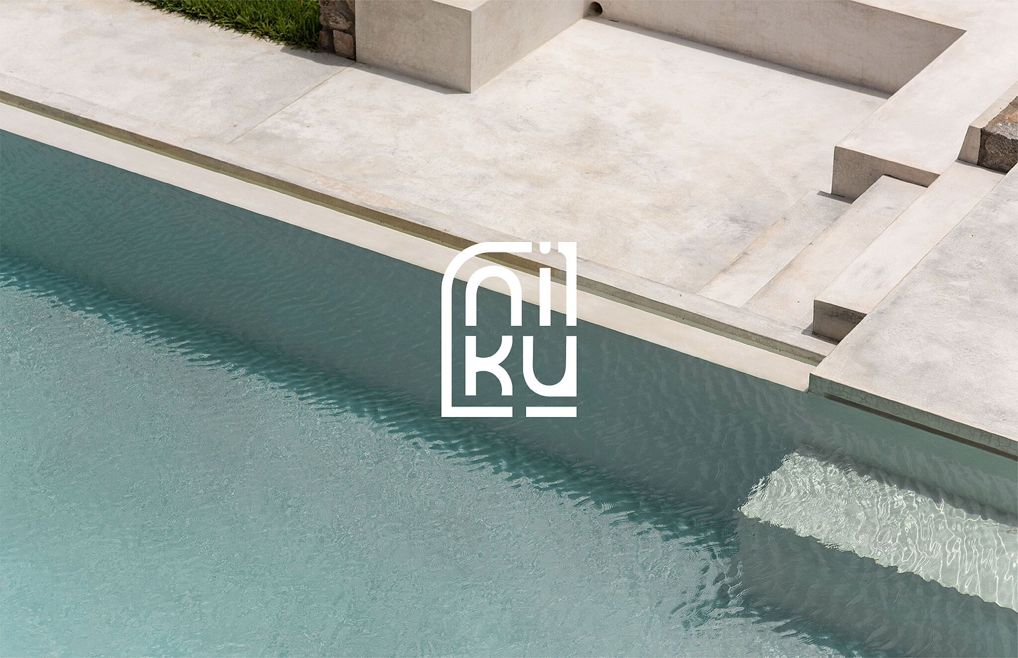
When long-time friends Dustin and Ollie approached us about the fact that they were building a destination, luxury villa in Puerto Escondido, Oaxaca, Mexico, we were intrigued to say the least.//As veterans of the New York hospitality and fashion businesses, the house would appeal to design-minded, affluent, travelers with an appreciation for adventure, as well as a large contingent of European vacationers that frequent Puerto Escondido in the high season. We worked closely with them and their architects to craft a brand to represent the property and future endeavors with an understanding of the underlying significance of people and place.//They had already started the design process with LaTinta Architects based in Mexico City to design a house that was a dramatic departure from the typical local architecture seen on this area of the coast.//The idea of building an expansive home, accessible only by car through rural mango groves, 20 minutes south of the actual town of Puerto Escondido, which itself is a small surf town, creates a strange juxtaposition of wealth and relative poverty. It was important to acknowledge and show respect for the existing culture and the architects addressed this challenge by utilizing native materials and local artisans for construction, furnishings, and artwork. It was also a problem and effort that we wanted to try to acknowledge, if even in a small way, with the brand.//With a working name of “Perfect Wave,” the house was designed to mirror the flowing ocean and mountains that abut the coast. Our team spent time in Puerto with the owners and architects, to better understand what makes the place so special to them, beyond the fantastic surf. And the overwhelming answers were “disconnection” and “re-centering.”//The owners, and many other semi-expats in the area, have a deep love of the native Mixtecan people and go out of their way to respect the place and give back to the local communities. With this in mind we set out to pay homage to the locals without it feeling like cultural appropriation.//For naming, our research led us to the native Mixtecan word NIKU which directly translates to “A rebirth or reincarnation.” The name references both the home’s unusual architecture, but also what the owners hope that visitors feel and experience on their visit. A rebirth through disconnection and peace. More importantly, the use of “House,” rather than the common “Casa,” was a concerted effort to acknowledge that the owners are not native, and despite building a home, will always be appreciative guests in this place.//The logo mark draws inspiration from the home’s architecture combined with local cultural references. For example, one of the most recognizable features of the house includes its roof corners, which taper upward slightly at the place where two walls meet. The logo reflects this in the “K” and “U.” The secondary mark and patterns utilize the negative space of the primary mark. This invites guests to look more closely at their surroundings, the locals, and maybe even themselves.//The brand’s color palette also draws inspiration from the finishes of the house, which is composed primarily of light colored cement and warm woods. A more coral finish to a traditional “wood brown” was adjusted to add vibrancy and a signature color to the brand.//The website is meant to be an introduction to the experience of staying in NIKU House, it had to embody the design aesthetic that drove the architectural decisions of the house. The fractal and rhythmic elements within the architecture and design were carried throughout the design process, pulling in inspiration from the logo and its graphic elements to enhance the visual engagement between the house, the website and the user interaction.


