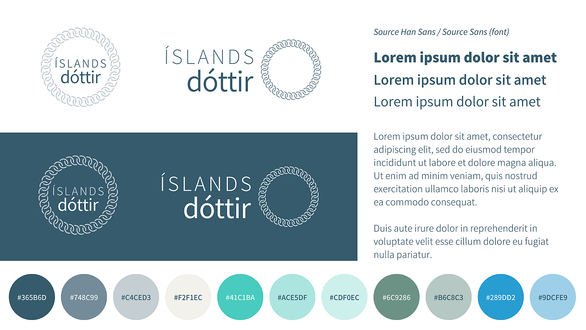
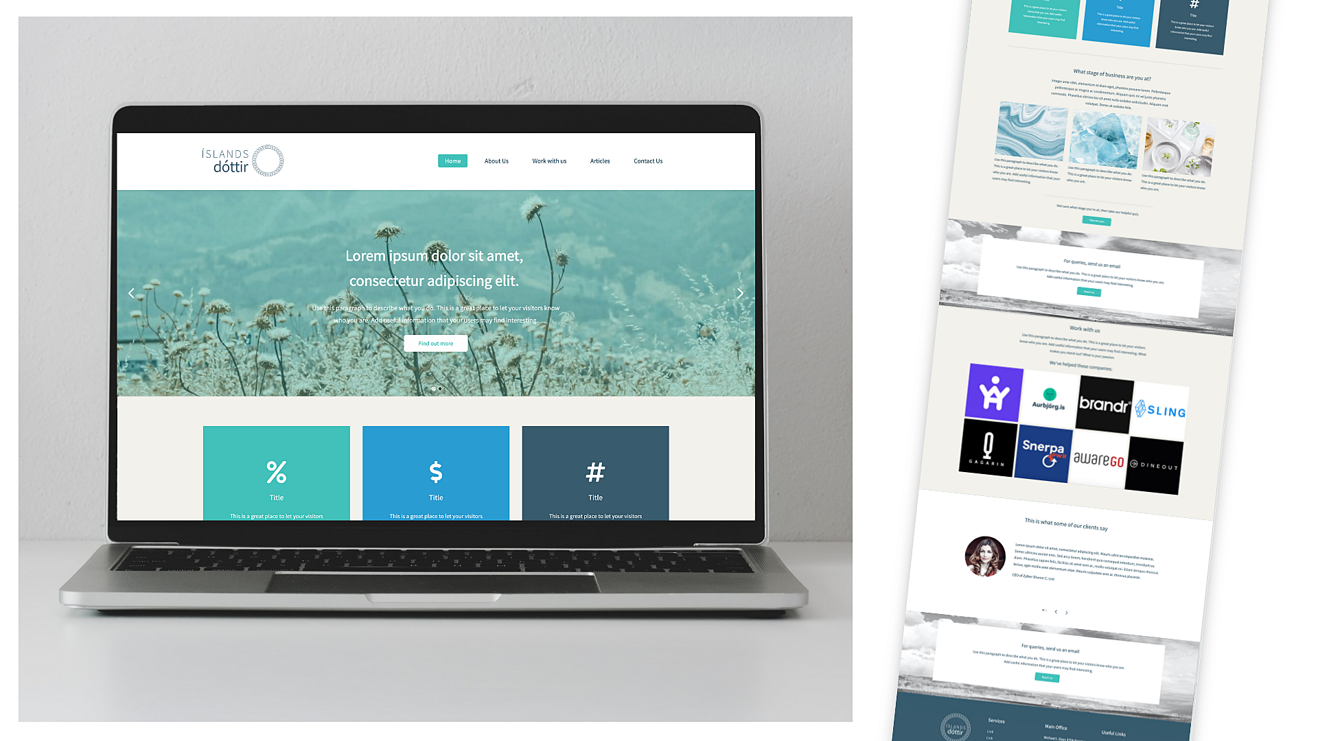
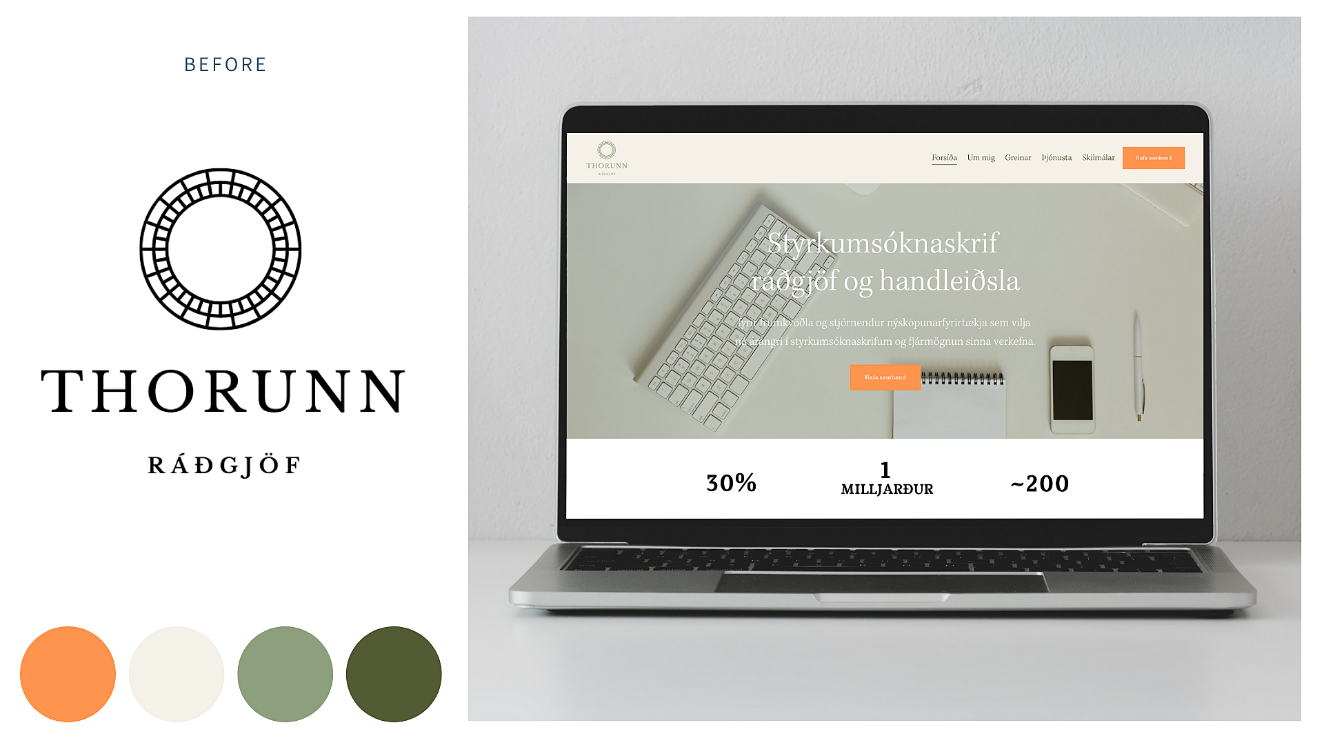
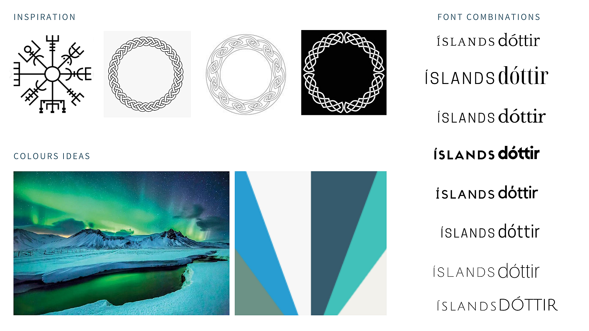
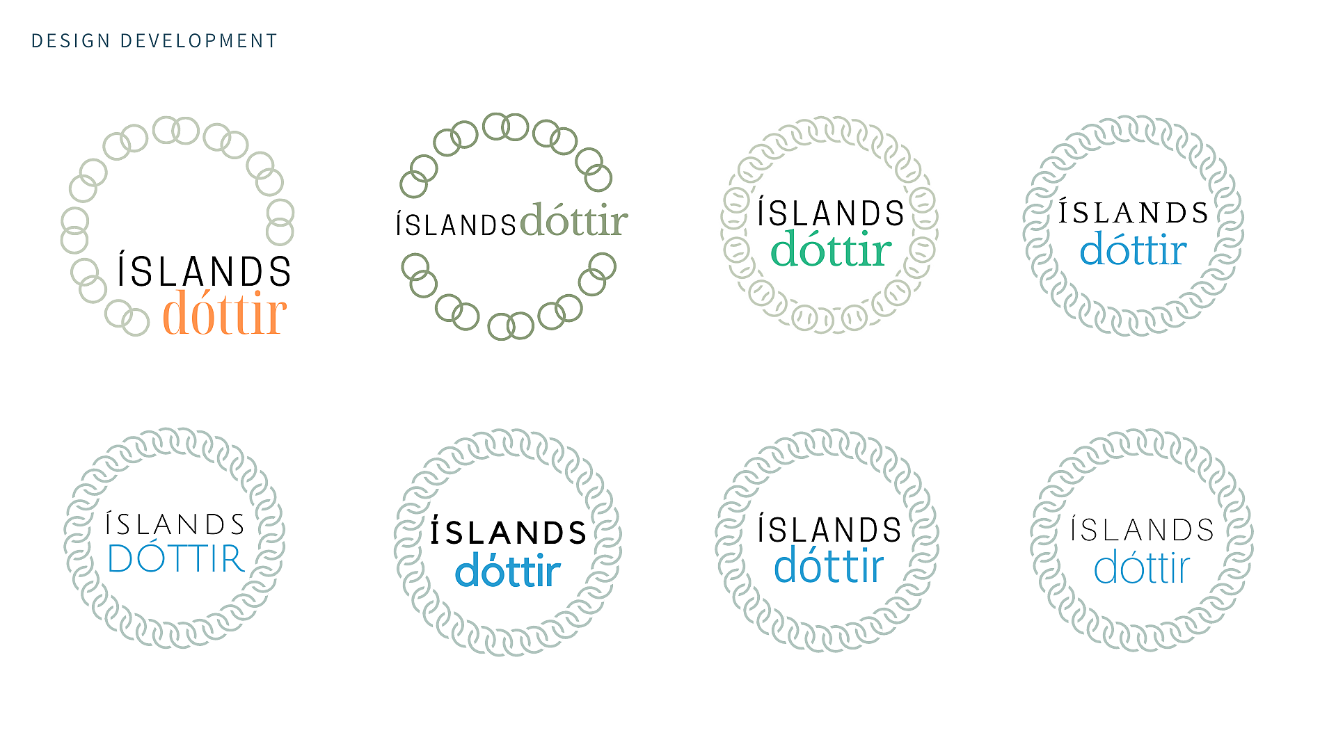
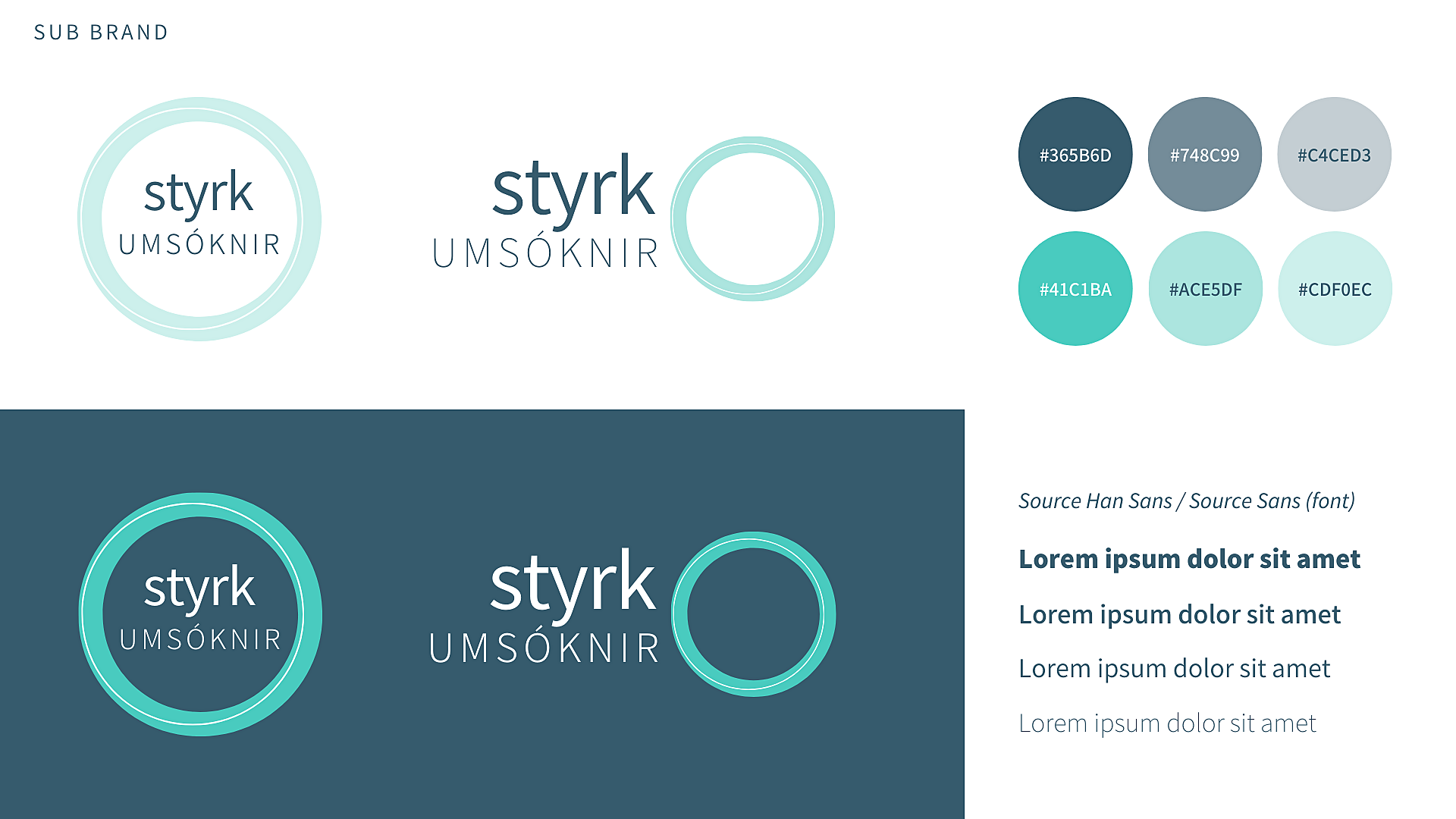
This rebranding was for Thorunn, who offers consultancy and support for businesses applying for grants in Iceland. Her consultancy and high end work sits under the brand Íslandsdóttir, which translates to 'daughter of Iceland'. This name comes from a popular Icelandic book character. The interlocking chain icon represents collaboration, support and is inspired by Nordic knots. The design process was a collaboration with the client, held on video calls and using screen sharing to bounce the ideas, develop the ideas and then refine them at each stage. We looked at fonts, colours, images for the brand library and design templates together. Once the Íslandsdóttir logos were nearly finalised, we created the sub brand, Styrkumsóknir. This literally means 'grant applications'. This area of her business focusses on her online courses and resources for businesses starting out or with a tight budget. The Styrkumsóknir brand is simpler and no frills.