INDIGO DESIGN WINNER 2023
INDIGO DESIGN WINNER 2023
INDIGO DESIGN WINNER 2023
INDIGO DESIGN WINNER 2023
INDIGO DESIGN WINNER 2023
INDIGO DESIGN WINNER 2023
INDIGO DESIGN WINNER 2023
INDIGO DESIGN WINNER 2023
Babeurre Délicatesses
/by Catherine Lemieux
2023 Freelancer Winner
Gold Winner in Integrated Graphic Design for Graphic Design
Silver Winner in Logos for Graphic Design
Silver Winner in Branding for Restaurants / Cafe
Silver Winner in Branding for Graphic Design
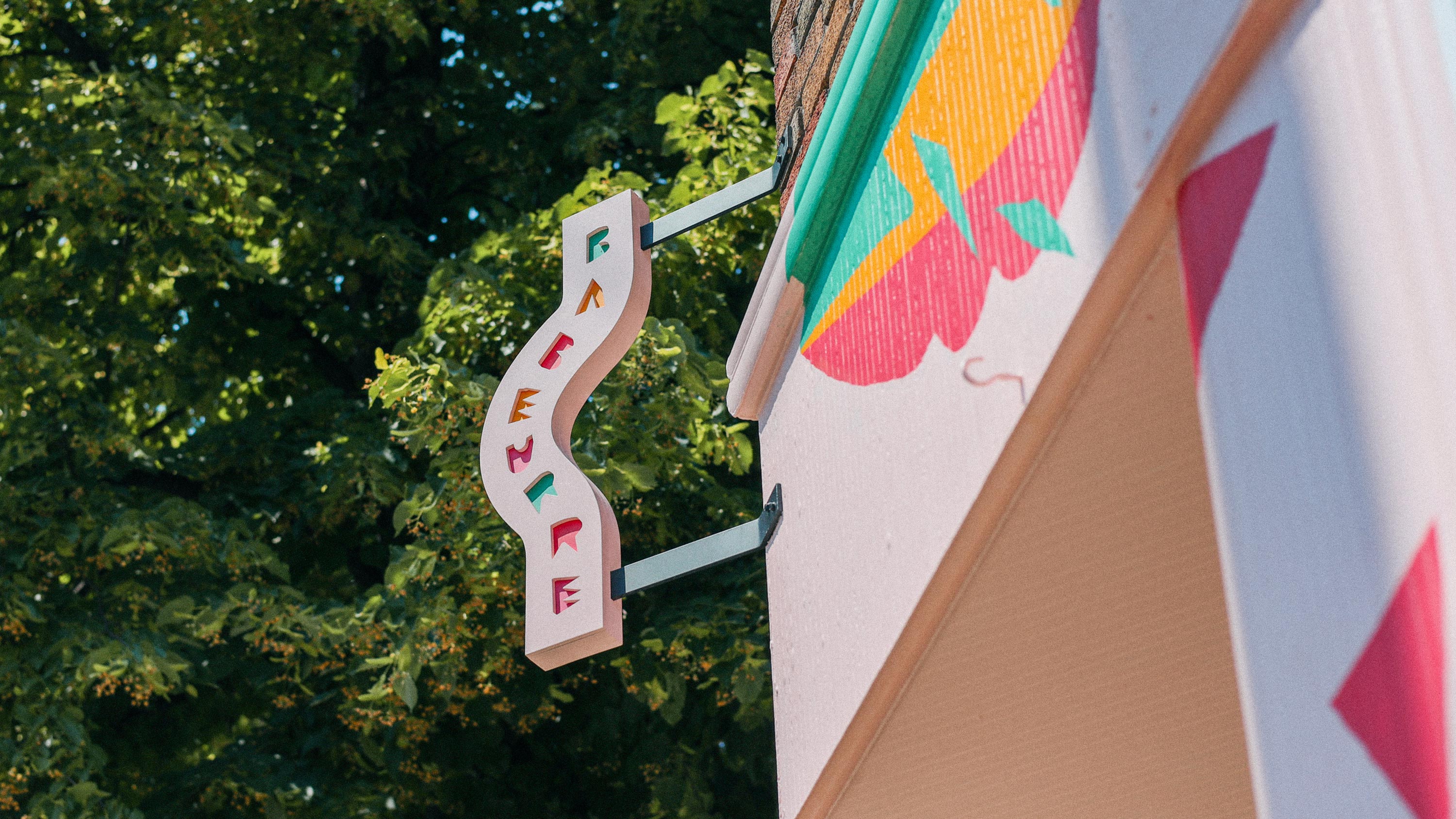
Description
Babeurre is a neighbourhood counter-restaurant that offers a menu that follows the cycle of people and seasons. They create incredible food to take-go or to eat on the spot. All of that in a friendly atmosphere. With a dining room of less than 20 seats, Babeurre presents an intimate and colourful decor with second-hand furniture. Recycling is, in fact, one of the main goals of the business. Even its name is inspired by it, renowned chef-owner Karine Jacques explains: " Babeurre is Buttermilk in french. It sounds comforting and sweet, but it's also what's left of churning cream to make butter. It perfectly represents this idea of recycling, not wasting anything, and reusing. This is the essence of our restaurant: to make noble products that we would normally leave aside and to highlight the producers. » How to manifest those key elements of recycling, proximity, and respect for ingredients (materials) in the visual identity? By going beyond digital design by thinking about the impact, durability and declinability aspect of each element of the visual universe. The logo is formed by 8 cutted, imperfect and singular letters. They are inspired by scraps and die cuts used for cookies. They represent various ingredients that can be combined in a multitude of visual recipes. The letters recall the handmade receipts which, although similar, are never identical. Identity colours are bright and inviting. Perfect for a family restaurant! In addition to allowing Babeurre to be noticed from afar, they have been designed and adjusted from the paint pigments used in the realization of the exterior mural. Thus, the harmony between all the variations, including the sign, is constant and perfect. It also allows the owner and collaborators to be able to create or upgrade new graphics, furnishing or decor elements without hassle. This meticulousness of intention and upcycling can be felt in every detail of the place. The sign, for example, was entirely designed from scrap. Its shape, which perfectly blends the silhouette of the building, flows delicately towards the entrance. Its cutting optimizes recovery to the maximum since the letters cut out on the front have been recovered and glued to the back of the sign. The visual universe is alive and designed to allow creative collaboration. From Renown Muralists to Creative Illustrators and Chefs for the day, everyone can have fun creating in the universe of Babeurre, a small place where food, people and beautiful things meet. Catherine Lemieux - Designer / Art Director and Creative Consultant Karine Jacques - Owner / Manager / Chef / Creative leader Ilana Pichon - Muralist Extraordinary / Illustrator / Muse Donna Very Good Girl - Precious Illustrator Véronique Côté (Atelier Mockup) - Sign Production Guru Marion Saint-Sernin (Studio BangBang) - Merch Production Magician


