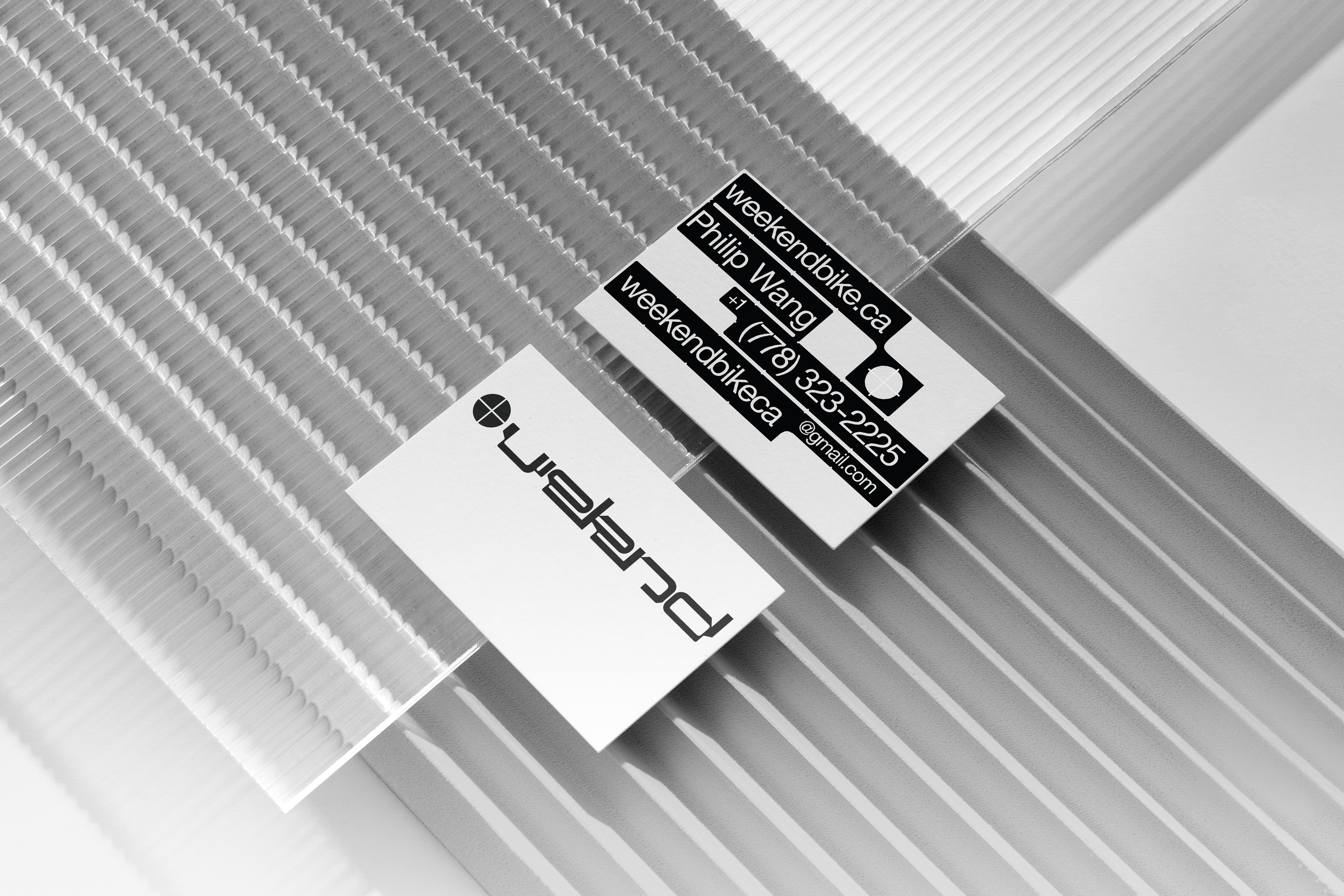
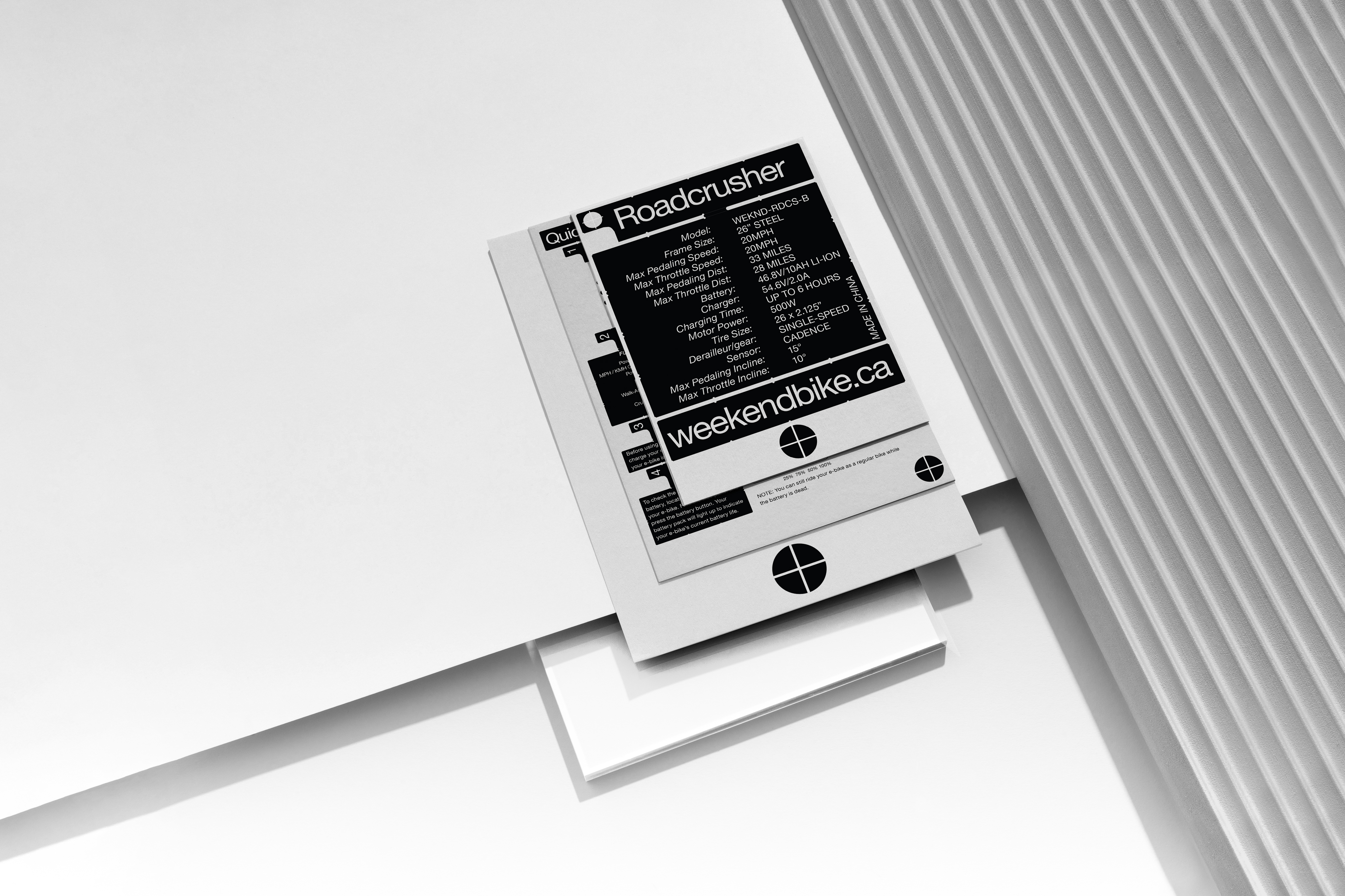
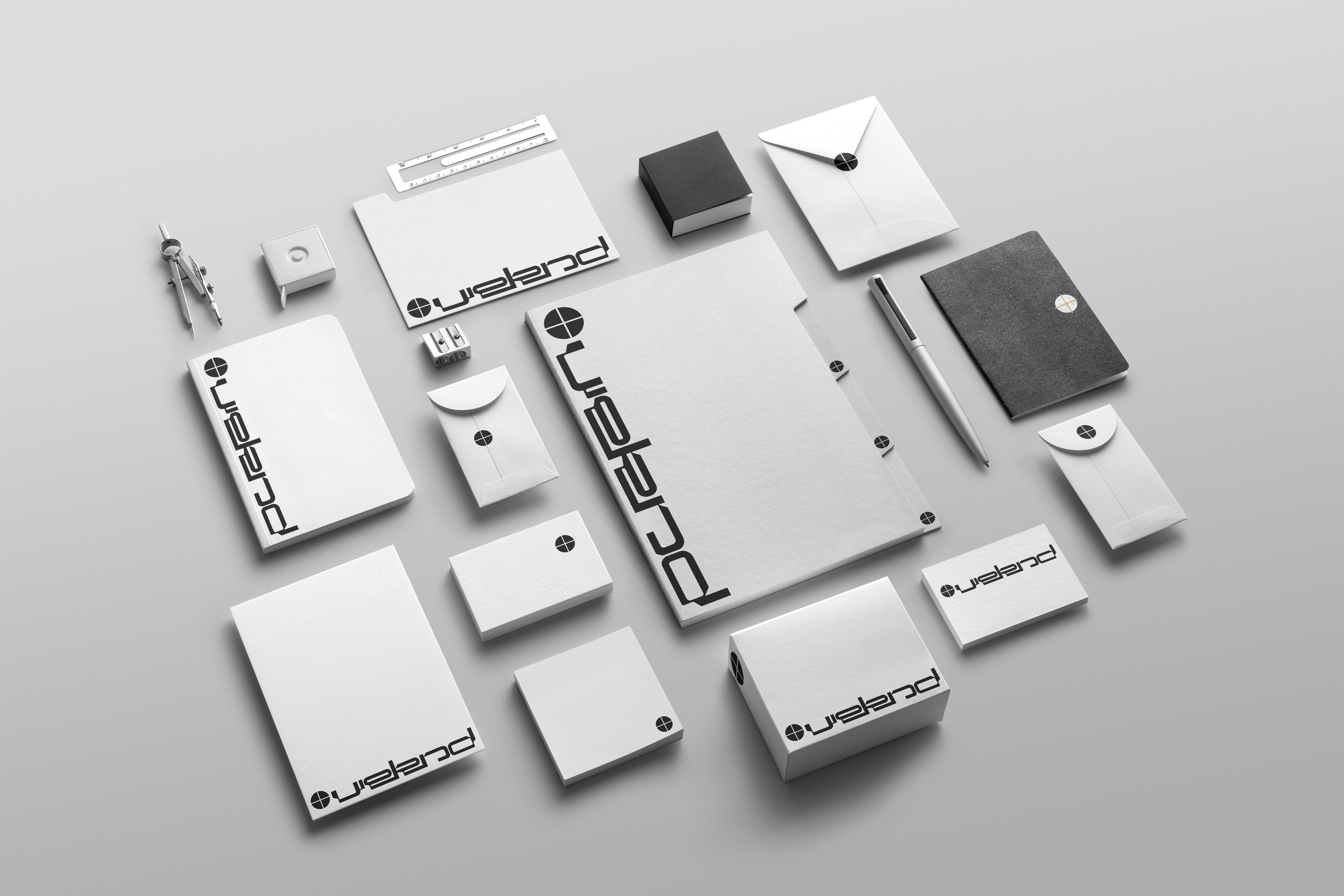
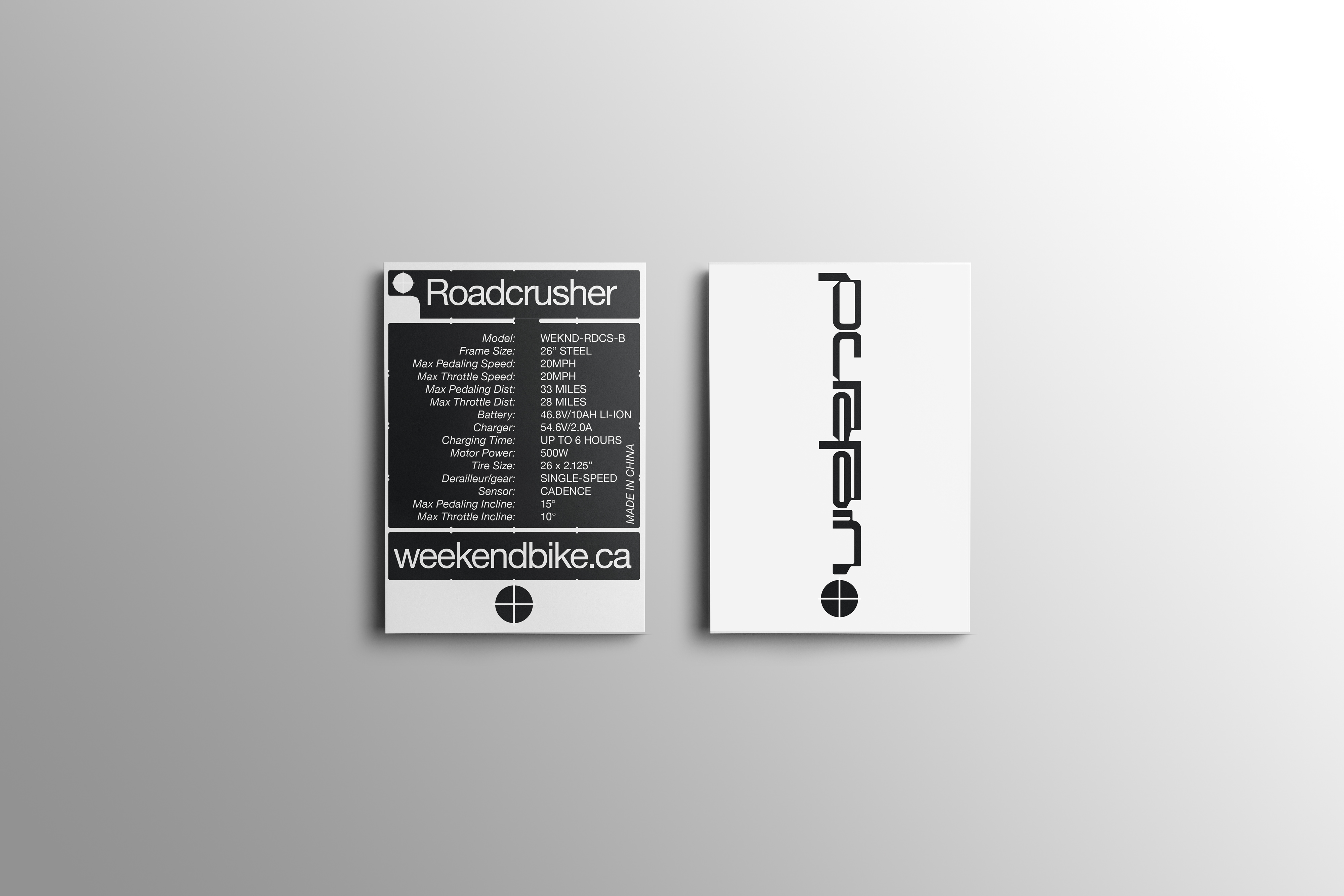
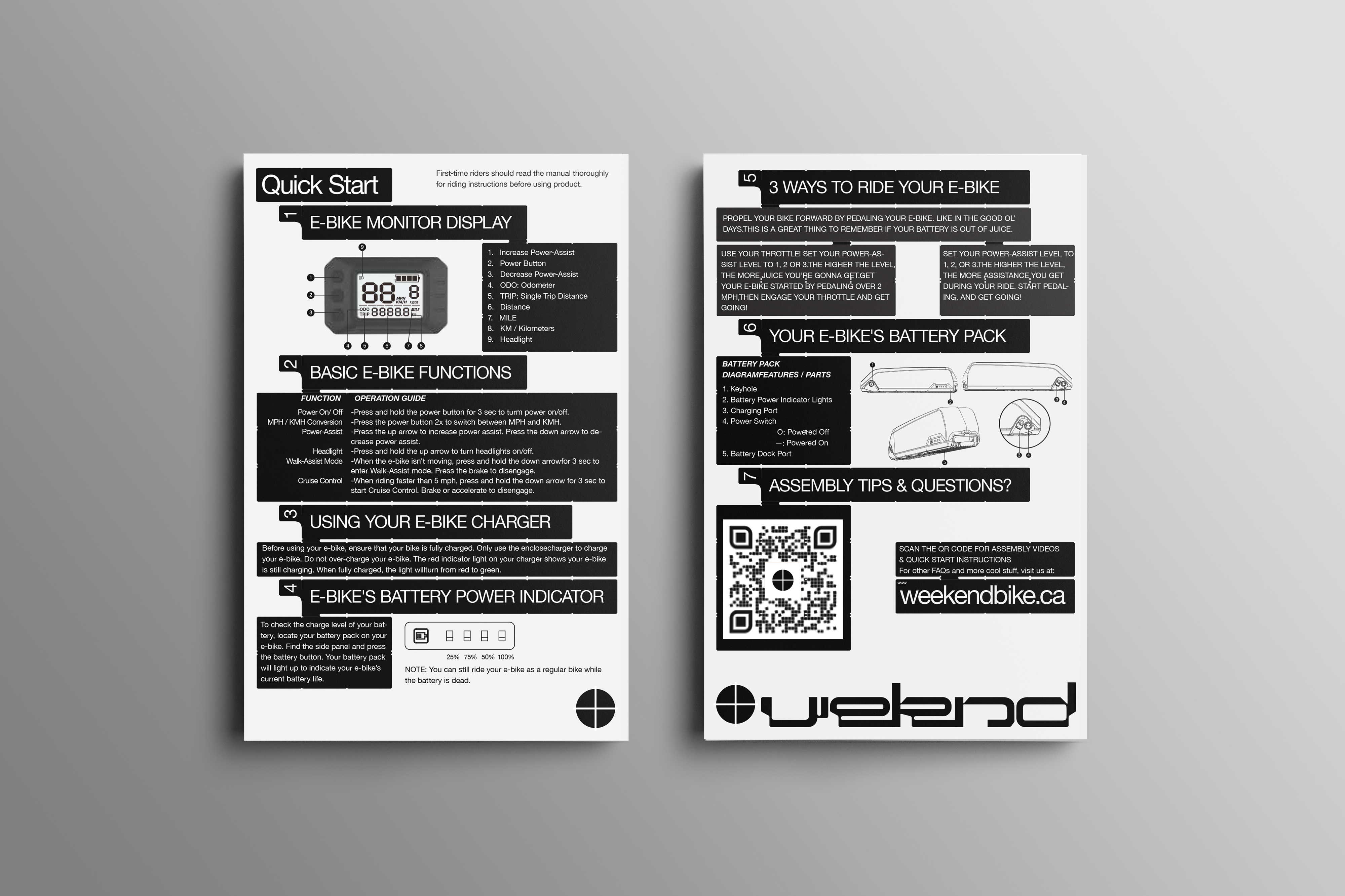
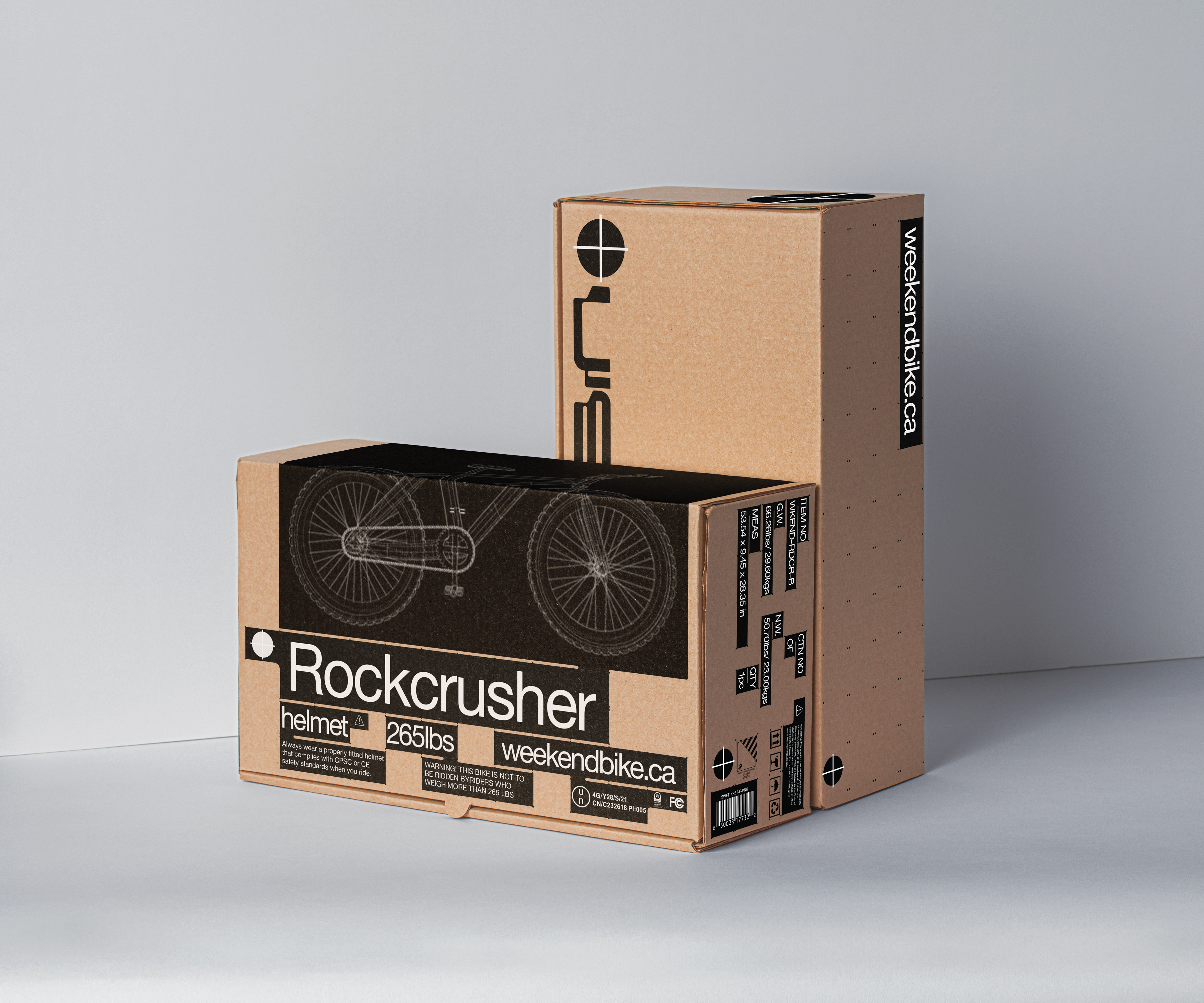
Weekend Bike CA is a Vancouver-based bike shop. The visual identity includes type design, logo design, package design, business cards, product graphics, and web design in the e-commerce environment to satisfy the need of a start-up. The visual identity system design, which embodies a technical aesthetic and reflects aspects of modernity, appeals to younger audiences. At the same time, it thoroughly aligns with the company's product and mission.
The project started with researching everything related to the product, the biking culture, and the unique visual language of modernism and technology.
The concept of branding is to recreate the scene of the hi-tech product performing in a futuristic environment from a graphic design perspective. The logo lockup consists of the screw shape icon and the bike-components-inspired logotype design - the same rationale for assembling a bike. And the visual system took influence from a variety of machine labels and the ways that they create the visual hierarchy of specifications and information.