PROBLEM
Oceanic Shade recently purchased two Australian-made cantilever umbrella/awning businesses; Revolvashade & Clevershade. Both use uniquely patented technology, high quality engineering and sit at a higher price point than its competitors, however the branding for both was amateur creating a huge disconnect. The two businesses, although very similar in engineering and design, were also not connected in any way visually.
SOLUTION
My approach to the branding for both was to create two 'sister' brands. These two brands sit alongside each other to build recognition in the brand, but are able to be designed for and marketed using very different styles. They each have their own brand DNA. Revolvashade is one of these two brands, a premium outdoor cantilever umbrella for domestic and commercial use. The umbrella design is strong, sleek and sophisticated and compliments any luxury property landscape. The branding needed to align itself with the product and appeal to a more sophisticated, design focussed buyer.
THE BRANDMARK
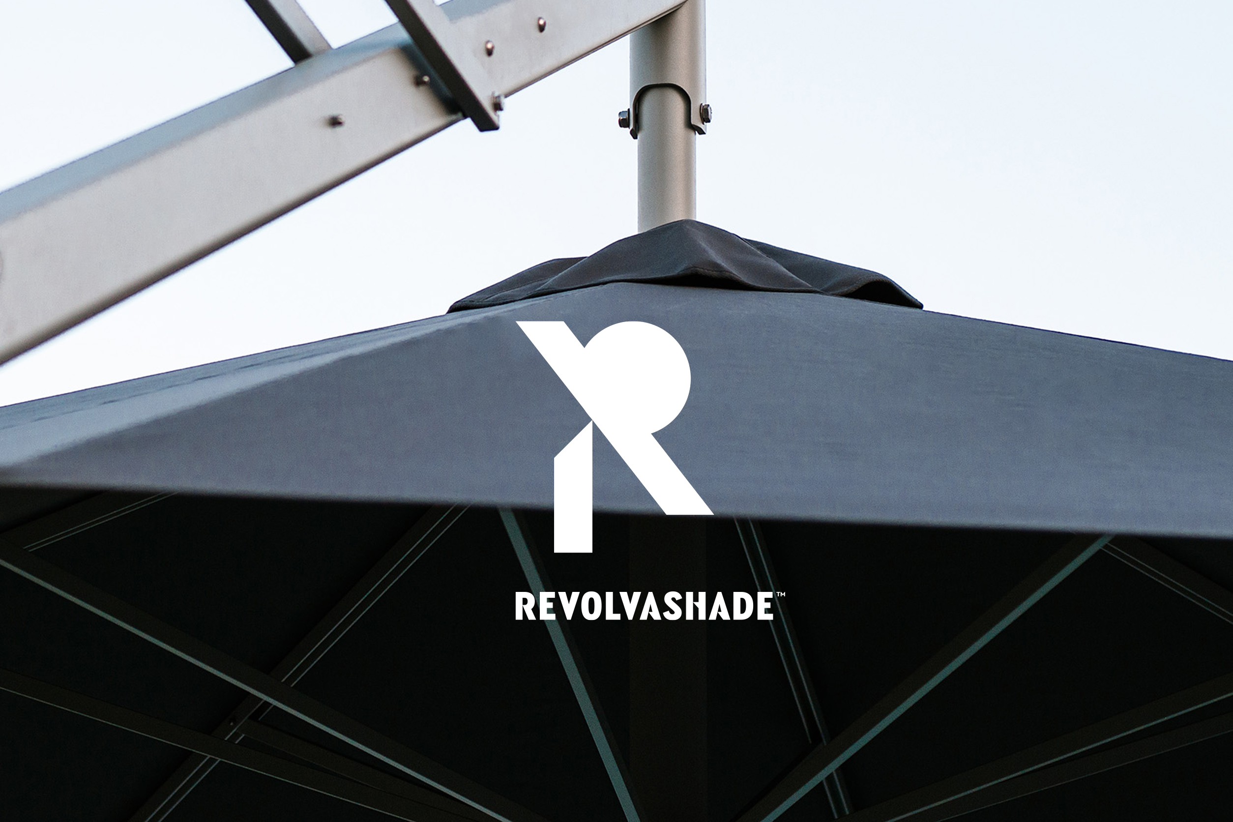
The Revolvashade brandmark is created using strong geometric shapes. The rectangular shapes represent the strong German engineered umbrella design, and the circular shape represents the sun that is 'blocked' by the umbrella. These shapes combined create a subtle unique 'R' to represent Revolvashade. The Clevershade branding uses the same 'pieces' and concept but creates a subtle 'C' to represent Clevershade.