INDIGO DESIGN WINNER 2023
INDIGO DESIGN WINNER 2023
INDIGO DESIGN WINNER 2023
INDIGO DESIGN WINNER 2023
INDIGO DESIGN WINNER 2023
INDIGO DESIGN WINNER 2023
INDIGO DESIGN WINNER 2023
INDIGO DESIGN WINNER 2023
Wilsafe Systems
/by Superminted Pte Ltd

2023 Agency Winner
Bronze Winner in Branding for Services - Other
Created by:
Lead Designer
Rachel Han
Design Company
Superminted Pte Ltd
Design Team
Superminted
Description
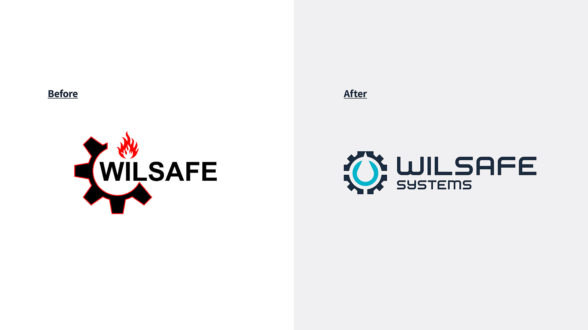
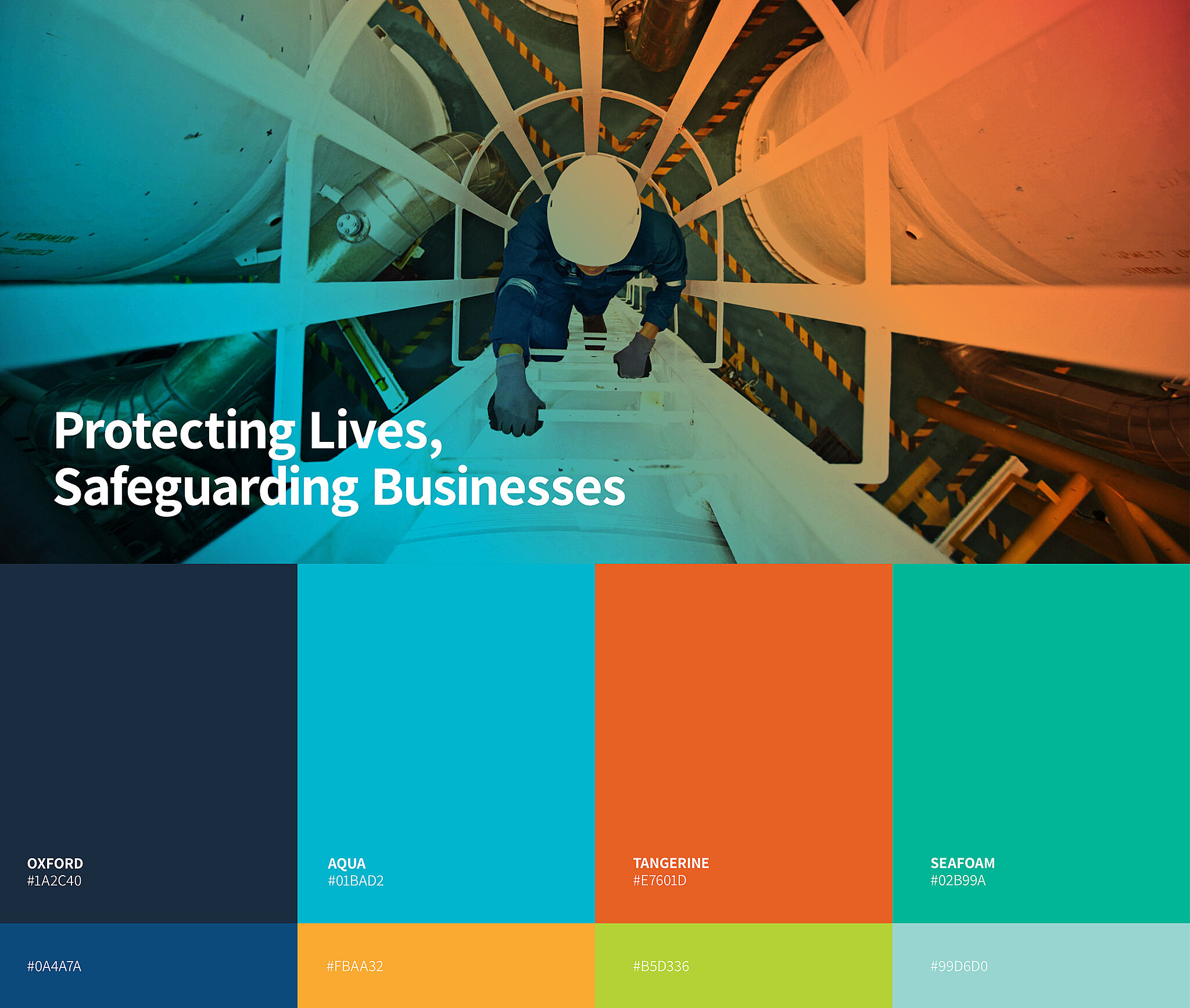
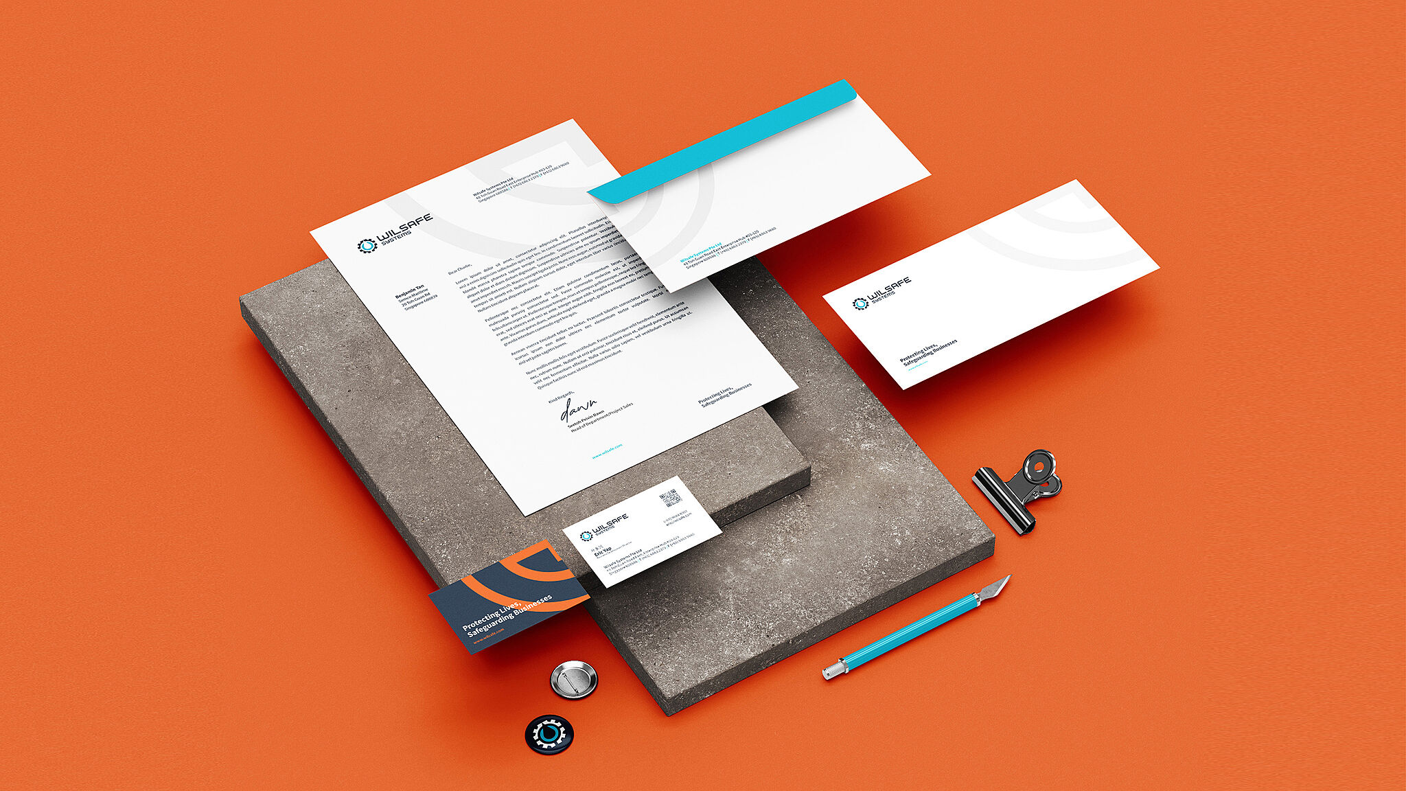
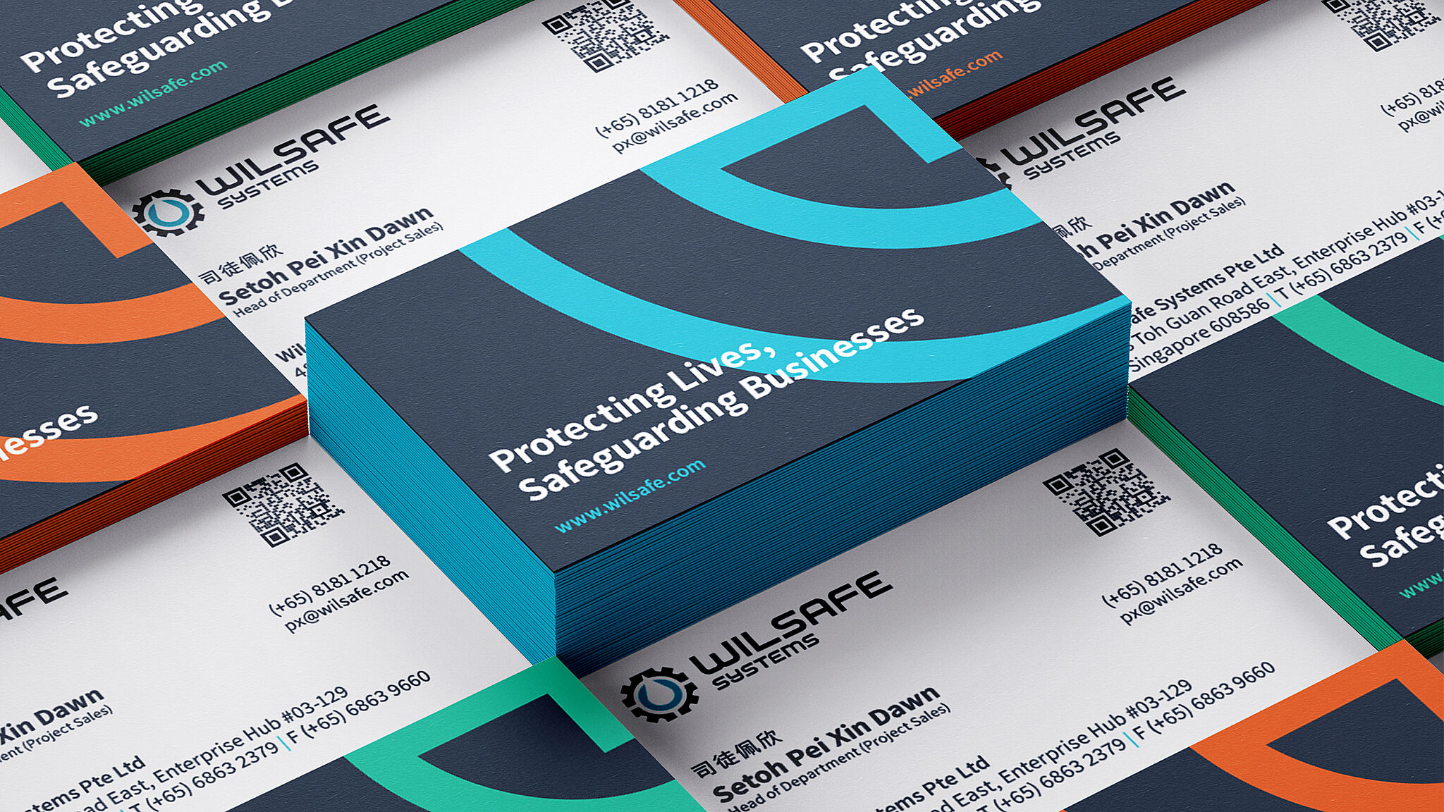
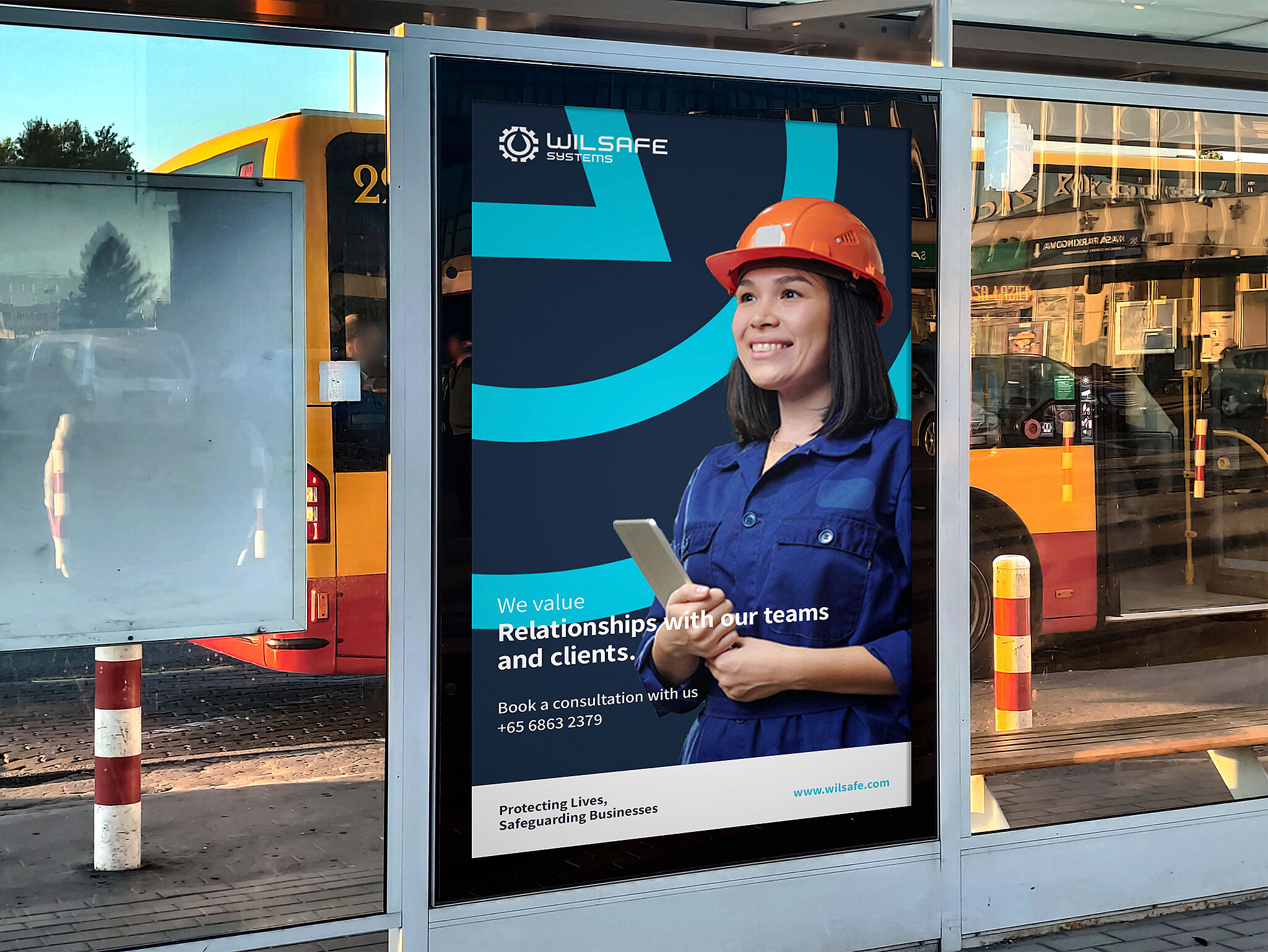
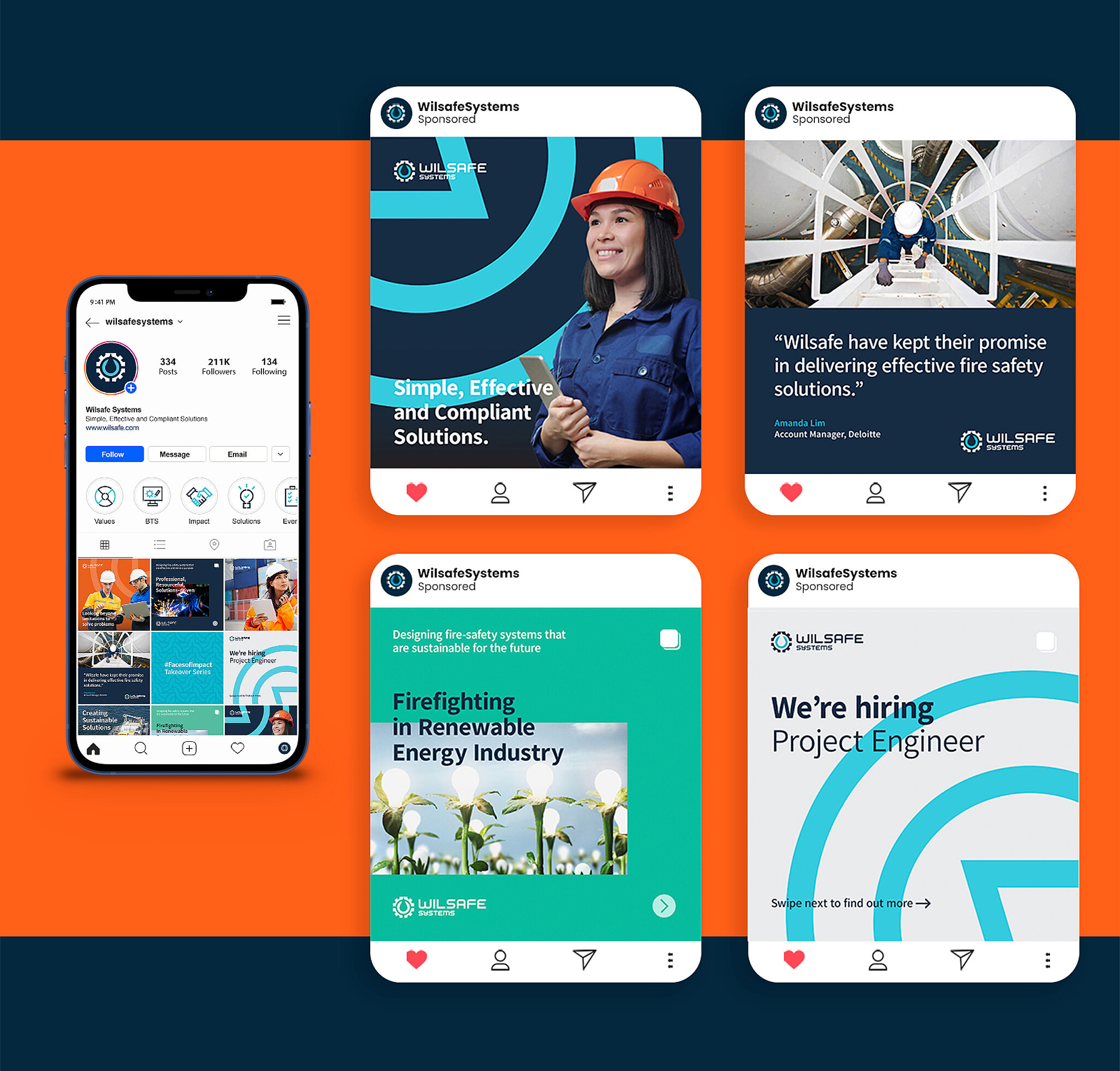
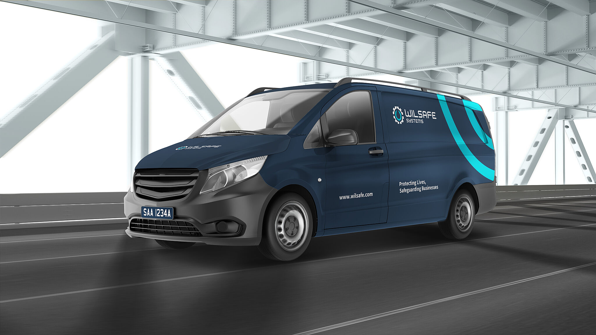
About Wilsafe Systems Protecting Lives, Safeguarding Businesses Wilsafe Systems is a company that provides full solution fire-fighting system for marine & offshore industries. The creative direction is centred around the the idea of Wilsafe being a fire fighting guardian, safeguarding lives and properties on board vessels. It speaks about Wilsafe being your reliable partner, providing effective and simple compliant fire safety solutions. Challenges: 1) Establishing a unique brand look and voice without deviating too far from their previous logo 2) Positioning Wilsafe on a global scale 3) Differentiating Wilsafe from its competitors. Solutions: We conducted a brand audit and strategy session with their current branding and marketing efforts and highlighted areas of gaps and improvements. With these findings in mind, we have identified a core purpose, vision and mission statement that positions Wilsafe on a more competitive advantage in the market. Brand Visual Development Working in close collaboration with Wilsafe team, we determined where emphasis should be placed by looking at how the organization sees itself - Resourceful and Solutions-driven. Inspired by Wilsafe focus on fire-safety systems, the new symbol captures the interplay of the gear and water coming together in one unity. The gears suggests multiple systems working in tandem, and signal the ideas of movement, connection and progress. Additionally, it forms the silhouette of water element which symbolizes the nature of the fire-fighting business. Photography is scaled to show either macro areas of vessels and human action. Showing people and environment was a key photographic consideration, as Wilsafe also supports the communities that rely on natural resources. Wilsafe uses a mix of vibrant palette allowing the brand to sit comfortably within the marine engineering space. The colour blue supports enabling values such as trusts, support and effectiveness. The palette is skewed towards blue tones to match the brand USP of supporting procurement managers and ship owners. These primary colours are also accompanied by secondary palette which can be implemented into Wilsafe’s future services. We also developed a bespoke iconography set and brand expression and patterns to further elevate its brand recall. Conclusion: This new identity brought global awareness to the brand’s universe and communicates the importance of providing simple and compliant solutions to relevant stakeholders. With an established brand that clearly represents its purpose, this project keeps gaining credibility and more supporters and partners. As a result, Wilsafe can now improve its operations and generate positive impact on local business and the whole community.