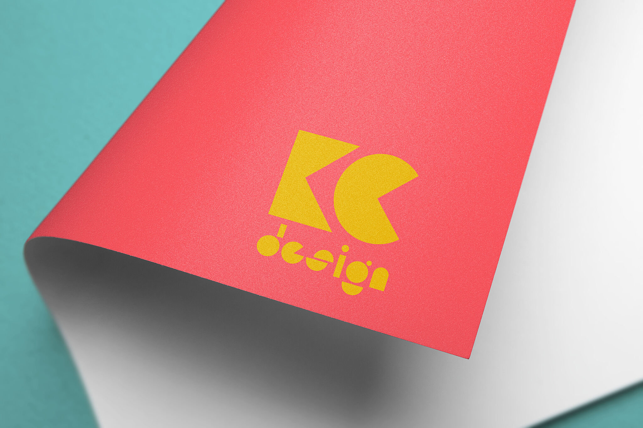
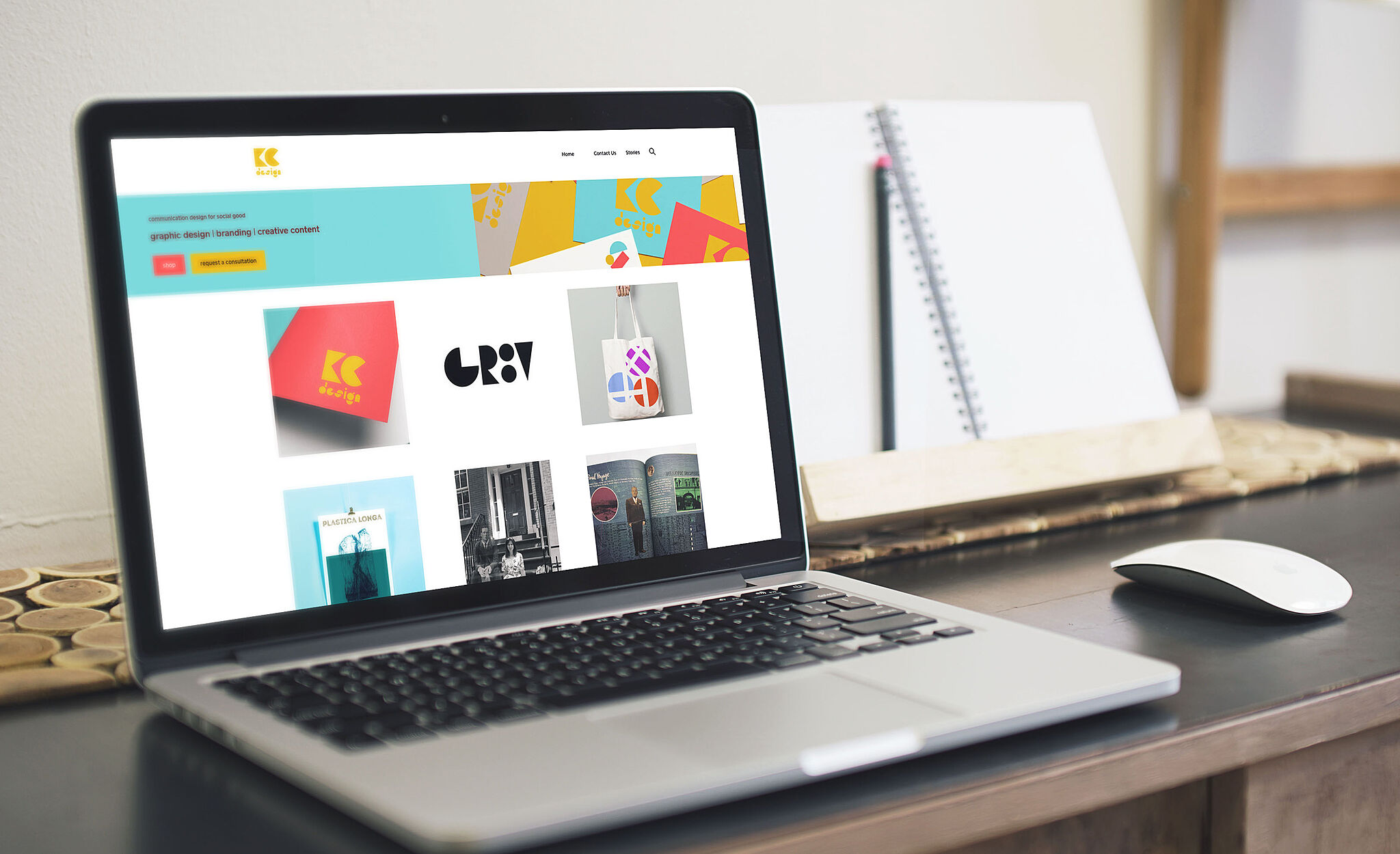
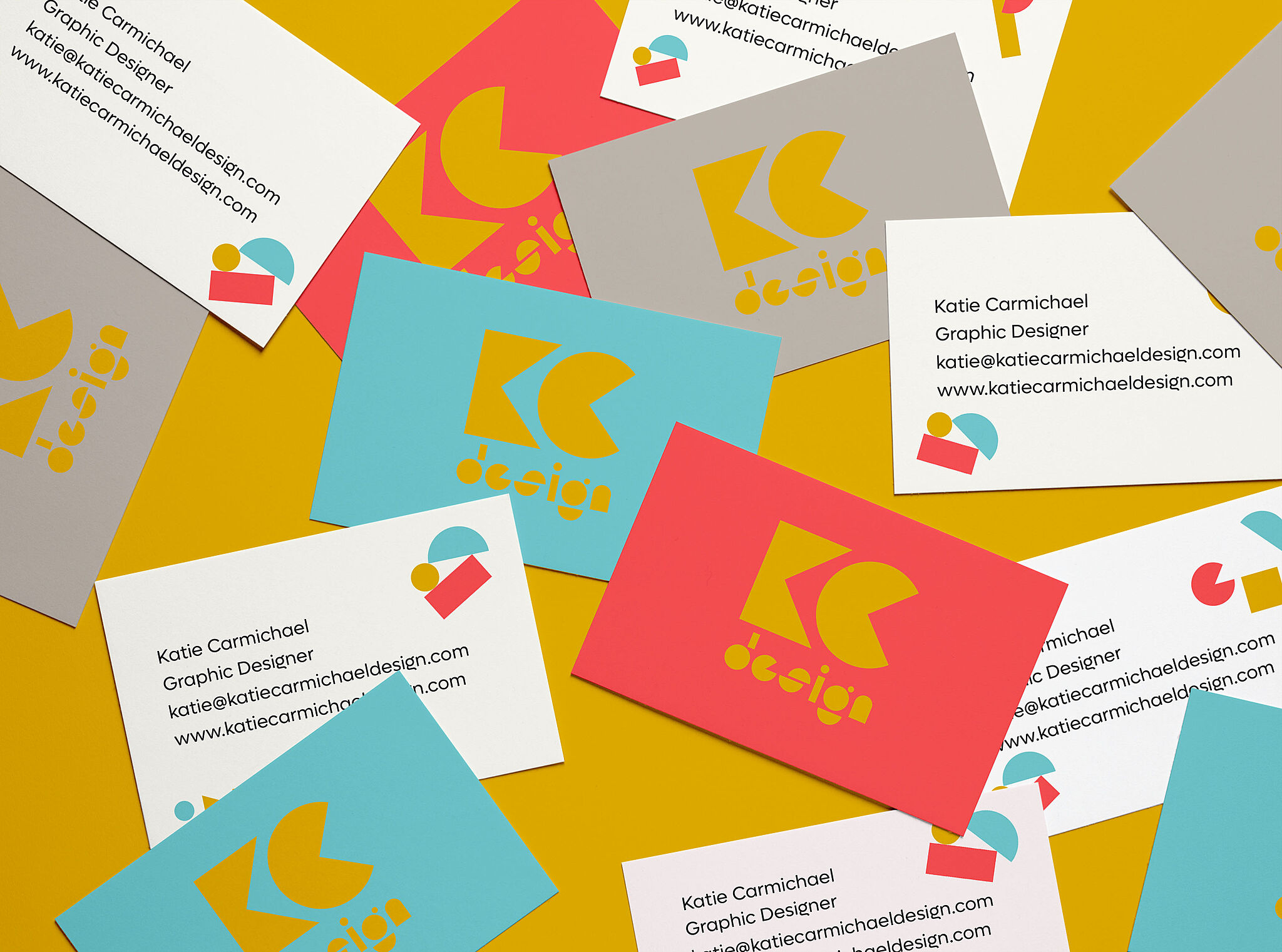
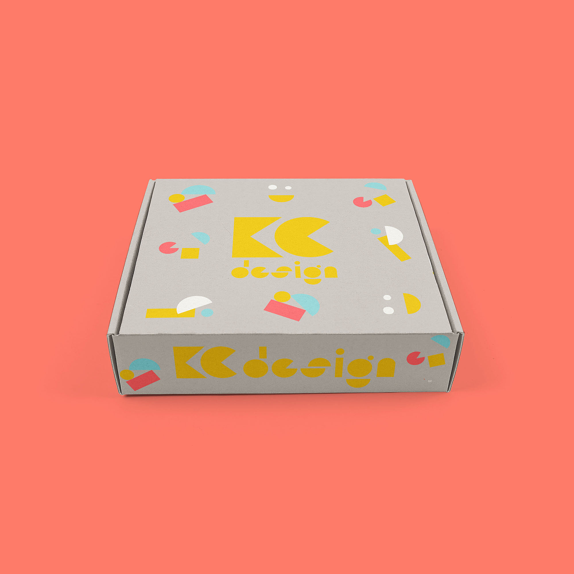
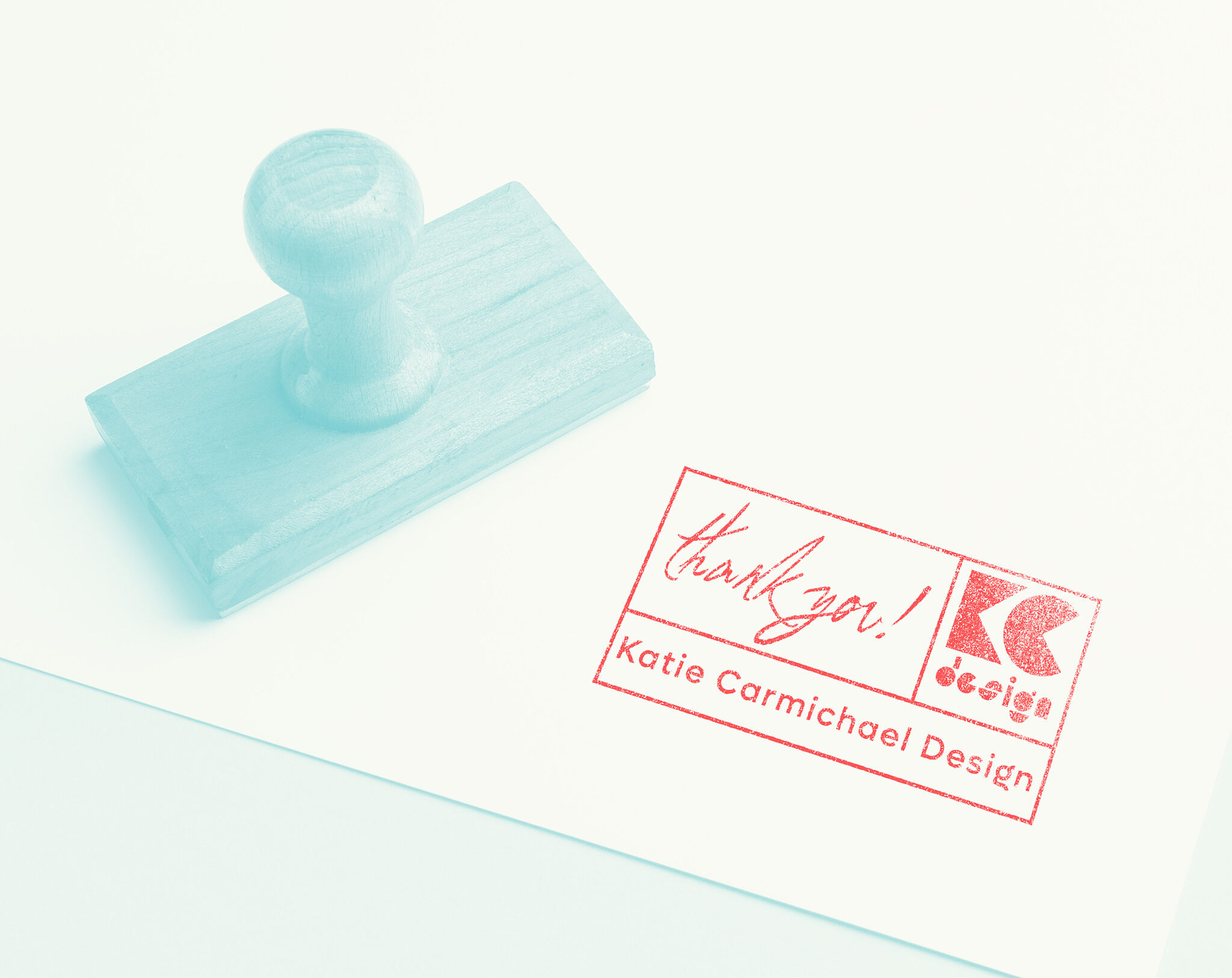
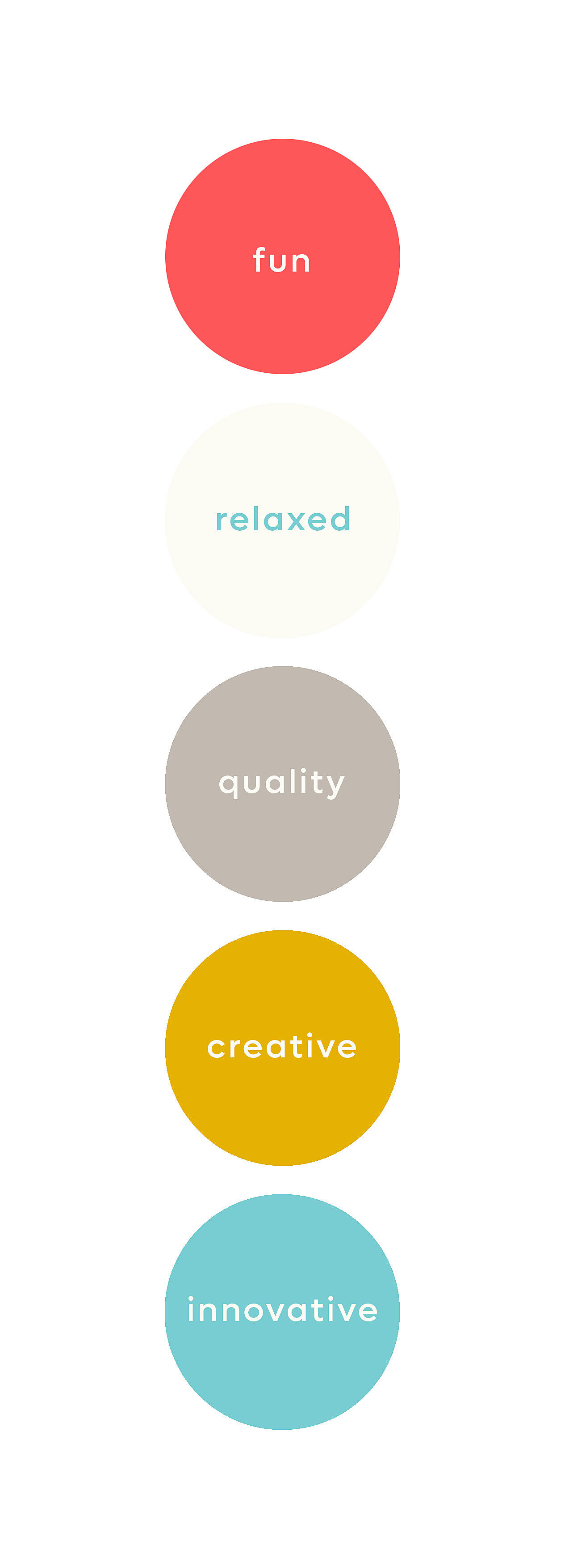
Katie Carmichael Design's new branding reflects the ethos and values of a micro-business which focusses on design for social good, non-profit and creative education projects.
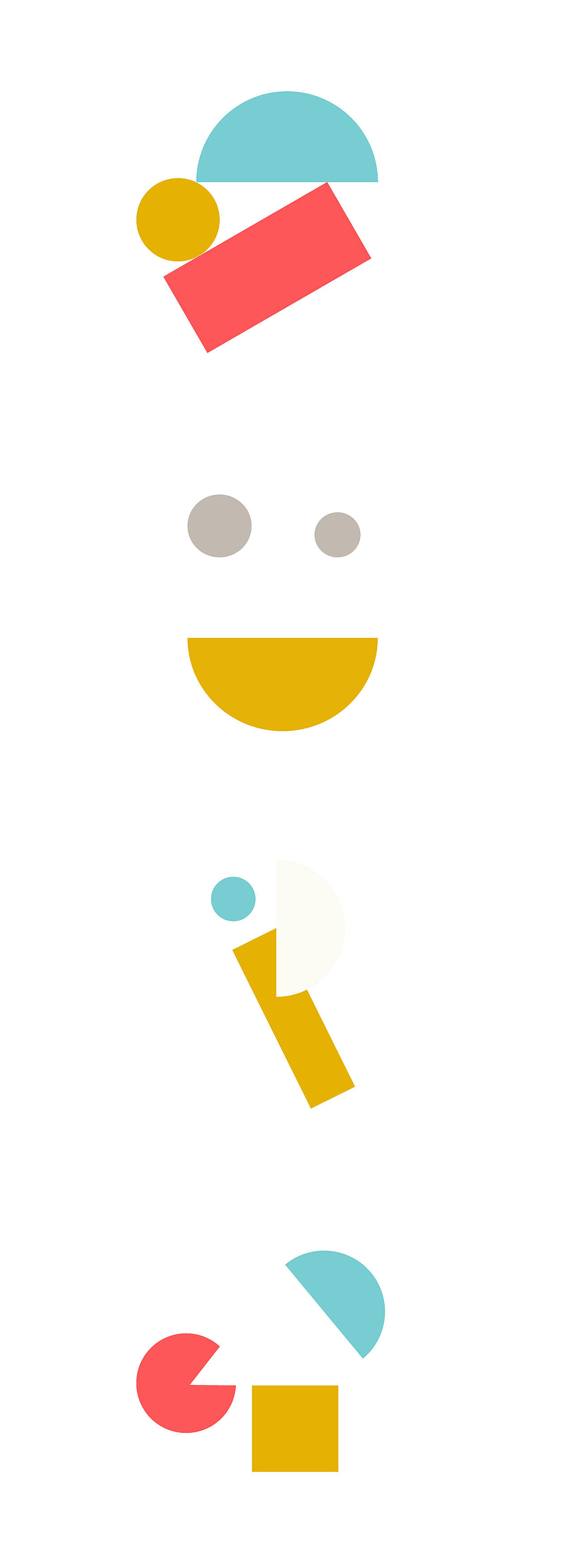
The fresh new geometric logo, its deconstructed motifs and overall light-hearted palette are inspired by design principles, the psychology of learning, gestalt theory and the Bauhaus, with an injection of fun.
As a designer with a career in education, I wanted my new branding to reflect my work, interests and approaches.
Designed on a grid but breaking the frame, the new logo design is a nod to graphic designers' sense of antagonism between following and breaking the rules; promoting the maverick and fun ethos of my approach to solving a design problem. The palette is friendly and unthreatening, designed to make the business approachable to potential commissioners and collaborators.
Influences include Bruno Munari, the Bauhaus, and my own teacher, Dave Cawthorn, who taught me that good design isn't about how much you can add on, but how much you can take away.