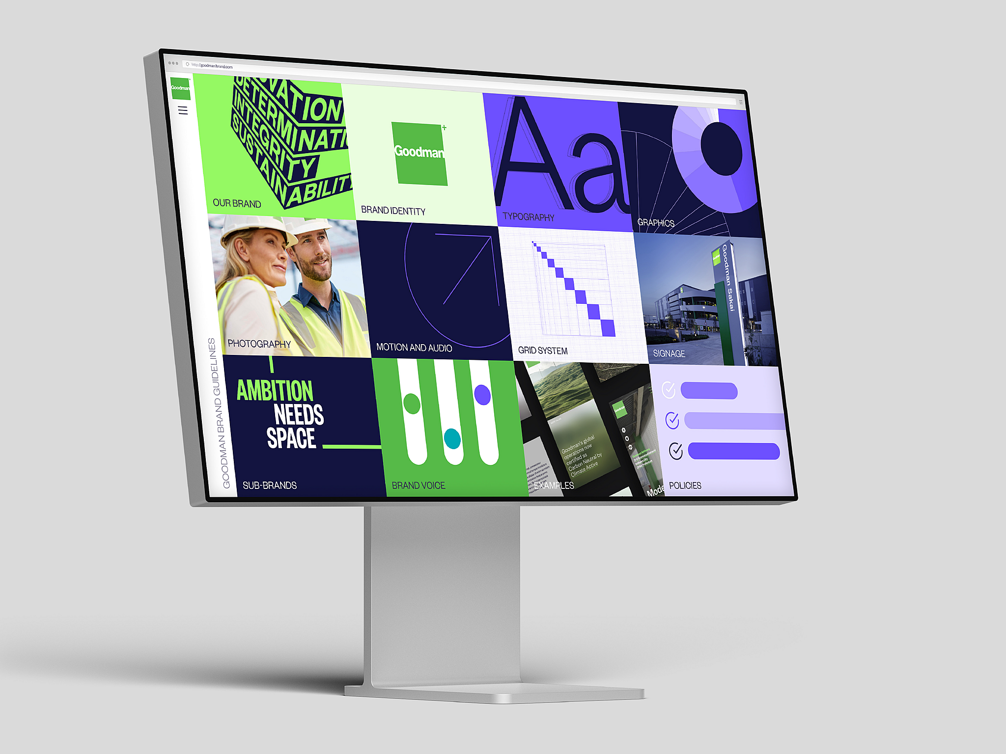
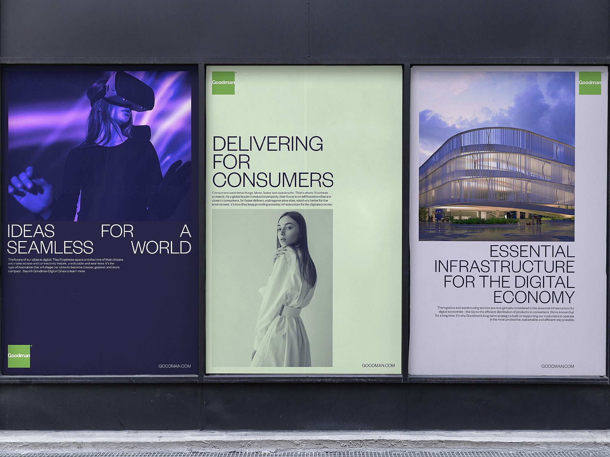
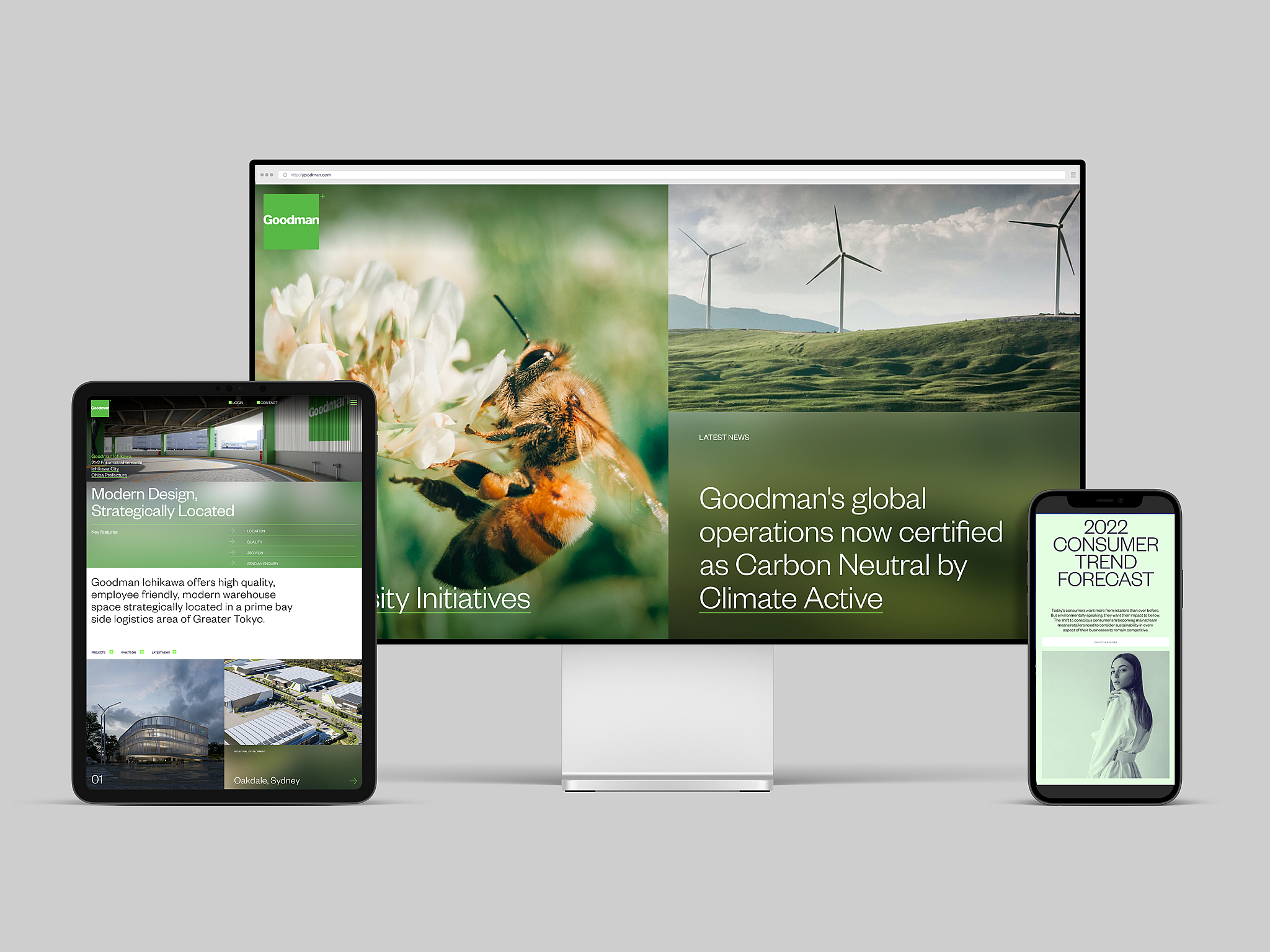
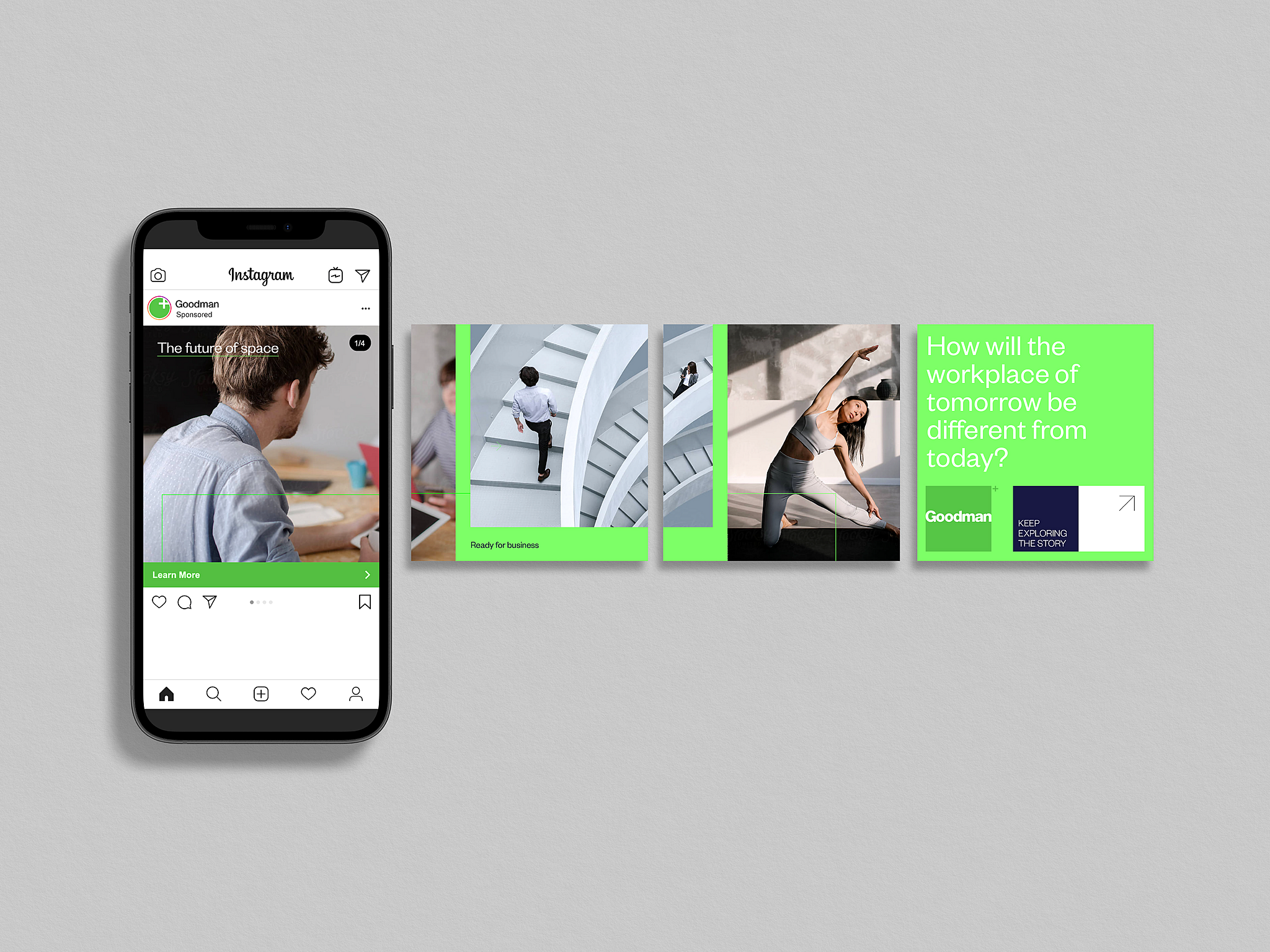
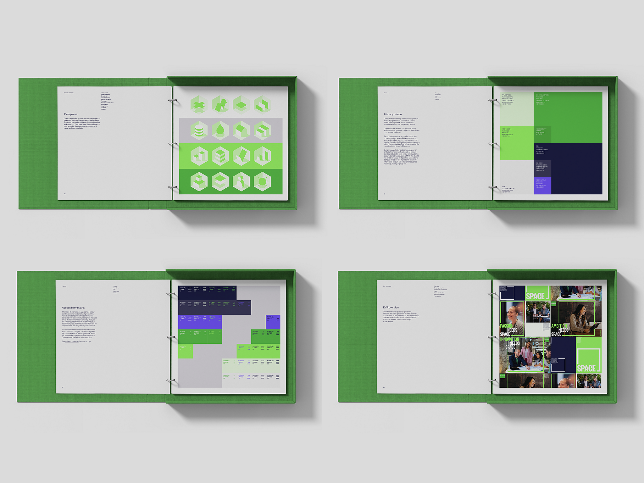
BRIEF: As a global leader in the industrial property space, Goodman is by far the most progressive in the category. Unfortunately, their old brand wasn’t conveying this. Our task was to update the brand to reflect the contemporary, innovative, and digital nature of their business. The work needed to be strong enough to set them apart, but flexible enough to take them into the future. Except for the Goodman logo, our brief was open.
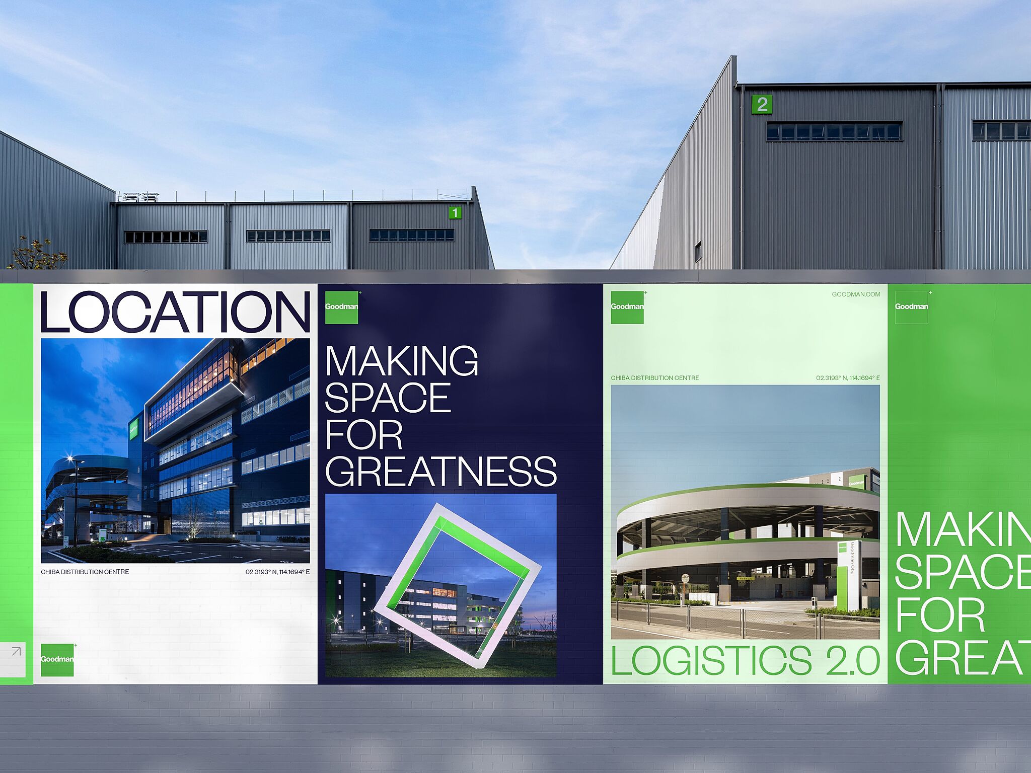
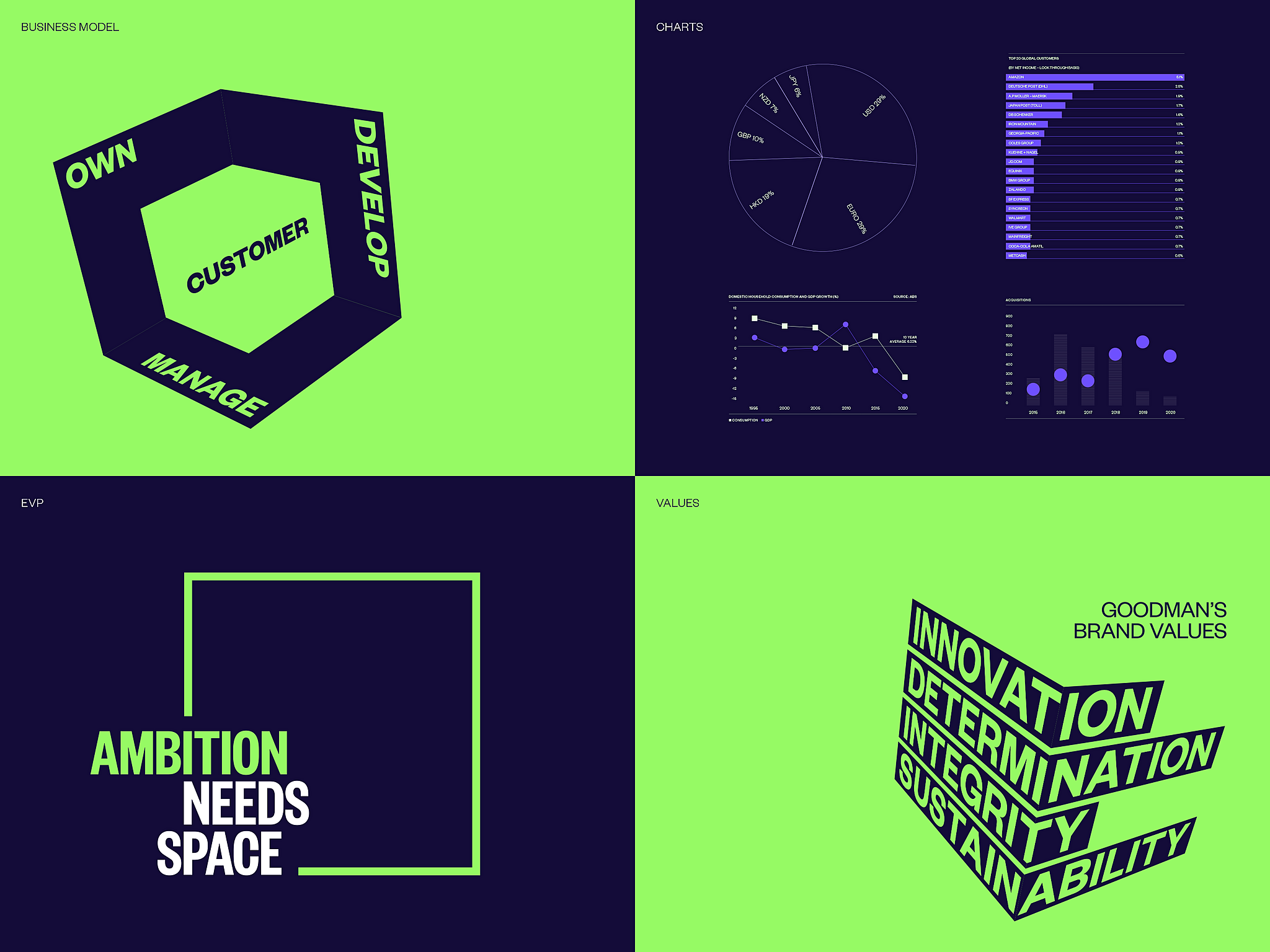
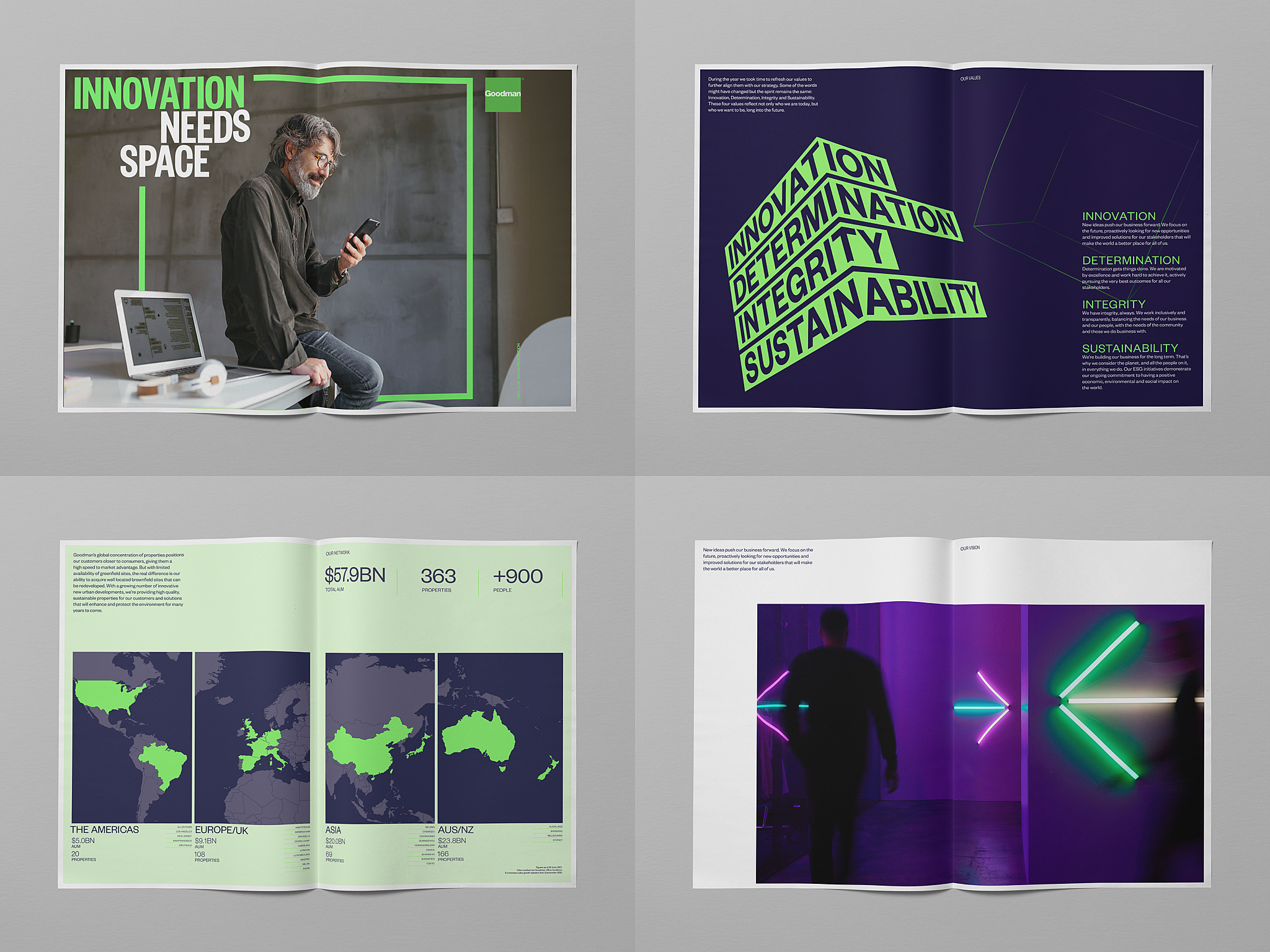
SOLUTION: The visual principles we developed are an intentional echo of patterns and systems commonly seen throughout warehousing and logistics industries. Visual elements are tightly packed but balanced with generous space. Movements are deliberate and precise. Our tone is clear and confident and our mindset is future-focussed. We contemporized Goodman’s brand green with the addition of a digital first colour palette, developed a distinctive verbal and graphic language, and created a fresh photographic style that matched Goodman’s energy and innovative approach to logistics.