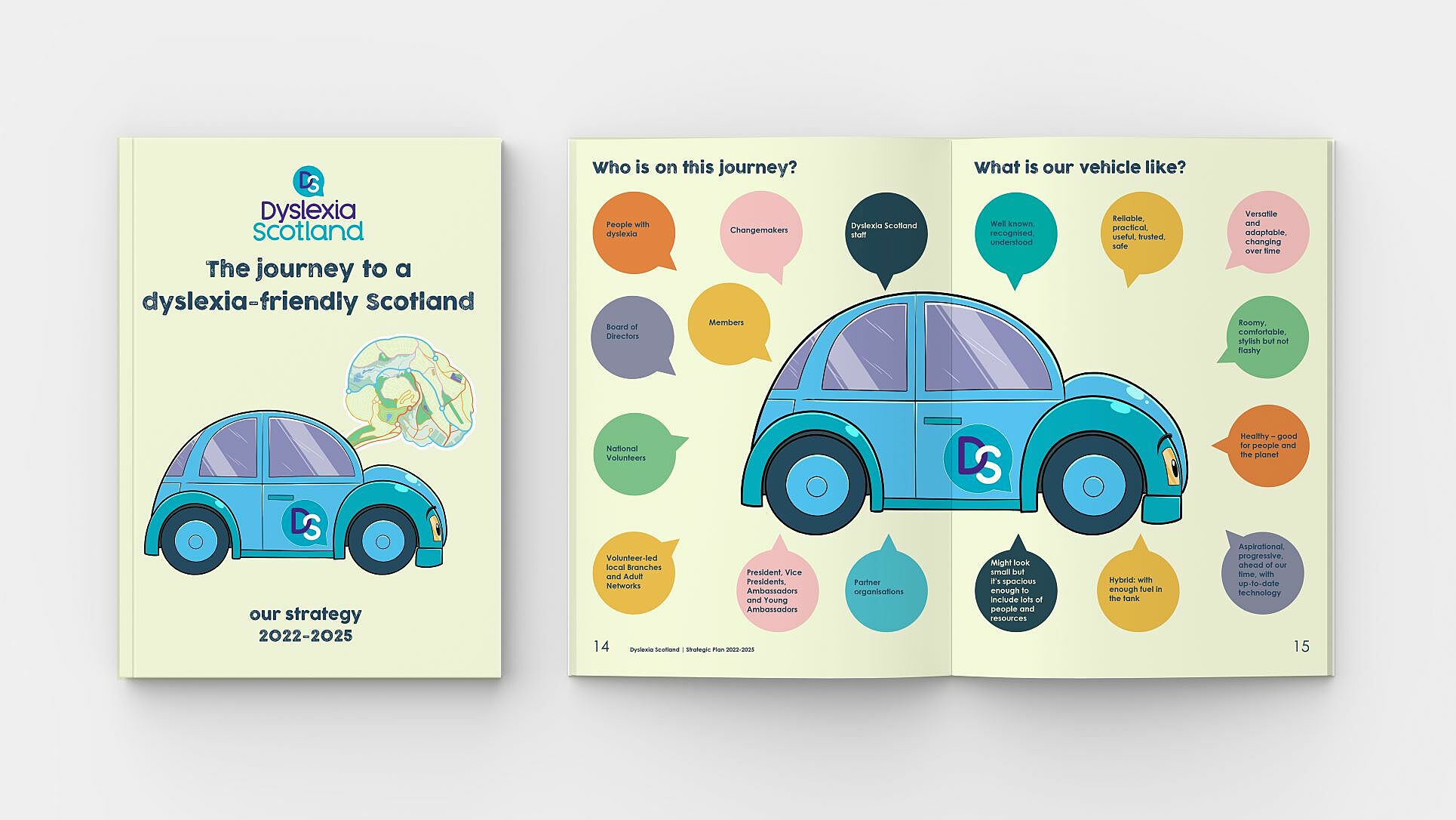
As an organisation that exists to serve both the dyslexic community and the changemakers who help promote inclusion, we know that our strategic plan has to be as accessible and engaging as possible for all-age reluctant readers right through to high-level decision makers.
The design concept builds on the metaphor of travel. Vividly portraying the organisation as a small, efficient and adaptable vehicle, the plan outlines the journey to a dyslexia-friendly nation, to make a high-level strategy more appealing and relatable to our diverse audience. The storytelling approach is embedded throughout the strategy visuals, with a map-folded summary, and a quirky video version that distill the bulk of the information into bitesize chunks.
Staying true to our principles as a dyslexia charity, we
- made the printed brochure as accessible as possible for dyslexic readers with dyslexia-friendly written formats such as rounded, sans-serif type and blue text on a cream background are used throughout
- commissioned a dyslexic illustrator to create the vehicle illustrations
- commissioned a dyslexic actor to narrate the video version
- produced the strategy in a range of formats to make the information as accessible possible for a diverse audience