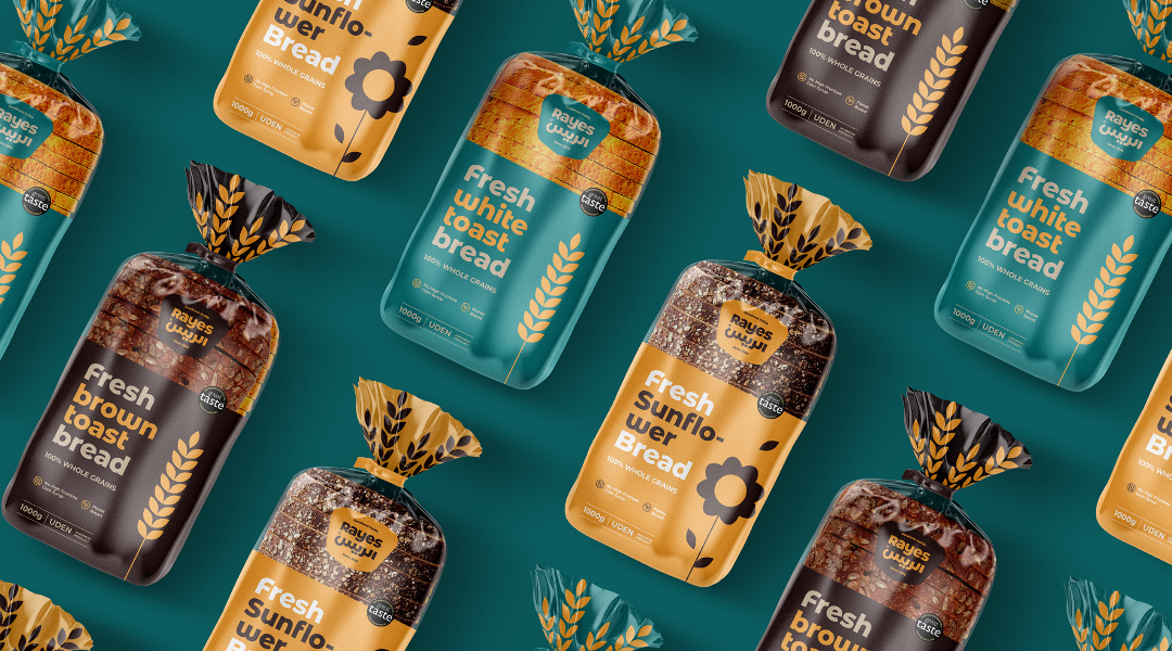
Founded in 2016, Al Rayes is a bakery that specializes in pastries, sweets, and other food products. To expand its business and offer a wider variety of food products, the company has decided to revamp its brand identity to make it more versatile, noticeable, and appealing to customers of all generations.
Our design approach was focused on creating a modern and fresh look that reflected Rayes' commitment to quality and attention to detail. We used warm and inviting colors that were both visually appealing and evocative of the bakery's delicious treats. We also created a unique logo that creatively incorporated the bakery's name, making it easily recognizable and memorable.
Goodness inside.
This positioning has a dual meaning. A feeling that you carry when you have an overwhelming desire or hunger for sweet delicacies and a feeling when you open the pack to find delicious treats that you can't resist. Goodness is a feeling of joy that triggers all your sensations for the consumption of the products. Therefore, it denotes a perfect blend of physical and spiritual enrichment.