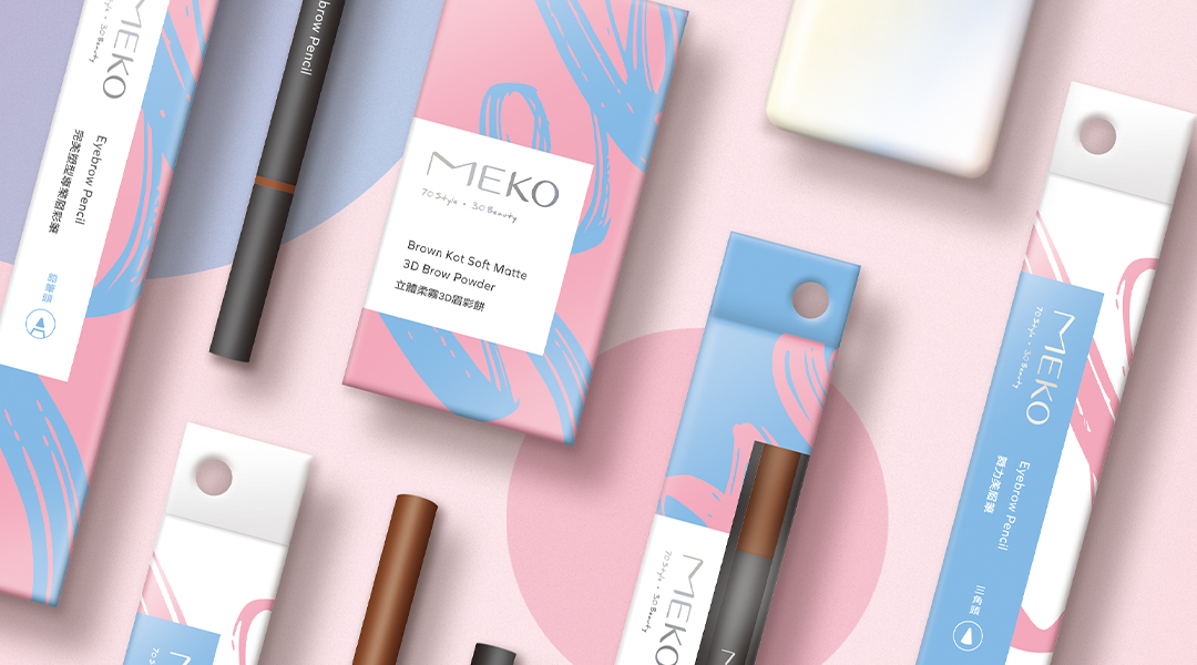
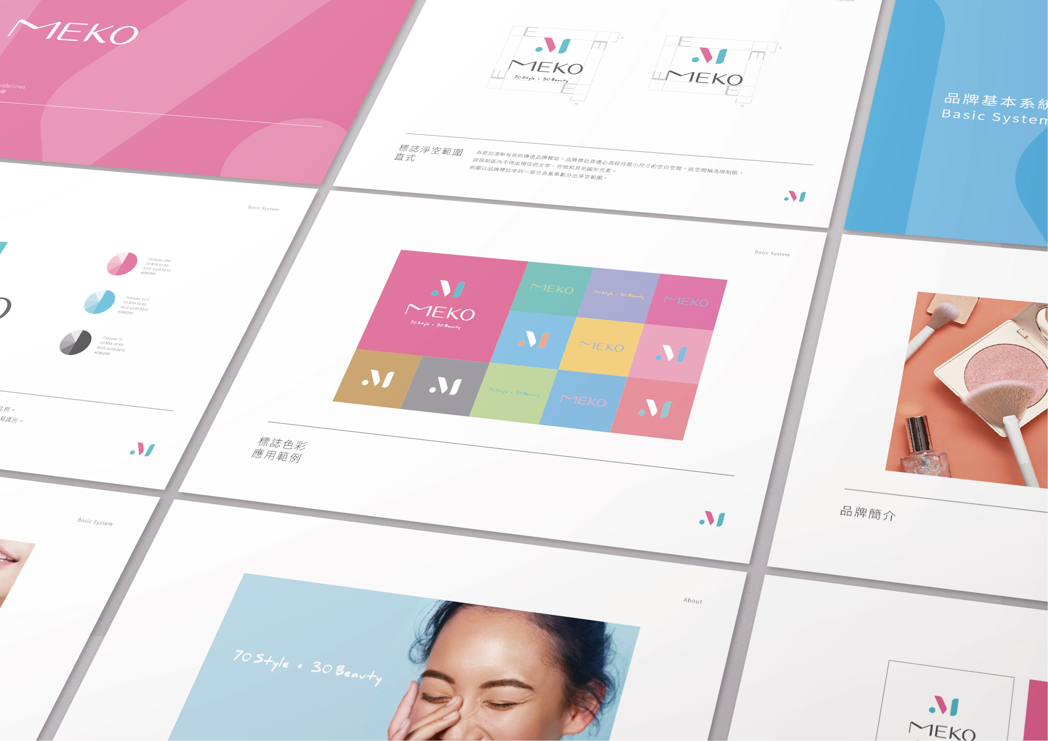
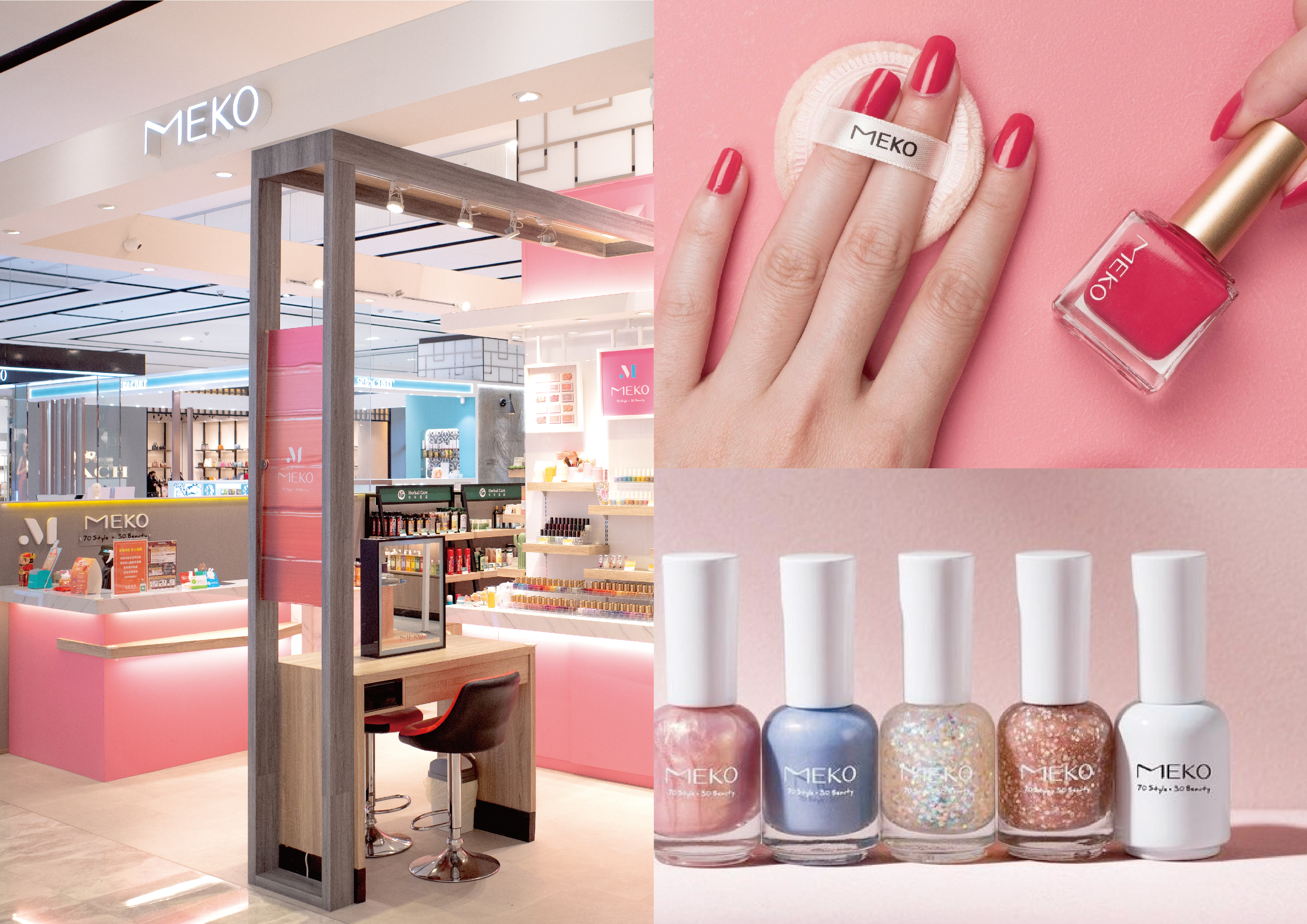
The MEKO brand has carved out a niche for itself in Taiwan over the past 20 years with beauty products, but the brand's personality is not clear. There was still room for improvement within the overall degree of sophistication. In 2019, the owner decided to refocus the positioning and integrate the brand image.
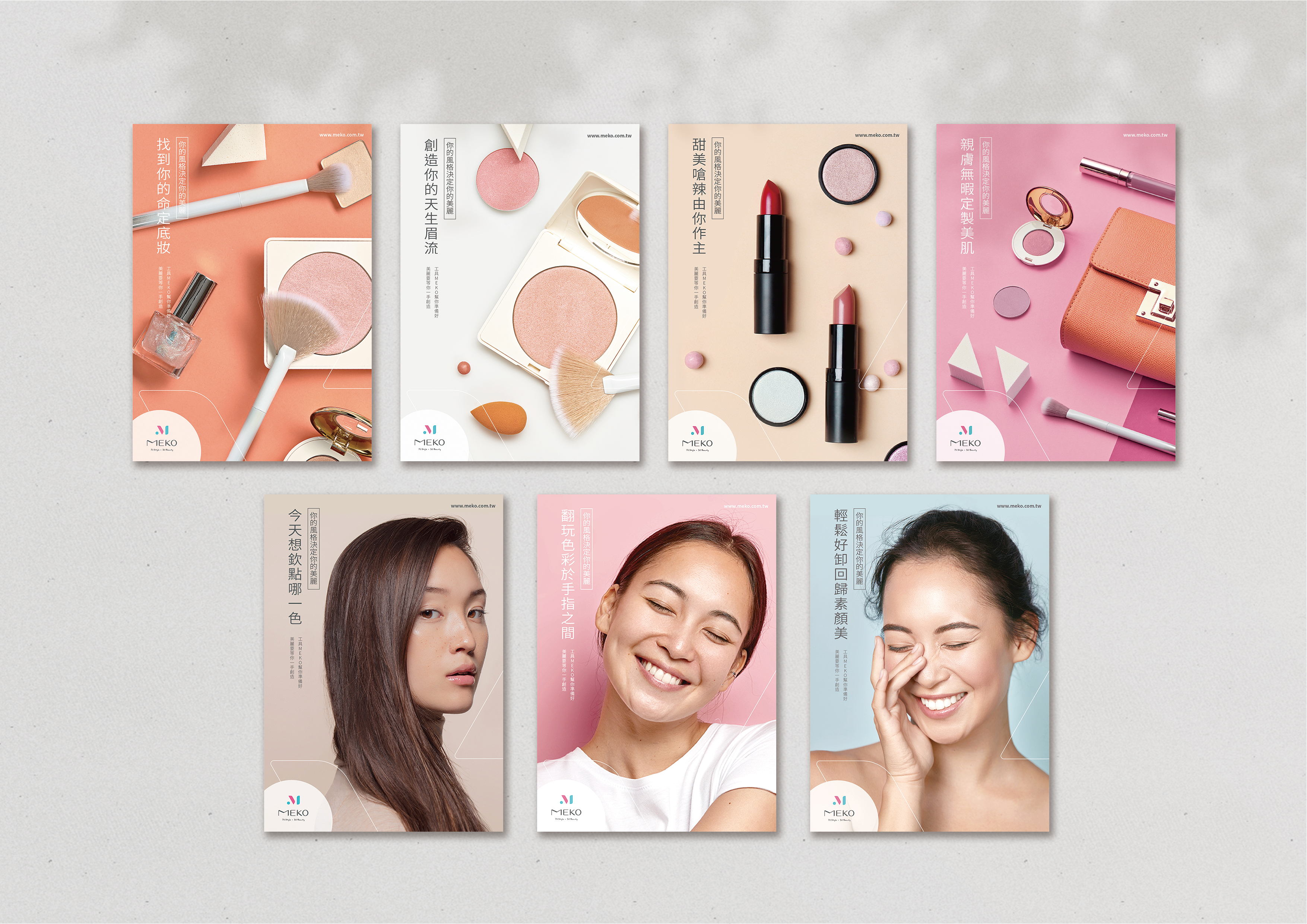
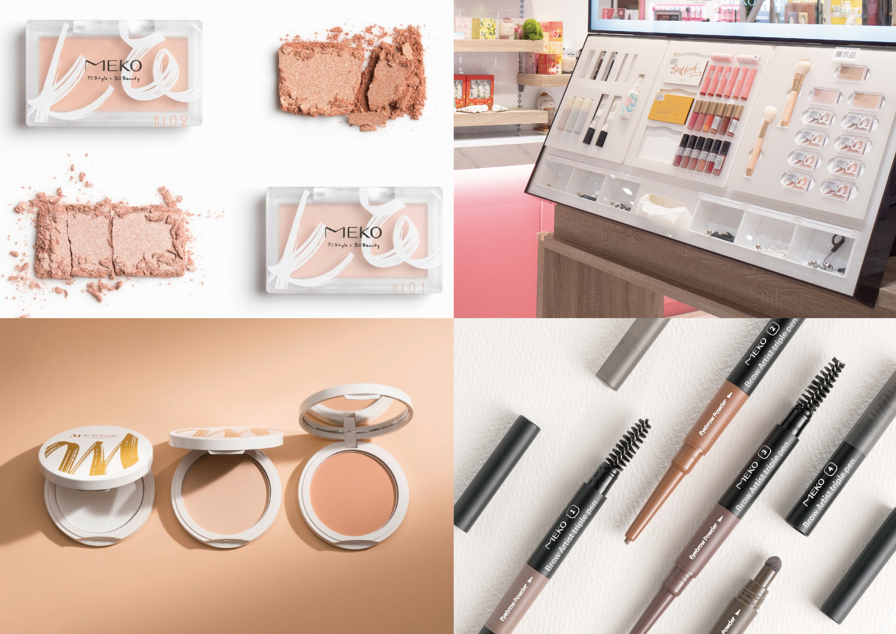
With''Min'' (a sense of exclusivity),''Easy''(easy to get started),''Key'' (critical), and''Obsession''(addiction to ownership) as the brand positioning, we hope to deliver high-quality cosmetic products and youthful vibes. The brand tagline''70% style 30%beauty''expresses how, with 70% MEKO cosmetic products and 30% natural beauty,every girl is 100% unique.
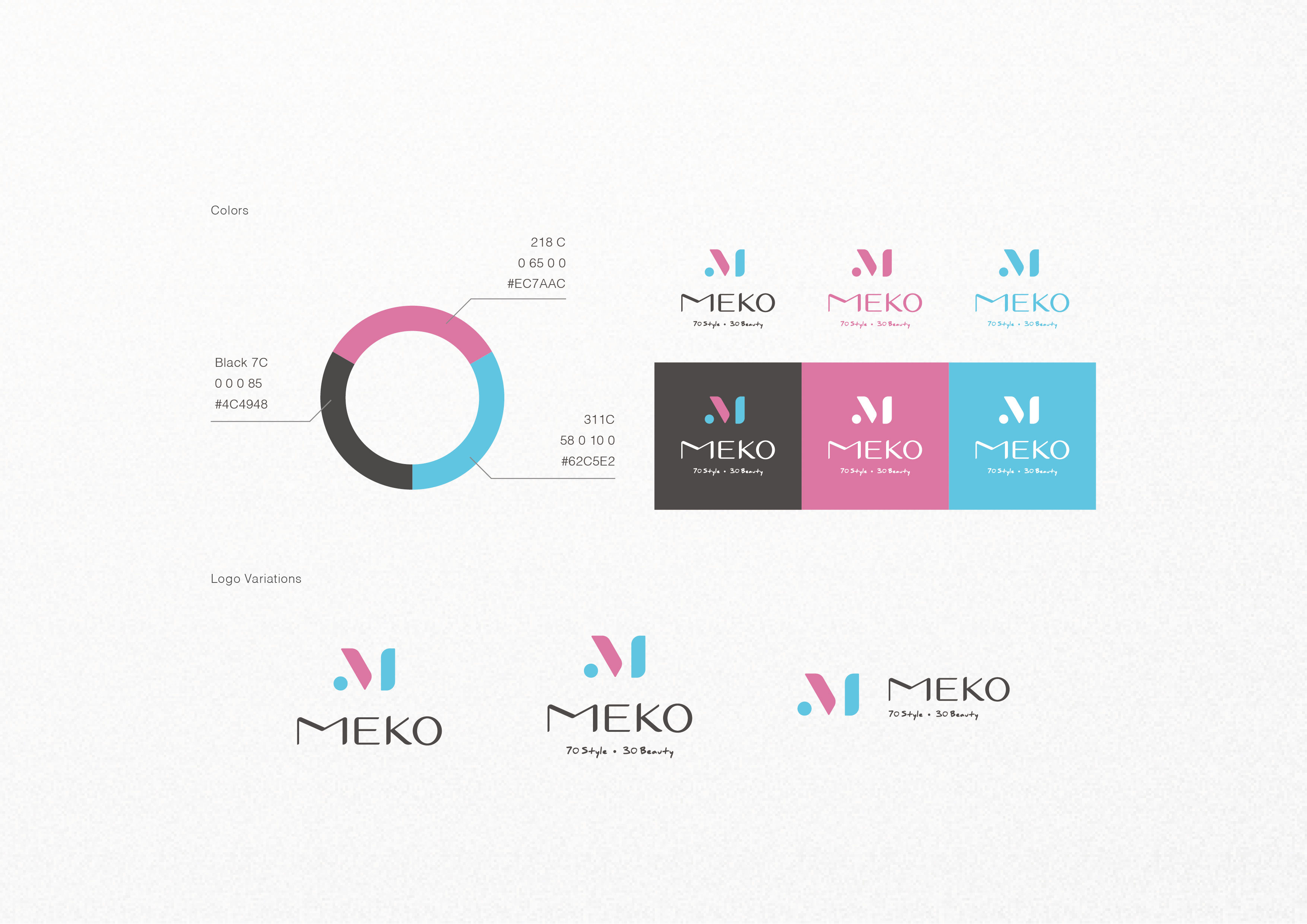
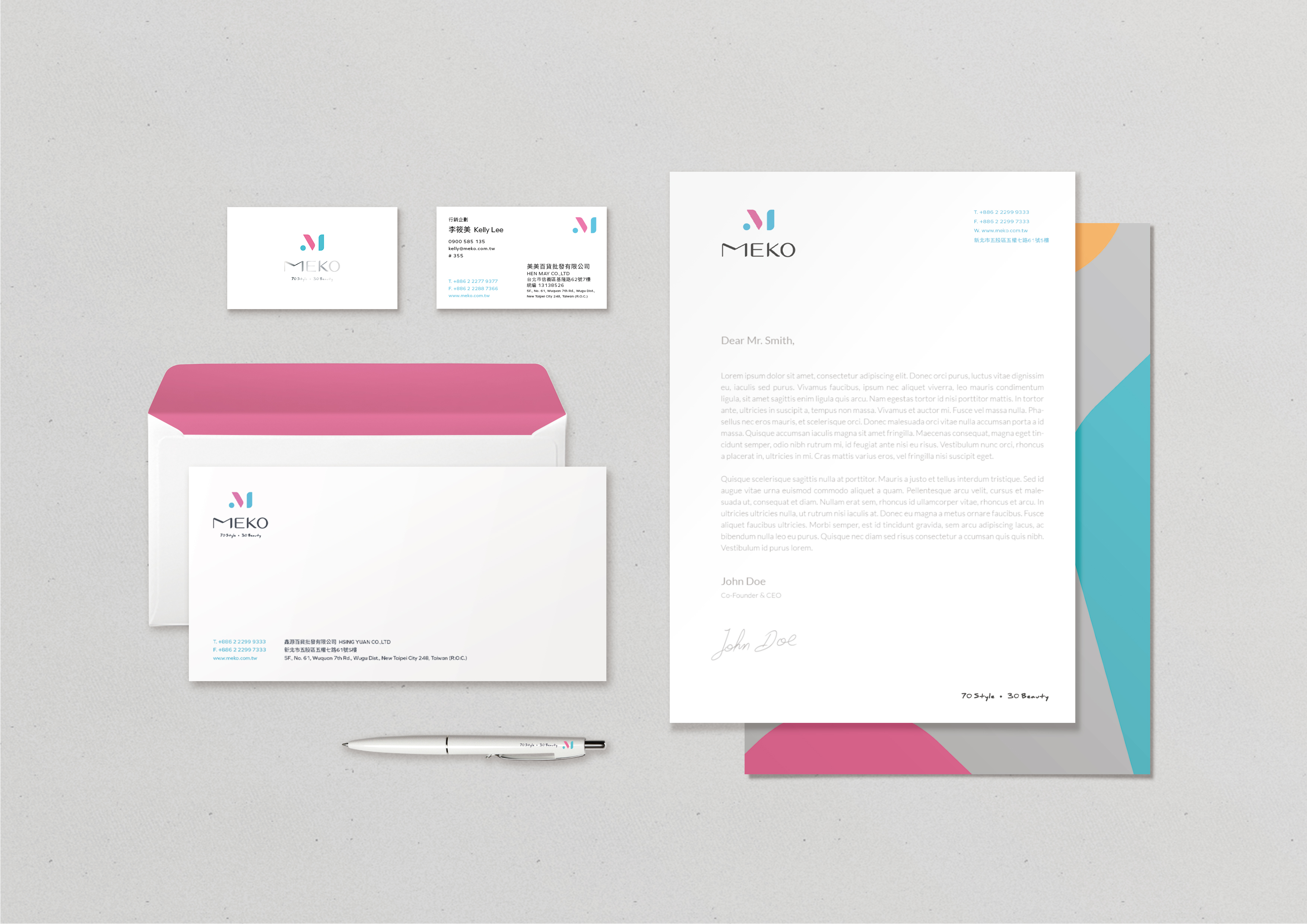
The logo design is made up of lightly layered lines that convey the easygoing quality of the brand. The proportions of the ''M'' are slightly wide, conveying the brand's true spirit of bringing both quality and innovation. To the existing pink, a trendy turquoise is added to convey the diverse makeup combinations of the MEKO brand.The dark gray represents the professional high quality of the brand's products.