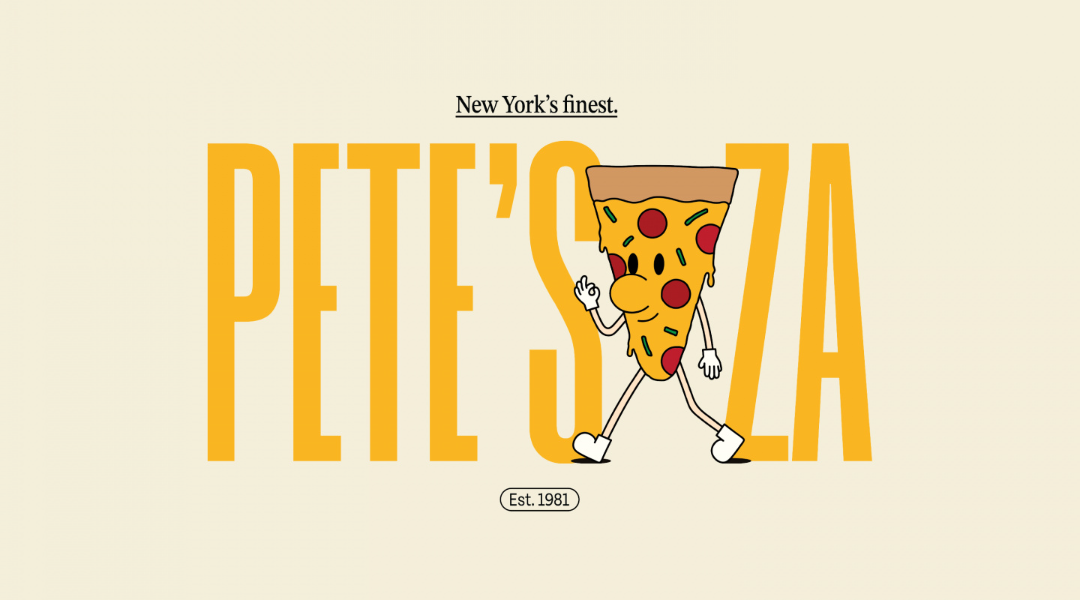
Drawing from an Italian-American heritage, "Pete's Za" offers New York-style pizza, entering the competitive arena alongside industry giants like Pizza Hut and Domino's.
During my research, I noted the prevalent use of colour in competitors' logos and branding, while their pizza box packaging tended to be relatively understated. This insight became the foundation for differentiating Pete's Za as a unique brand.
In response to my findings, I opted for a vibrant yellow hue, employed a condensed typeface for the logo, and introduced an illustrated mascot named Little Pete. Serving as the "face to the name," Little Pete fosters a warm and friendly connection with customers, setting Pete's Za apart in its sector.
These distinctive elements were seamlessly integrated into the packaging design for Pete's Za's pizza boxes and the menu. The result is a memorable brand that exudes friendliness and individuality, all while reflecting its New York origins.