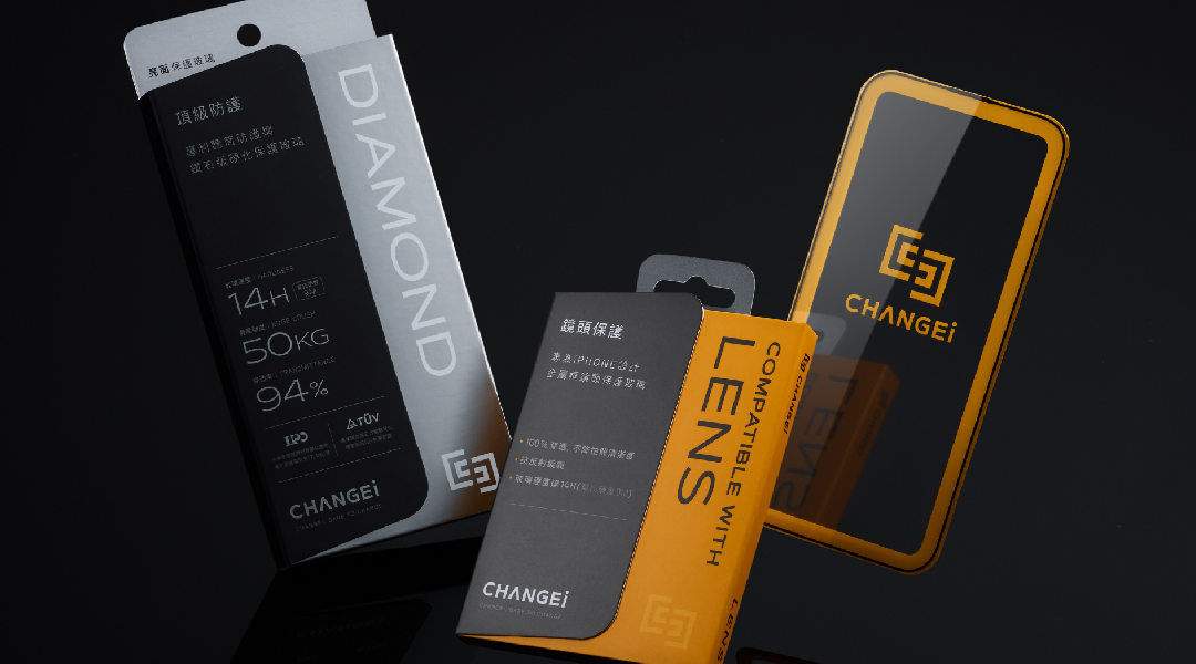
CHANGEi specializes in the research and manufacturing of glass protectors, offering high-quality solutions for mobile and tablet users with different functional demands.
The new brand identity and packaging design aim to create a distinct symbol consolidating its fragmented and inconsistent brand image while differentiating from competitors in the market.
In the market of 3C accessories, most designs have been primarily focused on sales-driven approaches. In CHANGEi, we create an identification system that can clearly communicate the brand advantages and unique selling points to consumers.
We use a door as the core visual concept to present "CHANGEi," symbolizing consumers' willingness to open a door to the unknown and embrace the enhanced experience brought by change.
The silhouette of the door resembles a perspective view of a mobile screen, reflecting the application of our protective film products. This visual symbol is not only integrated into all packaging designs but also incorporated into the design of retail counters. The packaging upgrade not only enhances the brand's bargaining power but offers distributors a series of compelling product look.
The unique die-cut shape of protective film structure breaks away from the conventional square box design, creating a three-dimensional visual effect. Color schemes and anti-counterfeit labels are utilized to differentiate the various sizes and characteristics of product functionality.
To enrich the visual hierarchy, we employ foil stamping to present the series name and logo, creating visual interplay through the reflection of black, white, transparent foils, and light. Clear and prominent numerical information facilitates consumers in choosing the right technical specifications.