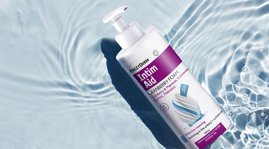
Frezyderm, one of the best Greek dermatological products companies, has been active in Greece and abroad for 37 years offering products that stand out for their innovation and quality. For the redesign of the gynecological line: Frezyderm's Feminine line a successful feminine care line, ABC Design strategically chose to retain the figurative element of the egg that was present in the original packaging design. The difference is in visualizing the egg in a more abstract form. Thus a linear spiral egg surrounded by water refers to the protection, care and sensitivity of the feminine nature. Aesthetically, you can understand the respect and expertise that the Feminine line offers to consumers. The linear egg relief on the surface of the package is covered with a local UVE gloss, while the different products of the series are characterized by a different color per package. The basic placement of the elements in the packages was kept almost as it was in the previous ones (text bars, lay out, etc.) so that you can easily connect. Fonts and design forms were adapted with small differences, thus making the transition to the new familiar visual, easily recognizable on the pharmacy shelf. Frezyderm's Feminine line came back powerfully into the lives of consumers, conquering a place in their everyday life.