Luxury Camping Brand Design In response to the resurgence of outdoor travel following the pandemic, the emergence of the "Chanshuo Woorao" camping site brand has been a notable development. The Chanshuo Group undertook the task of reimagining and reinvigorating underperforming camping sites, centering their vision around indigenous culture. The goal was to create a luxurious camping and leisure destination that seamlessly blends relaxation with nature.
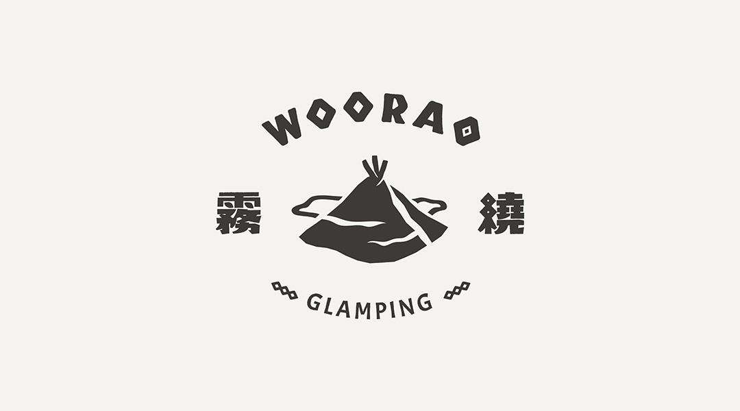
The design concept centers on "mist, nature, and relaxation," skillfully incorporating elements from Taiwan's Tayal indigenous culture to craft a profoundly soothing camping brand. The logo merges natural landscapes and tent silhouettes, evoking the untamed beauty of nature shrouded in the misty ambiance of the forest. Drawing inspiration from the Tayal cultural symbol, the "ancestral eye," a robust and powerful standard font was designed to achieve a harmonious balance between softness and strength within the brand logo.
In coloring, the inspiration is drawn from Tayal tribal clothing, cultural features, and nature itself. We selected "brown" to represent the color of wood, "red earth" to symbolize the land and vitality, "leaf green" to reflect the natural ecosystem, and "patterned black" to represent cultural significance. This combination creates an immersive experience that embodies both nature and culture.
Furthermore, the extended design elements employ carving and rugged techniques to artistically depict the traditional culinary characteristics of the Tayal indigenous culture. These include signature ingredients like garlic chives, wild boar, and bitterling fish, as well as actions like food preparation and grinding. With these elements incorporated into staff uniforms, keychains, cushions, and other brand extensions, a brand impression emphasizing experiential details and camping quality is created, inviting visitors to deeply immerse themselves in the wealth of cultural heritage and the pleasures of camping.