INDIGO DESIGN WINNER 2024
INDIGO DESIGN WINNER 2024
INDIGO DESIGN WINNER 2024
INDIGO DESIGN WINNER 2024
INDIGO DESIGN WINNER 2024
INDIGO DESIGN WINNER 2024
INDIGO DESIGN WINNER 2024
INDIGO DESIGN WINNER 2024
Branding for Stakewithus
/by Jay Chang
2024 Freelancer Winner
Gold Winner in Animation & Illustration for Websites for Digital Design
Gold Winner in Branding for Graphic Design
Silver Winner in Branding for Banking & Finances
Description
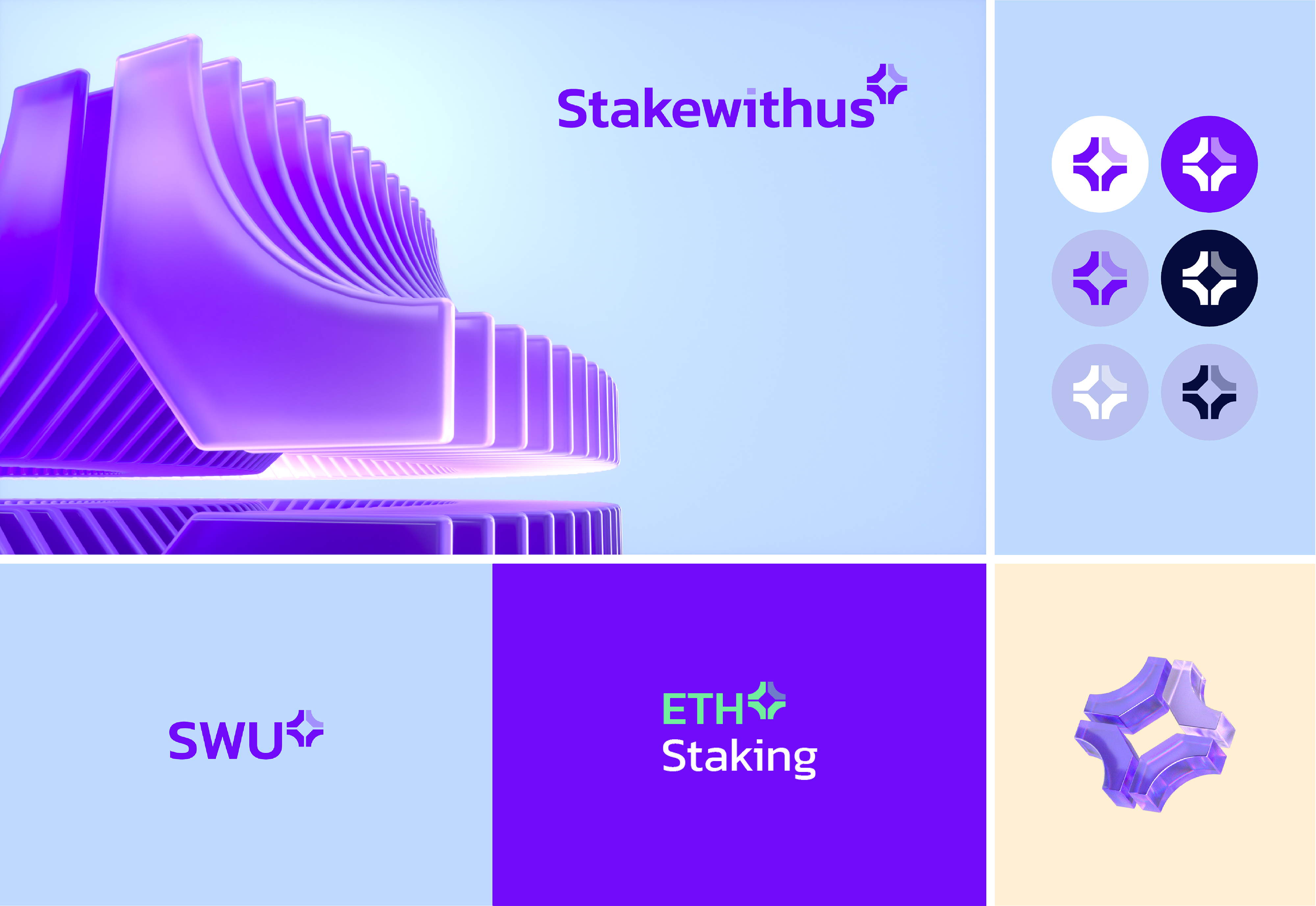
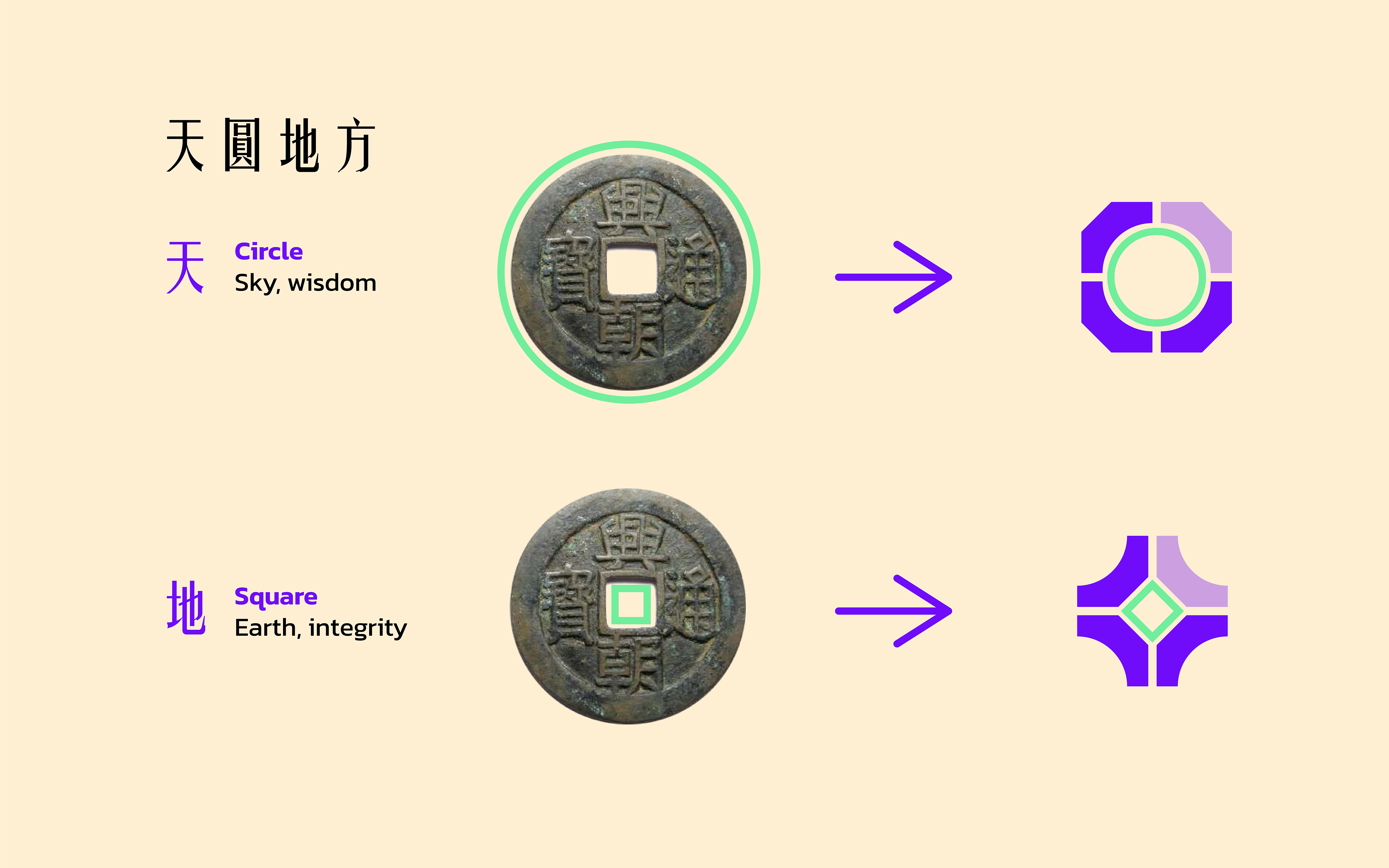
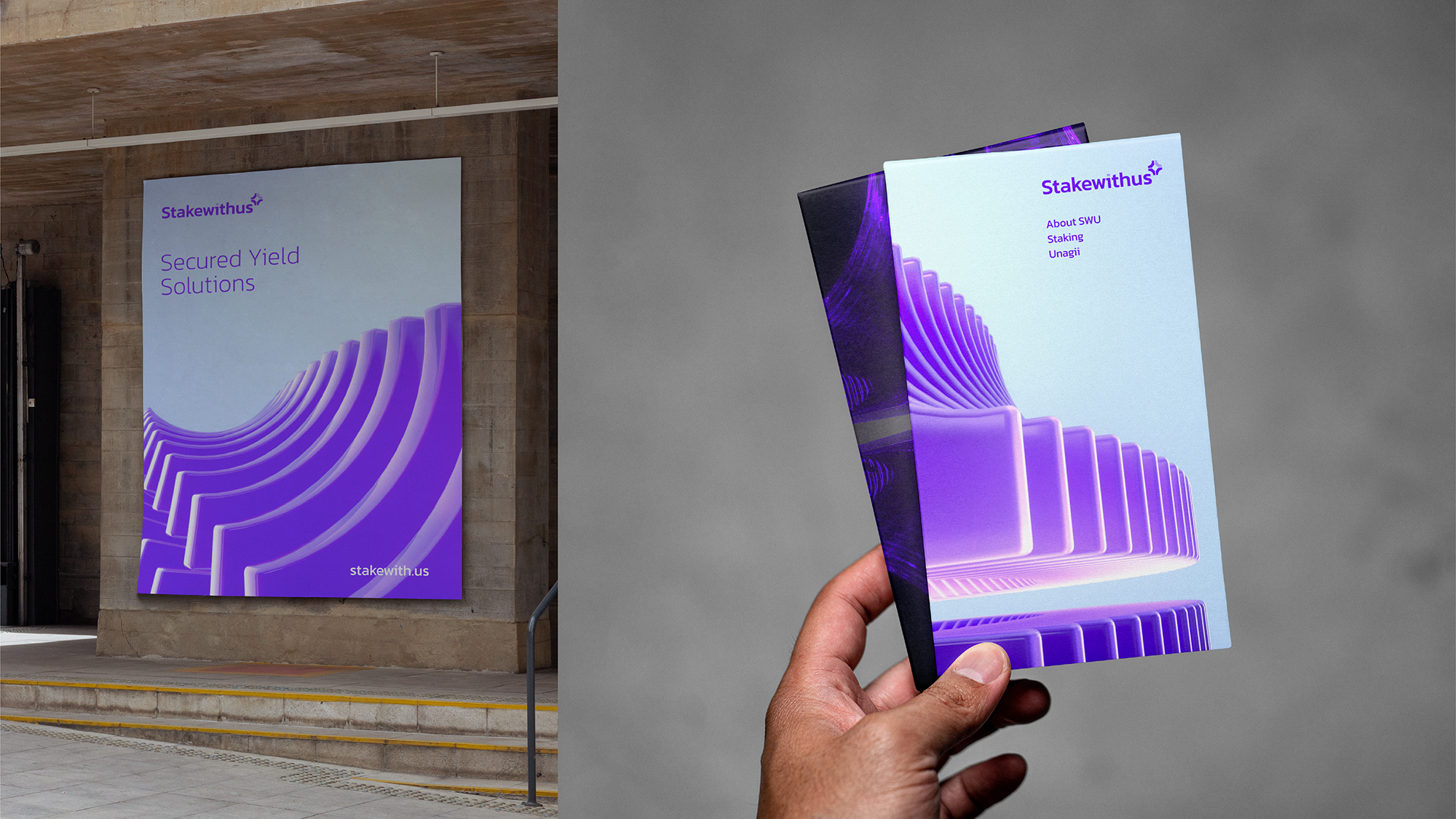
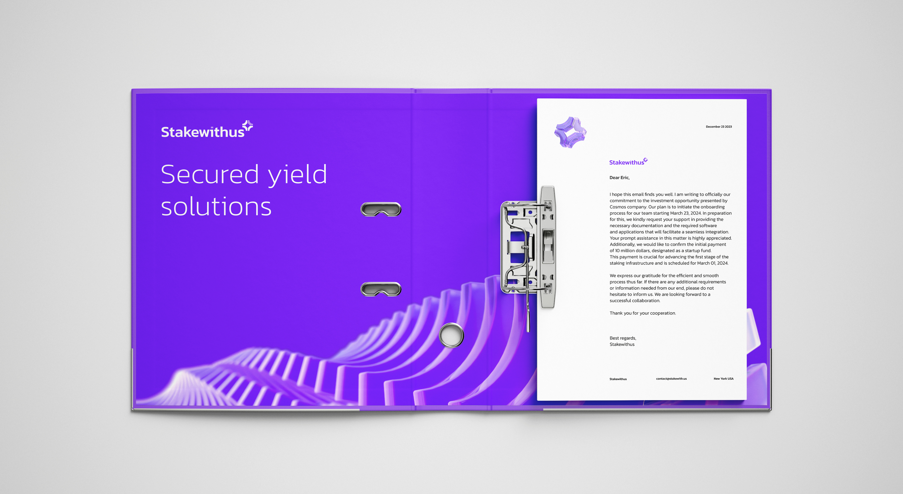
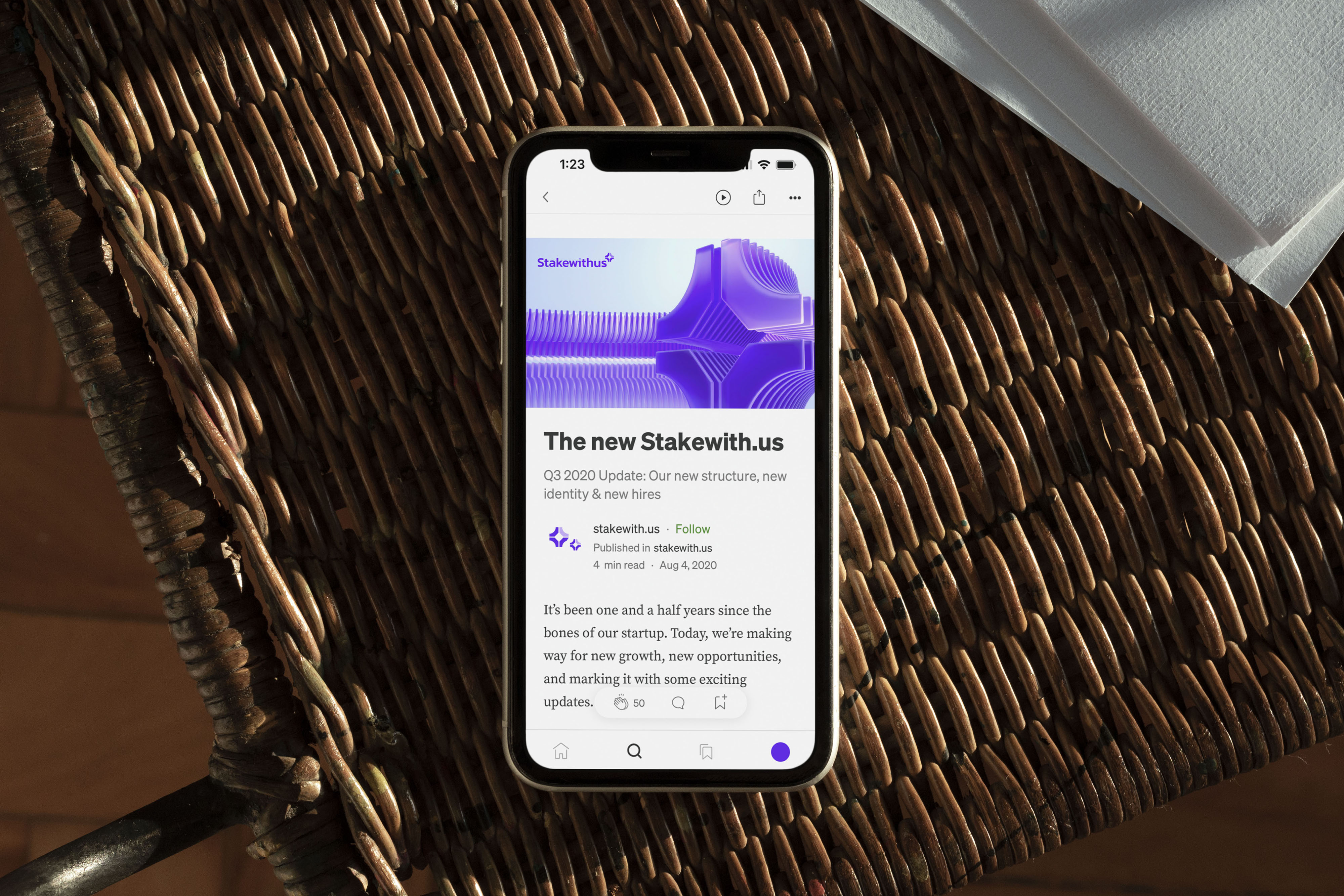
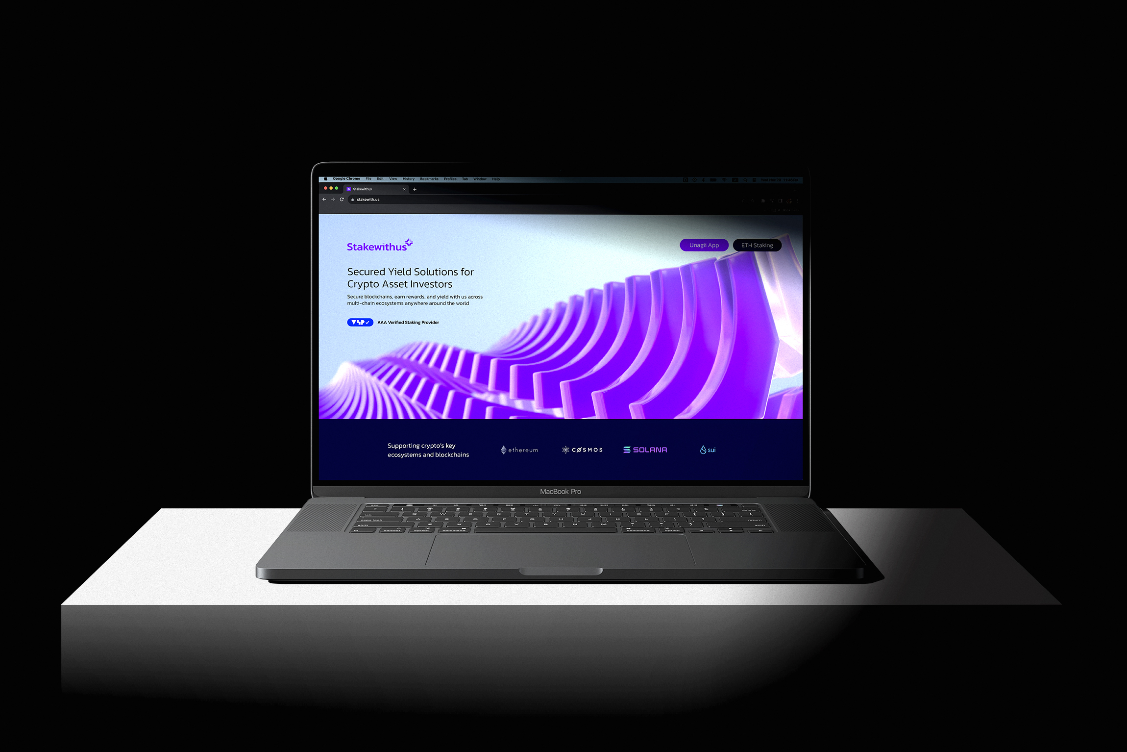
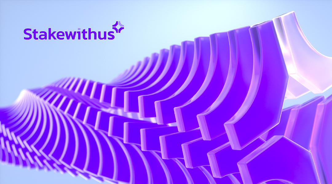
Demystifying Staking and Stakewithus (SWU) In the midst of the growing number of crypto institutions and services, staking emerges as a standout choice for long-term crypto investors. The concept is straightforward: investors agree to hold their crypto and not sell it for a period of time. This commitment aids in maintaining the network's stability and security. In return, they earn rewards, similar to interest from a savings bank account. Stakewithus (SWU) is a unique player in this field. It is the only B2B and institutional staking service that caters to businesses and major investors, and it's notably backed by a government fund in Singapore. SWU's Challenge: Refining Amid Crypto Chaos Founded in 2019, Stakewithus (SWU) has weathered the crypto market's volatility and established itself as a trusted player in the industry. However, in an increasingly complex and mistrusted market due to a surge in new entrants, SWU faces a pivotal rebranding challenge. It aims to set itself apart while projecting professionalism, approachability, and transparency. Blending Time-Honored Concepts with Futuristic Vision The logomark is inspired by the classic design of ancient Chinese coins, characterized by a circular shape enclosing a square center. The circle represents the sky, embodying innate wisdom, while the square symbolizes the earth, reflecting self-cultivated integrity. Crafted from four identical pieces, the SWU logomark ingeniously forms a circle at its core when these elements are flipped, seamlessly integrating this timeless concept. To modernize this traditional symbol, we've opted for a "3D frosted glass" effect rather than metallic visuals. This choice maintains sleekness while innovating from the coin's classic form. Unlocking the Power of the Multiplying Effect The multiplying effect is fundamental to staking. It incentivizes user participation for network security and stability, and is also a crucial element in understanding the risks and staking dynamics. Building on this concept, we have strategically arranged the shapes in stacked formations. This creates dynamic, fluid compositions that vividly embody the vibrant energy and the potential of new blockchain technology. Each stack plays an active role in shaping these formations, growing rewards, and also guiding the overall flow and direction. Empowering Companies with White Label Integration Services SWU offers another key service: providing staking infrastructure for companies and institutions looking to launch their own cryptocurrencies. Their infrastructure is designed for adaptability and seamless integration with various corporate staking systems. The logomark, composed of four identical pieces, includes one piece in a lighter shade to highlight SWU's white-label integration services. This subtle design choice underscores SWU's expertise, adaptability, and scalability, reinforcing its role as a foundational element in the staking ecosystem.