INDIGO DESIGN WINNER 2024
INDIGO DESIGN WINNER 2024
INDIGO DESIGN WINNER 2024
INDIGO DESIGN WINNER 2024
INDIGO DESIGN WINNER 2024
INDIGO DESIGN WINNER 2024
INDIGO DESIGN WINNER 2024
INDIGO DESIGN WINNER 2024
Roberta Peruzzi - Beauty Within
/by David Harrison Ferrell II
2024 Freelancer Winner
Silver Winner in Branding for Graphic Design
Bronze Winner in Logos for Graphic Design
Bronze Winner in Branding for Health & Beauty
Description
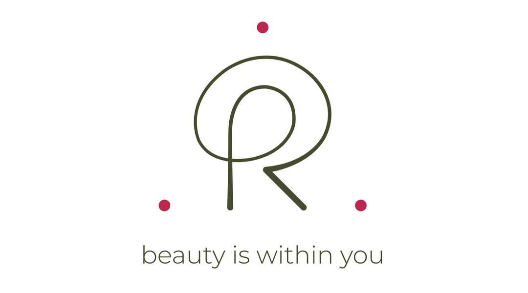
This branding design, which is still an ongoing project, was designed for a beautician, whose passion and professional success brought her to want to reach even greater heights within the industry. As her big break of opening a consultancy was finally approaching, she felt the need to present herself with a fresh, clean, minimalistic, yet captivating and meaningful image capable of distinguishing her competencies and expertise in a relatively saturated industry sector. Her main characteristic is that of going beyond "basic" beauty treatments to help clients not only with aesthetic blemishes, but also with disturbances (eg. weight, skin issues, migraines, fatigue, detox, intestinal cleansing), thus aiming to treat the root causes of these matters, specifically from within, to reach a state of overall rebalancing. She wanted to ensure that her new identity spoke a strong and clear message: I, as a client, am free to speak about my quite personal topics, to a trustworthy and experienced professional that can propose a new holistic approach capable of treating my defined imbalances. This is precisely how Roberta Peruzzi - Beauty Within was born. The logo is inspired by the concept of "holistic", communicating beauty as a representation of an inner balance, interconnected with a greater realm of internal factors. The R+P monogram, which depicts the client's first and last name initials, is intertwined with the representation of the person at the center. The theme of holism is further strengthened with the use of the single, uninterrupted line, highlighting the greater strength of the whole compared to the sum of the individual parts. The curves intend to communicate the sense of embracing and welcoming people into her world, as a hug, strengthening the concept of listening and comforting clients. Last but not least, the triangle indicates a clear direction, path, and process to reach the end goal, while maintaining a stable, down-to-earth approach. The color theme derives from my client's Armocromia Seasonal Color Analysis, which can be identified in a Bright Spring palette. A warmer undertone was associated to the colors for greater depth to emphasize the client's forthcoming and welcoming attitude. The green hue can be considered a chromotherapy treatment capable of curing cutaneous diseases, headaches, nevralgia, and fever, contrasting sicknesses linked to metabolic issues, purifying and decongesting human organisms, and aiding in the cure of respiratory illnesses (such as asthma and bronchitis). In Color Psychology, it represents balance and well-being, further aiding to calm, relax, alleviate tensions, and combat insomnia, while helping to reach prefixed goals. The Viva Magenta Pantone Color of the Year 2023, which promotes an attentive taking care of one's body, was paired with the green hue because of its rooted complementarity to green, similar to that of the Yin and the Yang, perfect symbol of balance and harmony. Additionally, it was incorporated into the design given its clear representation of audacity and inclusiveness, courage and empowerment, self-expression and transformative nature towards a more positive future. The logo was then associated with the payoff: "Beauty is within you" to further emphasize the concept of beauty as a representation of an inner balance that originates from basic root equilibriums, further strengthening the brand's overall visual balance. The originated brand is currently being applied to a series of communicative elements - from, but not limited to, the base Corporate Identity, a future storefront window, and the possible product packaging - successfully embracing the design's core message in its entirety, while stimulating an initial intended curiosity within the client base.


